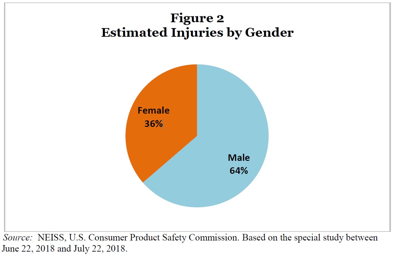
Where do we buy our food?

How you answer the question of where do you buy your food probably says a lot about your socioeconomic status. The chart here is from the Business Insider article Here’s where Americans are buying their groceries by Hayley Peterson (6/21/17).  Note that CVS, Walgreens, Dollar Tree, and Dollar General each outsell Whole Foods, for example. Why does this matter? The recent Guardian article Fears grow over ‘food swamps’ as drugstores outsell major grocers by Gabrielle Cannon (6/4/19) provides context.

Shelf-stable options tend to be highly processed and high in fat, sodium and sugar. Where they are the easiest option available, communities experience higher rates of chronic illness, like diabetes, heart disease and cancer.

“Highly processed food makes you sick,” says William McCarthy, an adjunct professor of public health at UCLA. “CVS and other pharmacies make money selling highly processed, long shelf-life foods, because it is all convenient.” But, he says, his research has shown that it’s not just about having more healthy options.

Interestingly,

In a 2016 study, researchers stocked corner stores in “food swamps” across East Los Angeles with affordable produce, hoping to test whether food retail interventions could be successful. They weren’t. While perceptions of the stores and community accessibility changed, patrons continued to purchase processed food instead of the fresh stuff.

Grocery sales data is available for 2018 (estimated) from the Winsight Grocery Business article WGB, Kantar Reveal ‘The Power 20’ Retailers by Meg major and Jon Springer (7/17/2018). They estimate CVS as fourth in grocery sales with Dollar General and Dollar Tree at 12 and 17, respectively. The Guardian article links to a couple of studies with statistical information suitable for a stats course.


How big is the disconnect between how we die and what the media reports?

The Our World in Data article Does the news reflect what we die from? by Hannah Ritchie (5/29/19) provides data on causes of death, google searches, and media reports by the NYT and the Guardian. The graph copied here is for 2016. As you can see there is a big disconnect. Why does this matter?

Media and its consumers are stuck in a reinforcing cycle. The news reports on breaking events, which are often based around a compelling story. Consumers want to know what’s going on in the world — we are quickly immersed by the latest headline. We come to expect news updates with increasing frequency, and media channels have clear incentives to deliver. This locks us into a cycle of expectation and coverage with a strong bias for outlier events. Most of us are left with a skewed perception of the world; we think the world is much worse than it is.5

The article has four time series from 1999 to 2016 (2004 to 2016 for google searches) corresponding to each of the four categories in the chart here. The charts are interactive and the data is available.

Footnote 5 is worth noting and Factfulness in worth reading: There are many results which show we have a negative bias of global progress. Factfulnesspublished by the Roslings, is packed with public survey results of Gapminder’s Ignorance Test. The test shows that the vast majority of people get the most basic questions on global development wrong (nearly always thinking the world is in a worst state than it is).


How do we get information about record setting weather events?

NOAA has an online tool, Data Tools: Daily Weather Records, that has a summary of daily, monthly, and all time weather records for the last 7, 30, and 365 days, as well as month to date and year to date. For instance, so far this year there have been 12,868 daily precipitation records set in the U.S. There is also a tool to select a time period and event. For example, from 5/21/2019 to 5/27/2019 there where 757 daily high precipitation records set.  The tool provides a map (copied here for this query) and a list of the stations with sortable records. For instances, in this time period the most rain was in Pawnee, OK which had 9.52 inches of rain breaking the previous record of 3.20 inches set on 5/21/1977.

Some details about the data:

For a station to be considered for any parameter, it must have a minimum of 30 years of data with more than 182 days complete each year.

These data are raw and have not been assessed for the effects of changing station instrumentation and time of observation.


How has the economic situation of college students changed?

The Pew article A Rising Share of Undergraduates Are From Poor Families, Especially at Less Selective Colleges, by Richard Fry and Anthony Cilluffo (5/22/19) summarizes the change in the economic background of students from 1996 to 2016.

As of the 2015-16 academic year (the most recent data available), about 20 million students were enrolled in undergraduate education, up from 16.7 million in 1995-96.1 Of those enrolled in 2015-16, 47% were nonwhite and 31% were in poverty, up from 29% and 21%, respectively, 20 years earlier.2

The rising proportion of undergraduates in poverty does not mirror wider trends in society. The official poverty rate for adults age 18 to 64 (12%) was similar in 1996 and 2016, suggesting that access to college for students from lower-income backgrounds has increased since 1996.

As the graph copied here shows:

The growth in the share of dependent students from families in poverty has been uneven across postsecondary education. Their growing presence has been most dramatic among less selective institutions.

The article has a eight charts, a methodology section, and links to the data sources.

Are there correlations between one or more deceased parents and race, gender, or socio-economic status?

The Census Bureau report Parental Mortality is Linked to a Variety of Socio-economic and Demographic Factors by Zachary Scherer (5/6/19) provides charts of deceased parent(s) by sex, race (chart copied here), and socio-economic status.

For example, among those ages 45 to 49, 26% have lost their mother, while 45% have lost their father. Along these same lines, 7 in 10 of those ages 60 to 64 have a deceased mother, while about 87% have lost their father.

For example, among those ages 35 to 44, 43% of those living below the FPL have lost one or both parents, compared to 28% for those living in households with an income-to-poverty ratio of at least 400% of the FPL.

Parental loss, which varies by race and socio-economic status, is often accompanied by psychological and material consequences. These statistics demonstrate the way these new SIPP data can help assess how socio-economic and demographic characteristics are associated with parental mortality in the United States.

There are two other charts and a link to the SIPP data source.


Where can we get state energy data?

The EIA has a new portal for state energy information. The new portal is introduced in the post New EIA Product Expands Access to State and Regional Energy Information by Stacy Angel and Pauline George (5/16/19).

EIA’s new State Energy Portal provides greater access to more state-level U.S. energy data with interactive, customizable views of more than 150 charts, tables, and maps. Infographics show the overall energy context for the states; state rankings provide a way to compare states. Users can download charts and embed them in their websites.

For example, the chart here is from the new portal. It is natural gas consumption by sector in New York from 2014 through Feb. of  2019. Notice the relationship between residential and electric power. Quiz question: Why does residential and electric power peak at opposite time of the year? The choices for this individual data set included a time range dating back to 1990, stacked bar chart, or table. The data is also available. Choose a state, an energy product, and explore.

QL Blooper

The graph is from Amazon and attempting to graphically represent the number of pages printed from two different toner cartridges. Maybe the designers took into account the compression from the weight of the paper. Enjoy.

What are the economic prospects for 2019 college grads?

The yearly EPI report on economic prospects for young college grads Class of 2019 College Edition by Elise Gould, Zane Makhiber, and Julia Wolfe (5/14/19) is now available. The report has 19 key finding and 10 graphs with available data. A few highlights:

Women make up half of 21- to 24-year-olds but well over half (57.4 percent) of young college degree holders.

One out of every 20 young college graduates is unemployed, a higher rate than in 2000, when only one in 25 was.

After falling in the aftermath of the Great Recession, wages for young college graduates have been growing steadily since 2014 and have (just barely) surpassed the 2000 benchmark; however, nearly two decades of wage growth for young college graduates have been lost.

Related Post: What are the prospects for new college grads? (5/21/18)

Does the U.S. import or export natural gas?

The title of the EIA post (5/2/19) says it all, United States has been a net exporter of natural gas for more than 12 consecutive months. In short,

U.S. net natural gas exports in February 2019 totaled 4.6 billion cubic feet per day (Bcf/d), marking 13 consecutive months in which U.S. natural gas exports exceeded imports. The United States exports natural gas by pipeline to both Canada and Mexico and increasingly exports liquefied natural gas (LNG) to several other countries.

Note the units, that is 4.6 billion cubic feet per day.  The eia has links to the data.

In a related post How much coal does the U.S. export? this question was posed:  If a country removes fossil fuels from the ground, how complicit are they in the CO2 emissions of those fuels even if they aren’t the ones burning it?

Why is Black maternal mortality higher?

Kevin Drum provides an excellent example of quantitative reasoning in his (5/6/19) post How Can We Reduce Black Maternal Mortality? The story begins with his chart here that shows maternal mortality increasing in general, but it has increased faster and is much higher for Black mothers as compared to White. Drum begins by addressing the toxic stress hypothesis, in other words, the differences are do to the stress caused by societal and systemic racism which leads to physiological issues.  But,

One reason for this is the “Hispanic paradox”: Hispanics certainly encounter systemic racism too, but the maternal mortality rate for Hispanic mothers is about the same as for white mothers.

The article has a graph of “allostatic load” which looks to quantify long-term stress.

The differences in allostatic load are tiny—about the equivalent of one IQ point on an intelligence test—and Hispanics have a higher allostatic load than either blacks or whites but the lowest maternal mortality rate.

Another chart looks at self-reported stress by race for poor individuals, but

Poor blacks report less stress and higher levels of optimism than both poor whites and poor Hispanics. Put all this together and the toxic stress/weathering hypotheses look shaky. The racial differences are modest and don’t seem to correlate well with maternal mortality anyway. The problem is that every other hypothesis seems wrong too. Researchers have looked at poverty, education, drinking, smoking, and genetic causes. None of them appear to be the answer.

There are two more charts as part of Drum’s article. The article is worth reading, he cites his data, and is it perfect for a QL based course. His general conclusion at this point:

This is shocking: we still have almost no idea of what’s going on even though this has been a well-known problem for more than two decades.