The Pew article A Rising Share of Undergraduates Are From Poor Families, Especially at Less Selective Colleges, by Richard Fry and Anthony Cilluffo (5/22/19) summarizes the change in the economic background of students from 1996 to 2016.
As of the 2015-16 academic year (the most recent data available), about 20 million students were enrolled in undergraduate education, up from 16.7 million in 1995-96.1 Of those enrolled in 2015-16, 47% were nonwhite and 31% were in poverty, up from 29% and 21%, respectively, 20 years earlier.2
The rising proportion of undergraduates in poverty does not mirror wider trends in society. The official poverty rate for adults age 18 to 64 (12%) was similar in 1996 and 2016, suggesting that access to college for students from lower-income backgrounds has increased since 1996.
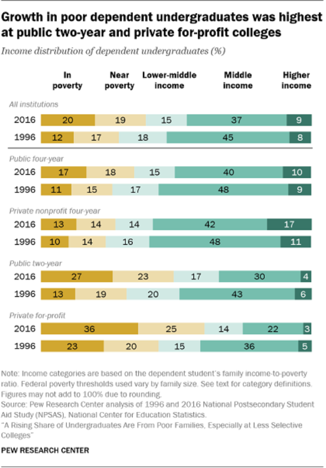
As the graph copied here shows:
The growth in the share of dependent students from families in poverty has been uneven across postsecondary education. Their growing presence has been most dramatic among less selective institutions.
The article has a eight charts, a methodology section, and links to the data sources.