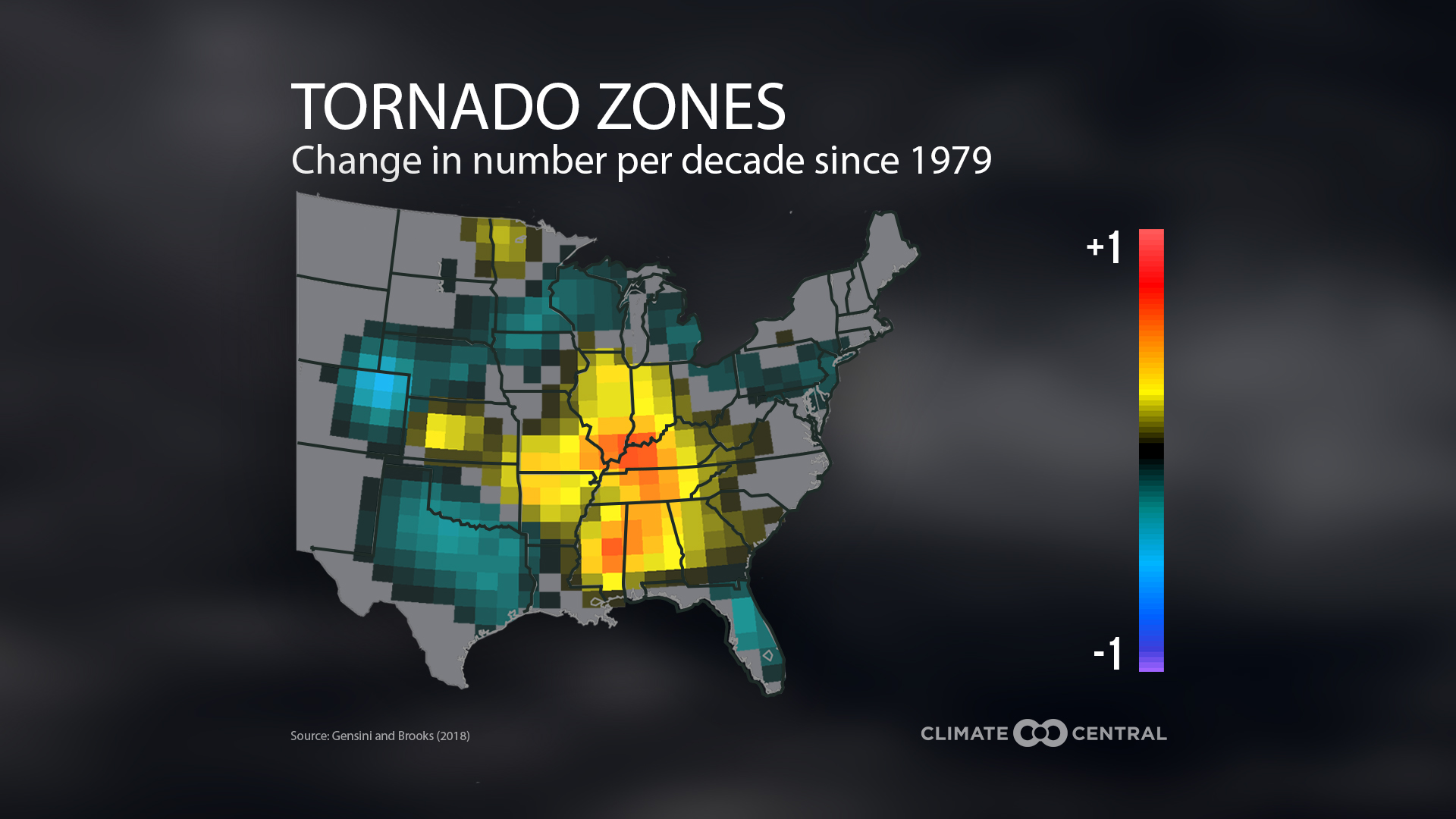
What is Population Bracketology?

The Census Bureau has a new interactive data visualization called Population Bracketology (see the screen shot here). In the game, players have to choose the city (or state for the state version) with the largest population.  Once the game is completed users can scroll over the cities (or states) to get the size of their population.  So, how much do you know about city and state population sizes? Play the game and find out.

How much coal does the U.S. export?

The EIA article In 2018, U.S. coal exports were the highest in five years (3/27/19) summarizes coal exports.

While U.S. coal consumption has generally declined since its 2008 peak, EIA expects that U.S. coal exports reached 116 million short tons (MMst) in 2018, the highest level in five years, based on foreign trade data collected by the U.S. Census Bureau. Exports of coal from the United States have increased since 2016 as international prices have made it more economic for U.S. producers to sell coal overseas.

While coal production in the U.S. has been on the  decline (2014: 1,000,048,758 short tons;  2015: 896,940,563;  2016: 728,364,498;  2017:774,609,357 ) along with consumption, exports have been increasing. This raises philosophical questions.  U.S. coal CO2  emissions have gone down due to burning less coal, but should U.S.  CO2 emissions include U.S. coal burned in other countries?  If a country removes fossil fuels from the ground, how complicit are they in the CO2 emissions of those fuels even if they aren’t the ones burning it?

The EIA article includes links to the data such as the Annual Coal Report page.

How will raising the federal minimum wage impact workers?

The EPI article, Raising the federal minimum wage to $15 by 2024 would life pay for nearly 40 million workers, by David Cooper (2/5/19) covers their analysis of raising the minimum wage.  Their graph here shows the gap between the minimum wage and median wage over time. The report is lengthy and detailed. A few quick highlights:

Raising the minimum wage to $15 by 2024 would undo the erosion of the value of the real minimum wage that began primarily in the 1980s. In fact, by 2021, for the first time in over 50 years, the federal minimum wage would exceed its historical inflation-adjusted high point, set in 1968.

All told, raising the minimum wage to $15 by 2024 would directly or indirectly lift wages for 39.7 million workers, 26.6 percent of the wage-earning workforce.

Indexing the minimum wage to the median wage would ensure that low-wage workers share in broad improvements in U.S. living standards and would prevent future growth in inequality between low- and middle-wage workers.

The article has over 20 graphs/charts/tables and each one has the associated data.  The report does include “a discussion of the research on the likely effects such a raise would have on businesses, employment, and low-wage workers’ welfare.”

How well do you know Antarctica?

Monthly average sea surface temperatures in the Southern Ocean around Antarctica from 1850–2017, based on NOAA’s ERSSTv5 data set. Analysis by Climate Reanalyzer, University of Maine Climate Change Institute.


The Climate.gov article Antarctica is colder than the Arctic – but it’s still losing ice by Michon Scott (3/121/19) is a detailed primer on Antarctica and it’s relation to climate change. Some basic facts about Antarctica:

Thanks to thick ice, Antarctic elevation averages more than 6,000 feet (more than a mile above sea level). The very highest parts of the ice sheet, near the center of East Antarctica, rival the height of its tallest mountains, at nearly 13,500 feet.

Antarctica’s interior gets so little precipitation that it counts among the world’s driest deserts. Air masses reaching the high-elevation interior are usually stripped of moisture. The U.S. Antarctic Program reports that, continent-wide, Antarctica receives an average of roughly 2 inches of precipitation per year. (Phoenix, Arizona, gets about 7.5 inches of annual precipitation.)

Is Antarctica warming? It’s complicated:

The Intergovernmental Panel on Climate Change (IPCC) synthesis report published in 2014 found a warming trend over Antarctica, but expressed low confidence that the warming was caused by human activities. In the late twentieth century, the ozone hole and its effects on air circulation may have partly shielded the continent from the global warming influence of greenhouse gas emissions. Continued success in addressing the ozone hole, along with fossil fuel emissions, may cause Antarctic temperatures to rise more rapidly in future decades.

West of the Antarctic Peninsula, measurements dating back to the 1950s show a strong warming trend in the upper ocean: nearly 2.7°F. Meanwhile, waters of the Arctic Circumpolar Current (ACC), far below the surface, have warmed faster than the rest of the global ocean. Between depths of 1,000 and 3,000 feet, ACC temperatures rose by 0.11°F per decade between the 1960s and the 2000s. Between the 1980s and 2013, ACC temperatures at those depths rose by 0.16°F per decade.

What about ice melting?

In contrast with the Arctic—where climate change is amplified, and sea ice shows a clear declining trend over time—Antarctic sea ice does not show a significant overall trend in either the summer or the winter. One region, south and west of the Antarctic Peninsula, has shown a persistent decline, but this trend is small relative to the high variability of the other Antarctic sea ice regions. In 2015, sea ice experts concluded that the small gains in Antarctic sea ice in some seasons were not enough to cancel out Arctic losses, and so globally, sea ice was declining. That basic conclusion remains true in early 2019.

But what if all the ice on the continent melted?

If the entire Antarctic Ice Sheet were to melt at once, it would raise global sea level more than 180 feet. Outside of an epic natural disaster such as an asteroid slamming into Antarctica, that ice sheet isn’t going to melt entirely for centuries, but it will contribute to sea level rise over the next century. The question is: How much? The exact answer is elusive. The IPCC Fifth Assessment Report (AR5) states that the effect of Antarctic ice sheets on sea level rise over the coming century is a major unknown. Not only is the ice sheet melt rate challenging to measure precisely, but other events could accelerate sea level rise, and it’s hard to know when or even if those events will occur.

Read the article and get to know Antarctica. The is ample stats and QL classroom opportunities and graphs in the article.


What are the gender trends in graduate school?

The Council of Graduate Schools (CGS) report, Graduate Enrollment and Degrees 2007 to 2017 (Oct 2018) provides data on enrollment and degrees in graduate school by gender and race.  For example, the graph here is Figure 2 in their report and provides enrollment data by field of study and  gender.  In the aggregate they note:

Academic year 2016-17 marked the eighth consecutive year in which women earned the majority of degrees awarded at the doctoral level. Women earned 64.0% of graduate certificates awarded in 2016-17, 57.3% of master’s degrees, and 53.0% of doctorates.

The report contains a number of graphs and data tables with various  demographic information (race, gender, international). For example,

Among first-time U.S. citizens and permanent resident graduate students in the Fall of 2017, about 23.9% were underrepresented minorities, including American Indian/Alaska Native (0.5%), Black/African American (11.9%), Native Hawaiian/Other Pacific Islander (0.2%), and Hispanic/Latino (11.3%) (Table B.11).

A summary page of the report, First-Time Enrollment Holds Steady – Application Counts Slightly Decline at U.S. Graduate Schools, also has a link to the full pdf report.

How many ways does NASA use pi?

At least 18 according to the Jet Propulsion Laboratory at NASA based on the article for pi day — Oh, the Places We Go: 18 Ways NASA Uses Pi.  Number 12 on the list: Keeping rover wheels turning:

Rover wheels have distinct designs on them that leave patterns on the ground as they turn. These patterns serve as visual markers that help operators while driving the Mars rovers remotely from Earth. Pi is used to calculate how far the rover should travel with each wheel rotation. By measuring the distance from one wheel mark to another, rover drivers can determine if the wheels are slipping or if they’ve driven the expected distance.

Each of the 18 on the list has an associated project with a printable poster. The  Celebrate Pi Day with NASA page has resources for educators, students, and pi day enthusiasts.

0 to 6 or 1 to 7, Does it matter?

The Decoded/Pew Research Center article On a scale from 1 to 10, how much to the numbers really matter? by Jonathan Evans reports on their experiment using a 0 to 6 scale and 1 to 7 scale.

 To carry it out, we randomly assigned respondents in France, Germany and the United Kingdom our political ideology question with one of two 7-point scales: either 0–6 or 1–7. The full question wording using our traditional 0–6 scale was this: “Some people talk about politics in terms of left, center and right. On a left-right scale from 0 to 6, with 0 indicating extreme left and 6 indicating extreme right, where would you place yourself?”

Their graph copied here shows the results of this study. An explanation:

These outcomes suggest that when a scale is easily divided in half — for example, when the maximum value is 6 rather than 7 — it’s more likely for respondents to select the midpoint. Previous research has found that respondents are likely to assume that half the top endpoint is a scale’s midpoint, so when half the top endpoint is not an answer option (e.g., 3.5 on the 1–7 scale), respondents seeking the central point on the scale may sometime choose 3 (not the scale midpoint) and sometimes choose 4 (the actual scale midpoint). Those who received the 0–6 scale could more easily find the midpoint (3) by halving the top endpoint.

The article has other charts and links to methodology.

How do we humanize data?

When comparing countries or even within countries, we can talk about GDP, Gini coefficients, poverty rates, etc., but sometimes (all the time?) it is hard to know what this really means for people. If a picture is worth a 1000 words then Dollar Street has 30,000,000 words as they “visited 264 families in 50 countries and collected 30,000 photos” resulting in an excellent example of humanizing data.

The pictures here represent the bathroom for a family in India earning $4621 per month and for a family in Egypt earning $775 per month (which is which?).  Dollar Street has large sets  of pictures like this from around the work for over 100 different categories such as armchairs, beds, computers, earrings,  floors, hands, ovens, and plates.  Difference can be explored by picture within countries or the world. These sets of pictures provide both a sense of what poverty is really like around the world, while at the same time there are much more similarities than one might expect even with seemingly large gaps in income. Take the time to visit Dollar Street.

How important are clouds to our climate?

Lucy Reading-Ikkanda/Quanta Magazine


The Quanta Magazine article, A World Without Clouds A state-of-the-art supercomputer simulation indicates that a feedback loop between global warming and cloud loss can push Earth’s climate past a disastrous tipping point in as little as a century by Natalie Wolchover (2/25/19), reports on recent finding published in Nature Geoscience.

Clouds currently cover about two-thirds of the planet at any moment. But computer simulations of clouds have begun to suggest that as the Earth warms, clouds become scarcer. With fewer white surfaces reflecting sunlight back to space, the Earth gets even warmer, leading to more cloud loss. This feedback loop causes warming to spiral out of control.

The simulation revealed a tipping point: a level of warming at which stratocumulus clouds break up altogether. The disappearance occurs when the concentration of CO2 in the simulated atmosphere reaches 1,200 parts per million — a level that fossil fuel burning could push us past in about a century, under “business-as-usual” emissions scenarios. In the simulation, when the tipping point is breached, Earth’s temperature soars 8 degrees Celsius, in addition to the 4 degrees of warming or more caused by the CO2 directly.

There is evidence that this may have happened in the past:

More data points surfaced in China, then Europe, then all over. A picture emerged of a brief, cataclysmic hot spell 56 million years ago, now known as the Paleocene-Eocene Thermal Maximum (PETM). After heat-trapping carbon leaked into the sky from an unknown source, the planet, which was already several degrees Celsius hotter than it is today, gained an additional 6 degrees.

Related posts on feedback loops:
How are beavers creating a climate feedback loop?
Greenland Ice, Changing Albedo, and a Feedback Loop
Oceans as a Heat Sink: Possible Feedback Loop
A Feedback Loop: The Alaska Tundra
Methane Bubbles – A Feedback Loop

What is the current information on wages trends?

EPI has released its report: State of Working America Wages 2018, Wage inequality marches on – and is even threatening data reliability by Elise Gould (2/20/19). The report includes 19 tables and charts. The data and charts are easily downloaded, such as the chart here. The report is thorough and anyone reading it will likely be surprised about something.  A few selection from the report:

From 2017 to 2018, men at the 95th percentile saw large wage gains, while those at the middle and very bottom of their wage distribution experienced downright wage losses.

The gender wage gap at the 10th percentile remains the smallest across the wage distribution and it has narrowed since 2000; it is currently at 5.9 percent. The regression-adjusted average gender wage gap narrowed slightly from 2000 to 2018 and is currently at 22.6 percent.

In both comparison periods, both men and women at the 10th percentile saw greater wage growth in states with minimum wage changes versus those without.

Over the last 18 years, wage growth for white and Hispanic workers has been about four times faster than that of black workers in the 20th through the 70th percentiles of their respective wage distributions. The 60th and 70th percentiles of the black wage distribution remain below their 2000 levels.

The wages of those with a high school diploma rose faster than the wages of those with a college degree over the last two years, narrowing the gap between college and high school wages. As a result, the college wage premium—the regression-adjusted log-wage difference between the wages of college-educated and high school–educated workers—fell from 50.6 percent to 48.4 percent between 2016 and 2018.

Related posts:  How have wages grown since 1980?
What is the pay gap between black women and white men?
What are the prospects for high school grads?

The Interactive Graphs page has two charts on wages.