 The Nenets are reindeer herders in Russia’s Arctic that migrate 800 miles each year. The National Geographic Article, They Migrate 800 Miles a Year. Now It’s Getting Tougher, tells their story.
The Nenets have undertaken this annual migration for centuries, and at 800 miles round-trip, it’s one of the longest in the world. Yuri’s group, called Brigade 4, is a relic of a Soviet collective—under Soviet rule the Nenets endured decades of forced collectivization and religious persecution. They survived centuries of Russian rule before that. Through it all, they’ve managed to sustain their language, their animist worldview, and their nomadic traditions.
The Nenets are facing challenges.
As I talk to Yuri, the region is suffering another record-hot summer; the thermometer has already hit 94°F. It hasn’t rained for weeks, and it’s hard for reindeer to pull the loaded sleighs across the dry tundra. Before the summer is out, a boy and more than 2,300 reindeer will die from anthrax on southern Yamal, and dozens of people will get sick—a direct result of thawing permafrost, which allowed animal carcasses buried during an outbreak in the 1940s to reemerge, still bearing infectious microbes.
And it isn’t just climate related challenges.
Yet climate change isn’t even the greatest threat to the Nenets. Development is. Russia’s quest for new sources of hydrocarbons has encroached on pastures that were already tight for the estimated 255,000 reindeer and the 6,000 nomadic herders that live on Yamal.
Read the article, which includes a video and a number of great photos and maps: They Migrate 800 Miles a Year. Now It’s Getting Tougher.
Related permafrost articles from this blog: Climate Change, Melting Permafrost, and Disease, Melting Permafrost and a Feedback Loop, Climate Change – Impacts on People, and Methane Bubbles – A Feedback Loop.


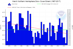


 NOAA’s