 The Our World in Data blog post, A sense of units and scale for electrical energy production and consumption has the graph here. It provides a comparison of the scale of different types of electricity production along with comparisons to consumption. For example the Three Gorges Dam is worth 270,000 MWh while the Hoover Dam provides 11,000 MWh. On the other hand the Alta onshore wind form generates 7,342 MWh. The post has a nice discussion of units as well as information about the types of electricity generation they highlight in the graphic.
How much do you know about the production and consumption of protein?
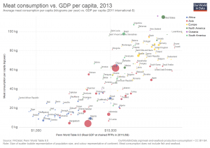
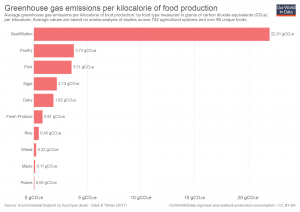 If you read the post by Our World in Data, Meat and Seafood Production & Consumption, you will be able to impress your friends. The post consists of 34 graphs. You can download the images and the data for each. The graph here is Greenhouse gas emissions per gram of protein by food type. Beef is far more CO2 intensive than any other protein source. The second chart here shows Meat consumption vs. GDP per capita (2013) and the U.S. is one of the top two consumers of meat.
What is the pay gap between Hispanic women vs white non-Hispanic men?
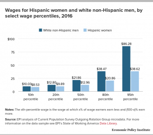 The Economic Policy Institute has the answer with their post Latina workers have to work 10 months into 2017 to be paid the same as white non-Hispanic men in 2016. They compare not only wages by percentile (graph here), but also compare by occupation and education.
Much of these differences are grounded in the presence of occupational segregation. Latina workers are far more likely to be found in certain low-wage professions than white men are (and less common in high-wage professions). But, even in professions with more Latina workers, they still are paid less on average than their white male colleagues.
As Hispanic women increase their educational attainment, their pay gap with white men actually increases. The largest dollar gap (more than $17 an hour), occurs for workers with more than a college degree.
The EPI post includes downloadable graphs (such as the one here) as well as the data.
What is the connection between Greenland and the East Coast of the U.S.?
 In NASA’s post, Greenland melt speeds East Coast sea level rise, they explain:
The recent work reveals a substantial acceleration in sea level rise, roughly from Philadelphia south, starting in the late 20th century. And it is likely a strong confirmation of sea-level “fingerprints,” one of the most counter-intuitive effects of large-scale melting: As ice vanishes, the loss of its gravitational pull lowers sea level nearby, even as sea level rises farther away.
Their analysis shows that the Greenland and Antarctic influence alone would account for an increase in the rate of sea level rise on the East Coast of 0.0016 to 0.0059 inches (0.04 to 0.15 millimeters) each year, varying by location. That’s equivalent to 7.8 inches (0.2 meters) of sea-level rise on the northern East Coast over the next century, and 2.5 feet (0.75 meters) in the south, though the estimates are quantitative and not an attempt at an actual projection.
Emphasis here in increase as this is in addition to the increases based on the meted water and thermal expansion of the water. Connected to this article, is the graph here, change in Greenland ice in Gt, which is from NASA’s Greenland page where you can also get the data.
How are king tides changing?
 King tides occur when the sun is closest to the earth and aligned with the moon. For the northern hemisphere this happens in the fall. The picture here from the climate.gov post, King tides cause flooding in Florida in fall 2017, is from October,17 2016 at Brickell Bay Drive and 12th Street in downtown Miami.
While the celestial mechanisms that cause these king tides are not changing anytime soon, the water levels of the oceans are. This means that as the sun and moon tug away at the ocean, they are tugging at an ever-larger amount of water, dragging more of it on-shore than they did during previous decades’ king tides.
The article includes the graph here of maximum daily water levels during king tides near Miami, with a  regression line. The trend shows a water level increase of almost 10 inches since 1994. To get the data go to the Tides and Current page from NOAA, click on the pin by Miami, and then click on the station home page. Under the tides/water level tab go to water level. There is some work involved in the settings to get the data, but there is really interesting data available.
Is sexual harassment a serious problem?
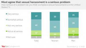 YouGov asked the question, How serious of a problems do you think workplace sexual harassment is in the United States? Very serious or somewhat serious was the response of 70% of the respondents.
But for women it is a greater concern: 78% of women say sexual harassment in the workplace is a serious problem today, and 33% of women say it is a very serious problem). 60% of men agree it is a serious issue, with 21% calling it very serious.
The article has more questions and graphs. The most interesting may be the breakdown by gender and political party.
However, Republicans are less likely than Democrats to say sexual harassment in the workplace is a serious problem in the United States – and that’s especially true among Republican men. Democrats – both men and women – are more likely to describe workplace harassment as a very serious problem. But there are big differences between Republican men and women. Seven in ten Republican women say sexual harassment in the workplace is a serious problem; less than half of Republican men agree.
Republican men have a very different view on this issue. At the bottom of the article there is a link to the data, which can easily be incorporated into a stats class followed by an interesting classroom discussion.
What country produces the greatest amount of their electicity with renewable resources?
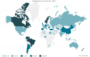 In 2015, the winner is Norway by producing 97.7% of their electricity needs through renewable energy. The top 3 is completed with New Zealand (80.1%) and Columbia (77.7%). The U.S. produces only 13.6% of their electricity with renewable energy. You can learn more from the Global Energy Statistics Yearbook 2017. The data on renewable energy production dates back to 1990. You can download graphs like the one here and the data sets (after registering).
When and why was leaded gasoline phased out?
 Kevin Drum answers the question in his post A Little Bit of Chart History for Wednesday. The phase out started in 1975. Why?
According to Nussbaum, EPA wanted places like California to reduce smog, and that meant cars would have to be fitted with catalytic converters. However, since gasoline lead ruins catalytic converters, refineries needed to produced unleaded gasoline. This was the initial impetus behind unleaded gasoline. The fact that it also reduced atmospheric lead was basically a happy accident.
Once that was done, however, EPA started looking more closely at the health effects of lead. It was no secret that high levels of lead poisoning were dangerous, but new research was showing that even moderate levels could be dangerous, especially in young children. So now EPA had two reasons to phase out leaded gasoline.
Drum’s post provides nice historical context on leaded gas, including this graph that may be the first graph produced showing a correlation between lead in blood and lead in gas (excellent artifact for use in a classroom). Read the article to find out about President Carter’s connection in all of this.
For further information read Drum’s essay Lead: America’s Real Criminal Element, published in Feb 2016. The lead crime connection has an element of environmental racism, which is not often discussed. In Statistics Materials you’ll find lead and crime data for linear regression and further information.
How much later are frosts occurring?
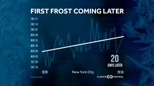 Climate Central has your answer with its post The First Frost is Coming Later. They provide graphs, like the one here for NYC (about 20 days later since 1970), for most major cities in the U.S. They don’t provide the data, but you can try and send them an email and they may send it to you. Alternatively, this could be a great stats project where students get the data themselves for a city of their choice and create the chart. You can get weather data from NOAA Climate Data Online.
Do you know what is in the recent Climate Science Special Report?
 There is a lot of information in the Climate Science Special Report, but you can read the Executive Summary, or this shorter summary from the Wunderground post Blockbuster Assessment: Humans Likely Responsible For Virtually All Global Warming Since 1950s. Posted here is a graph about global mean sea level (GMSL) rise from the executive summary. Yes, 8ft of sea level rise is a possibility by 2100.
Emerging science regarding Antarctic ice sheet stability suggests that, for higher scenarios, a GMSL rise exceeding 8 feet (2.4 m) by 2100 is physically possible, although the probability of such an extreme outcome cannot currently be assessed. Regardless of emission pathway, it is extremely likely that GMSL rise will continue beyond 2100 (high confidence). (Ch. 12)
Relative sea level rise in this century will vary along U.S. coastlines due, in part, to changes in Earth’s gravitational field and rotation from melting of land ice, changes in ocean circulation, and vertical land motion (very high confidence). For almost all future GMSL rise scenarios, relative sea level rise is likely to be greater than the global average in the U.S. Northeast and the western Gulf of Mexico. In intermediate and low GMSL rise scenarios, relative sea level rise is likely to be less than the global average in much of the Pacific Northwest and Alaska. For high GMSL rise scenarios, relative sea level rise is likely to be higher than the global average along all U.S. coastlines outside Alaska. Almost all U.S. coastlines experience more than global mean sea level rise in response to Antarctic ice loss, and thus would be particularly affected under extreme GMSL rise scenarios involving substantial Antarctic mass loss (high confidence). (Ch. 12)
Plenty of graphs in the executive summary and the Wundergraound post of any QL course and much of the data is available.