The Climate.gov article Antarctica is colder than the Arctic – but it’s still losing ice by Michon Scott (3/121/19) is a detailed primer on Antarctica and it’s relation to climate change. Some basic facts about Antarctica:
Thanks to thick ice, Antarctic elevation averages more than 6,000 feet (more than a mile above sea level). The very highest parts of the ice sheet, near the center of East Antarctica, rival the height of its tallest mountains, at nearly 13,500 feet.
Antarctica’s interior gets so little precipitation that it counts among the world’s driest deserts. Air masses reaching the high-elevation interior are usually stripped of moisture. The U.S. Antarctic Program reports that, continent-wide, Antarctica receives an average of roughly 2 inches of precipitation per year. (Phoenix, Arizona, gets about 7.5 inches of annual precipitation.)
Is Antarctica warming? It’s complicated:
The Intergovernmental Panel on Climate Change (IPCC) synthesis report published in 2014 found a warming trend over Antarctica, but expressed low confidence that the warming was caused by human activities. In the late twentieth century, the ozone hole and its effects on air circulation may have partly shielded the continent from the global warming influence of greenhouse gas emissions. Continued success in addressing the ozone hole, along with fossil fuel emissions, may cause Antarctic temperatures to rise more rapidly in future decades.
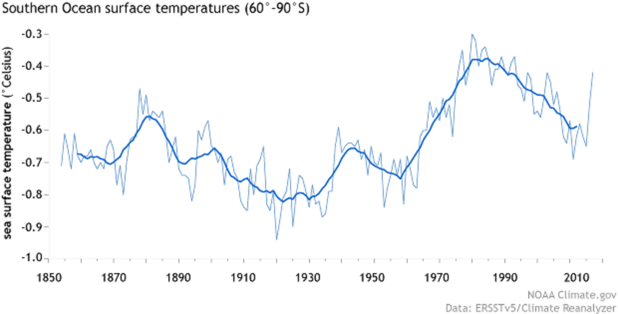
West of the Antarctic Peninsula, measurements dating back to the 1950s show a strong warming trend in the upper ocean: nearly 2.7°F. Meanwhile, waters of the Arctic Circumpolar Current (ACC), far below the surface, have warmed faster than the rest of the global ocean. Between depths of 1,000 and 3,000 feet, ACC temperatures rose by 0.11°F per decade between the 1960s and the 2000s. Between the 1980s and 2013, ACC temperatures at those depths rose by 0.16°F per decade.
What about ice melting?
In contrast with the Arctic—where climate change is amplified, and sea ice shows a clear declining trend over time—Antarctic sea ice does not show a significant overall trend in either the summer or the winter. One region, south and west of the Antarctic Peninsula, has shown a persistent decline, but this trend is small relative to the high variability of the other Antarctic sea ice regions. In 2015, sea ice experts concluded that the small gains in Antarctic sea ice in some seasons were not enough to cancel out Arctic losses, and so globally, sea ice was declining. That basic conclusion remains true in early 2019.
But what if all the ice on the continent melted?
If the entire Antarctic Ice Sheet were to melt at once, it would raise global sea level more than 180 feet. Outside of an epic natural disaster such as an asteroid slamming into Antarctica, that ice sheet isn’t going to melt entirely for centuries, but it will contribute to sea level rise over the next century. The question is: How much? The exact answer is elusive. The IPCC Fifth Assessment Report (AR5) states that the effect of Antarctic ice sheets on sea level rise over the coming century is a major unknown. Not only is the ice sheet melt rate challenging to measure precisely, but other events could accelerate sea level rise, and it’s hard to know when or even if those events will occur.
Read the article and get to know Antarctica. The is ample stats and QL classroom opportunities and graphs in the article.