 According to the EIA article U.S. coal consumption in 2018 expected to be the lowest in 39 years:
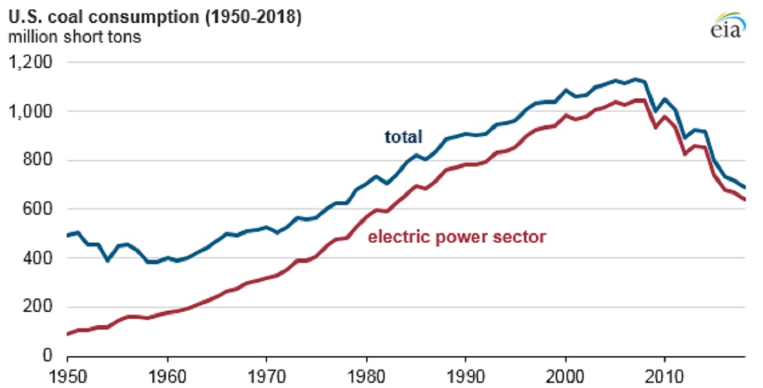
EIA expects total U.S. coal consumption in 2018 to fall to 691 million short tons (MMst), a 4% decline from 2017 and the lowest level since 1979. U.S. coal consumption has been falling since its peak in 2007, and EIA forecasts that 2018 coal consumption will be 437 MMst (44%) lower than 2007 levels, mainly driven by declines in coal use in the electric power sector.
Why the decline?
One of the main drivers of coal retirements is the price of coal relative to natural gas. Natural gas prices have stayed relatively low since domestic natural gas production began to grow in 2007. This period of sustained, low natural gas prices has kept the cost of generating electricity with natural gas competitive with generation from coal. Other factors such as the age of generators, changes in regional electricity demand, and increased competition from renewables have led to decreasing coal capacity.
EIA coal consumption data can be found on the Monthly Energy Review page and in our Calculus Projects page. A recent Think Progress article,
More coal plants shut down in Trump’s first two years than in Obama’s entire first term – The administration’s own data reveal coal isn’t coming back by Joe Romm (1/3/19) reports on the decrease in coal consumption.