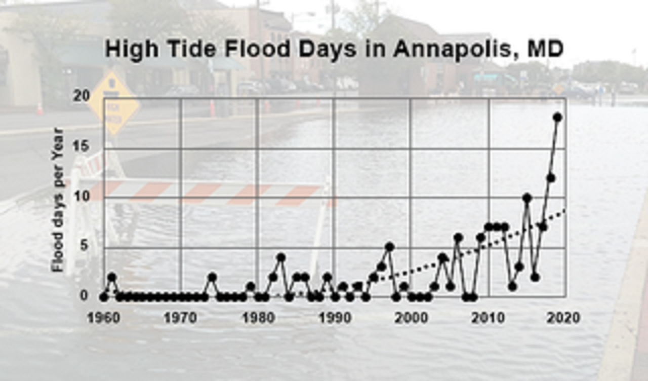
NASA’s Vital Signs of the Planet article Beating Back the Tides by Jenny Marder (11/11/2020) provides an update on the increasing frequency of high tides (see the graph copied here for one example).
Between 2000 and 2015, high-tide flooding in the U.S. doubled from an average of three days per year to six along the Northeast Atlantic, according to a 2018 NOAA report. It is especially common along the East Coast and Gulf Coast, where the frequency is up by roughly 200% over the last two decades. In some areas like Annapolis, the numbers are even more extreme. Annapolis had a record 18 days of high-tide flooding from May 2019 to April 2020, according to flooding thresholds for the city established by NOAA. That’s up from the previous record of 12 days in 2018. Before 2015, the record number of high-tide flood days in one year was seven, and the yearly average of high-tide floods from 1995 to 2005 was two.
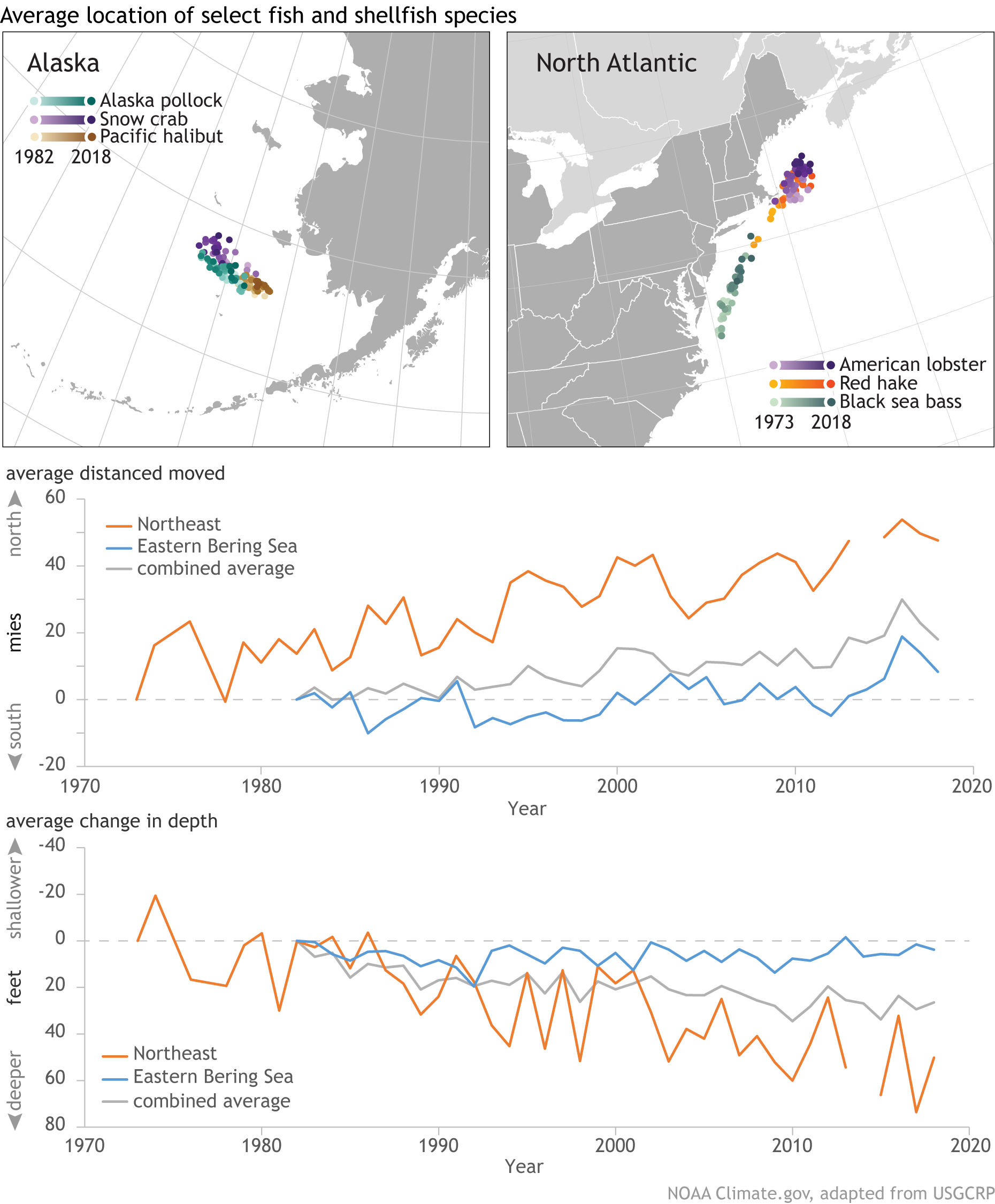
The graphs show the annual change in latitude and depth of 140 marine species along the northeastern U.S. coast and in the eastern Bering Sea. Changes in geographic distribution have been aggregated across all 140 species. In waters off the Northeast, fish and shellfish are moving northward at a significant rate; in the eastern Bering Sea, they are still shifting northward but at a lesser rate. Likewise, marine species in both regions are moving to deeper waters, but the rate of change in depth is especially high along the northeastern coast.
The U.S. Bureau of Labor Statistics has a Graphics for Economic News Releases page. The graph copied here is median usual weekly earnings of full-time wage and salary workers. Most of the patters are not a surprise, such as men earning more than women. What may be new here is that Asian women ($1224) out earned White men ($1122). Asian men out earned all others at $1542. The page includes seven other charts with the data.
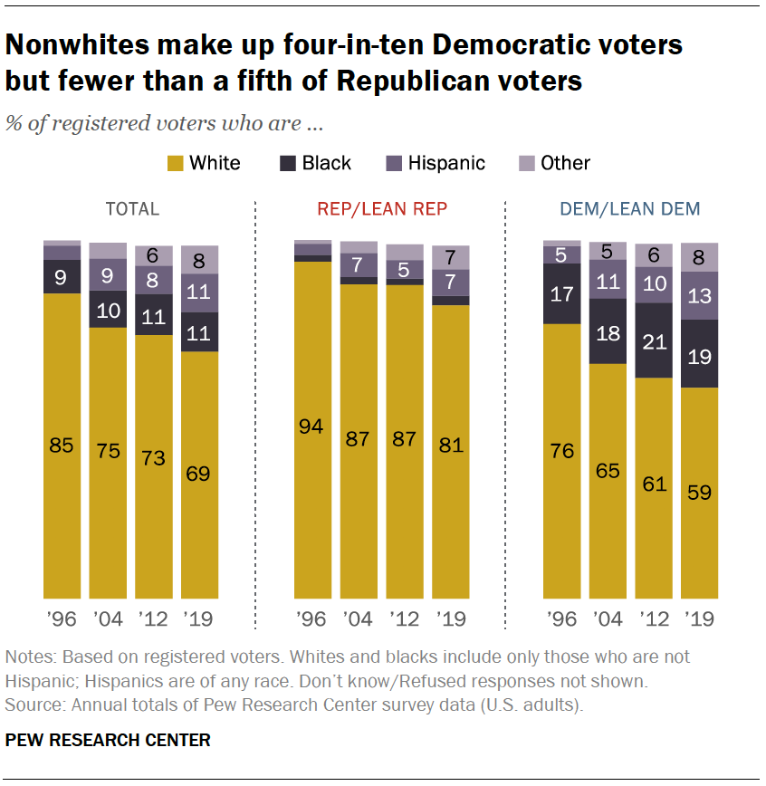
Pew has a summary of voter demographics by party in their article What the 2020 electorate looks like by party, race and ethnicity, age, education and religion by John Gramlich (10/26/2020). For example, see the graph copied here.
White Americans accounted for 67% of eligible voters nationally in 2018, but they represented a much larger share in several key battlegrounds in the Midwest and Mid-Atlantic, including Wisconsin (86%), Ohio (82%), Pennsylvania (81%) and Michigan (79%). The reverse was true in some battleground states in the West and South. For example, the White share of eligible voters was below the national average in Nevada (58%), Florida (61%) and Arizona (63%). You can see racial and ethnic breakdown of eligible voters in all 50 states – and how it changed between 2000 and 2018 – with this interactive feature.
Check out the interactive graph that is referenced in this quote, along with the half a dozen other graphs in the article. All great for a QL or stats based course.
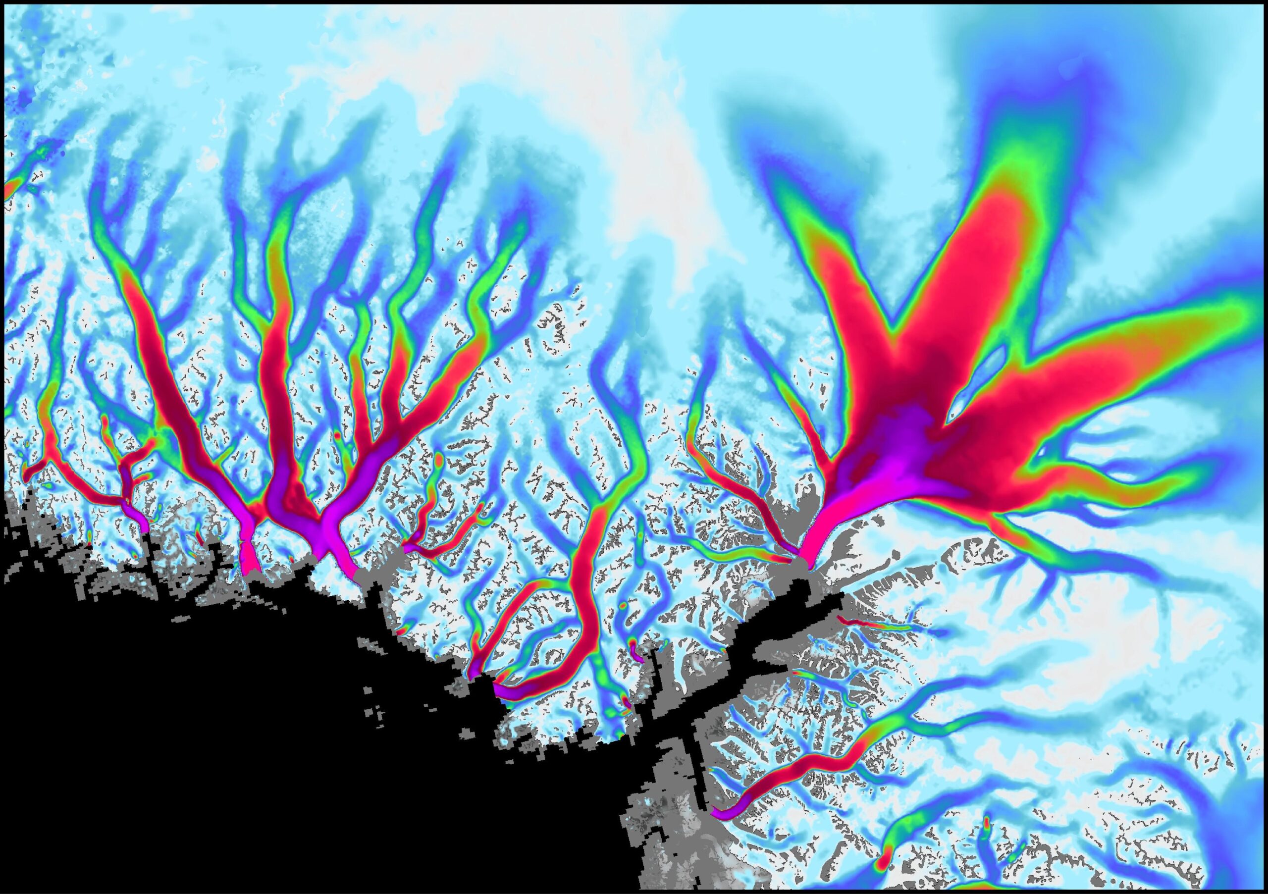
From NASA’s Vital Signs of the Planet feature Greenland’s Retreating Glaciers Could Impact Local Ecology (10/27/2020):
A new study of Greenland’s shrinking ice sheet reveals that many of the island’s glaciers are not only retreating, but are also undergoing other physical changes. Some of those changes are causing the rerouting of freshwater rivers beneath the glaciers, where it meets the bedrock. These rivers carry nutrients into the ocean, so this reconfiguring has the potential to impact the local ecology as well as the human communities that depend on it.
Some calculus language in the article:
Multiple studies have shown that the melting ice sheet is losing mass at an accelerating rate due to rising atmosphere and ocean temperatures, and that the additional meltwater is flowing into the sea.
The visualization copied here shows the flow velocity of the glaciers (white – slow, magenta – fastest). The article links to the ITS_LIVE data page with glacier data (mostly GIS). Greenland and Antarctica glacier mass times series data here.
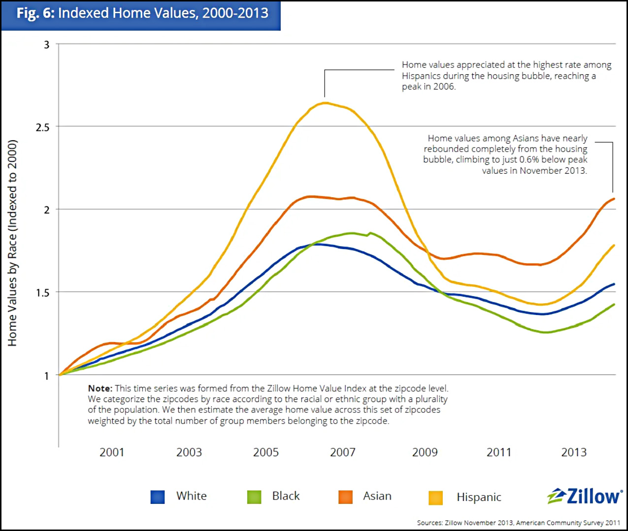
There’s no question that homes in majority-Black neighborhoods are undervalued compared to similar homes in majority-White neighborhoods, but do they also appreciate more slowly?
The article goes through four charts with the last one copied here.
However, if I were forced to choose one of these as the most telling, I’d take the Zillow chart since its data covers the entire nation and it provides a useful time series that fits what I know about the bubble-era lending industry—although I’d sure like to see it extended to the present. It shows that over a somewhat longish term, home appreciation has been lower in Black neighborhoods than in white neighborhoods, primarily because of a huge drop following the housing bubble. The culprit here, however, is not Black neighborhoods per se, but the mortgage industry, which oversold to Black borrowers during the bubble and drove prices far higher than even normal bubble standards. That wretched episode has been documented in considerable detail in a lot of places, but you can read a good outline here if you want to learn more.
A key question the Brooking’s report leaves unanswered is whether the black/white housing differential is larger or smaller than it was 10 or 20 years ago. If it was larger in the past and is smaller today, that implies that homes in majority black neighborhoods, although still undervalued relative to homes in predominantly white neighborhoods, have enjoyed greater relative appreciation. From the standpoint of wealth creation, the amount of appreciation since you bought your home is likely to matter more than whether the current price of your house is more or less than otherwise similar properties. Another way of expressing this is that homeowners in black neighborhoods had a lower purchase price (or basis) in their home, and even though it is still undervalued, it may have gained more value in percentage terms than homes in non-majority black neighborhoods.
Indeed, Dan Immergluck and his colleagues at the Georgia State University found that for those who bought homes in 2012, price appreciation for black homebuyers from 2012 through 2017 was higher than for white homebuyers. Immergluck’s data show that in most markets, homes bought by black buyers appreciated more than homes bought by white homebuyers.
This article also references the Zillow study, A House Divided – How Race Colors the Path to Homeownership by Skylar Olsen (1/15/2014), which includes a number of graphs related to homeownership by race. As Drum notes it would be nice if this study was updated.
This is something different. Since many of the folks that read this blog are educators, I’m posting this essay by Michael Rogers (michael.b.rogers (at) ucdenver.edu) and myself. I hope you find it thought provoking.
The Face-to-Face Classroom isn’t Scalable
As covid-19 has required faculty to engage in different modes of teaching, moving us from face-to-face to various forms of remote, blended, or online learning it is natural for us to try and replicate the classroom experience by, for example, holding synchronous zoom classes. Instead we might step back and consider what it is about face-to-face teaching that makes it the seemingly “gold standard” of teaching. Is it simply that it is in person? Are the attributes of personal, engaging, and responsive what makes the small face-to-face classroom so valuable? On the other end of the spectrum what can we learn from fully automated online courses, which have their place for some learners, but lack the attributes of face-to-face classes? One of the distinct differences between fully automated online courses and face-to-face classes is that face-to-face is not scalable. According to Taleb in The Black Swan a profession that is “scalable” is one “in which you are not paid by the hour and thus subject to the limitation of the amount of your labor.” The context here is very similar in that the professor’s labor, the interaction with students, is a limitation on the number of students they can accommodate in a classroom. For example, a fully automated online course scales to as many students as want to take it with no extra effort on the part of an instructor, which decreases the cost per student. If a course is scalable it isn’t going to be personally responsive.
What we do in face-to-face classes really isn’t scalable. We know that there is a big difference between 20 and 300 students in a classroom which requires us to change our modes of instruction, assessments, feedback, student-student interactions, and student-teacher interactions as enrollment increases. When does the change happen? Going from a 300 to a 500-person lecture course likely does not require changing methods but moving from 20 to 60 will. Factors that can affect scalability include classroom design and technology. For example, the SCALE-UP project has introductory science courses with 100+ students and uses a classroom design that has nine students sitting at round tables. So, while the overall enrollment is scaled up the classroom layout scales the learning experience back down to one that is responsive to the needs of the individual learner. As we navigate remote and online learning, we should ask ourselves if what we are doing is scalable or not and if it is scalable then we are likely not creating a personal learning environment and students may question the cost.
So, what makes face-to-face so effective? A successful curriculum will be designed for diverse learners with varying backgrounds, perspectives, and academic preparation. It will use multiple forms of engagement, representations, and expressions (Universal Design for Learning). It will be individualized and pluralized (Gardner). In short, the instructor and curriculum need to be responsive to those students in the classroom at that time. In face-to-face education faculty get to know their students and often see them in other courses and settings during their education. We talk with them before classes, after class, in the hallways, during office hours, etc. This helps faculty learn how to connect with and support individual students. This personal connection happens more in smaller classes than large lectures and is nonexistent in fully automated online courses. It is much easier to provide feedback that is timely and personalized in the face-to-face environment. Instruction can be adjusted in real-time to address questions, confusion, and provide alternative explanations or representations. Also consider how often a student asks a question or a faculty member provides motivation when they happen to come in contact in a hallway or when passing an office.
A face-to-face class also allows for nonverbal communication and other transition cues. For example, when students are asked to discuss a topic with their group or neighbors the noise volume increases and as that volume decreases the instructor is receiving a cue to bring the students back together and transition into the next part of the lesson. This example is scalable from a small enrollment class to a large lecture hall but does not scale well to Remote (aka zoom) and Online. Seeing that someone is excited via their facial expressions works well in a small classroom environment but does not scale well to a large lecture hall and definitely doesn’t scale to remote where students may prefer to not turn their cameras on. Similarly, there are several nonverbal cues to let an instructor know that students are confused and that they need to either explain something again and/or in a different way. In the face-to-face classroom instructors can quickly adjust using the nonverbal cues by, for example, interjecting a moment of socratic method or a think, pair, share session. Instructors and students alike use hand gestures in a wide variety of ways such as the right-hand rule for remembering the vector cross-product or simply raising their hand to ask a question. Again, these do not easily scale to remote and online environments. While zoom participants can raise their virtual hand and enter comments and questions into the chat monitoring all of these different sources of information can be challenging even for a small class.
If all we do as teachers is move our content to videos or classes to zoom, which at first glance may seem close to having in person classes, we will have lost much of what makes face-to-face valuable. So, what do we do? First, we need to recognize what exactly has been lost and then consider how to replace that information. For example, how do we recover some of the lost nonverbal communication? We may want to communicate to students that since we can’t see them, we have lost nonverbal information and need them to help us recover that information. We may consider regularly surveying students, something easily done with technology, about their learning in the course. We could also schedule a few one-on-one zoom meetings with each student to help recover some of the lost personal connections. Note though that all of this takes extra time and brings us back to the notion of scalability.
As we continue to adjust to the current crises, let’s pay attention to what makes face-to-face effective and worth the cost and not try to replicate it blindly with technology, while at the same time looking towards technology to make our classes as valuable as face-to-face. As we meet the challenge presented to us at this time and learn new skills and modes of teaching, let us also keep in mind that some of what we do now we may want to bring back with us to the face-to-face classroom. For example, YouTube is loaded with instructional videos, albeit at varying quality, with many quite good, that can provide alternative perspectives on topics covered during an in-person class. Links to these videos can be added to the course schedule making it easy for students to access them and the instructor can select high quality videos so that students are not trying to decide the quality. Instructors may want to make their own tutorial video covering a topic that has historically been challenging, increasing the resources a student has to be successful. Some students may find the chat and polling features in zoom a more comfortable way to express themselves when not feeling comfortable communicating verbally. While many face-to-face courses use student response systems or flashcards for polling, we should also look at chat tools such as Slack or Mentimeter.
Covid-19 and the move to remote learning can be considered a black swan event for faculty; an unpredictable event with severe consequence. We had been comfortable with face-to-face and may not have been exploring technology in the ways we could have. In general, we were not prepared for such a drastic change in our mode of teaching. We now have an opportunity to not just think about what makes face-to-face so effective, but also to try to provide a framework for the differences in modes of instruction. We suggested scalability as one such framework that may help us think about how to adjust to remote learning given what we know about face-to-face. When covid-19 subsides to the point where we return to face-to-face, we should not simply return to what we used to do as what we’ve learned in these past several months can be used to make the face-to-face experience even better. We should also look to continually experiment with online tools so that we are better prepared for an unpredictable future.
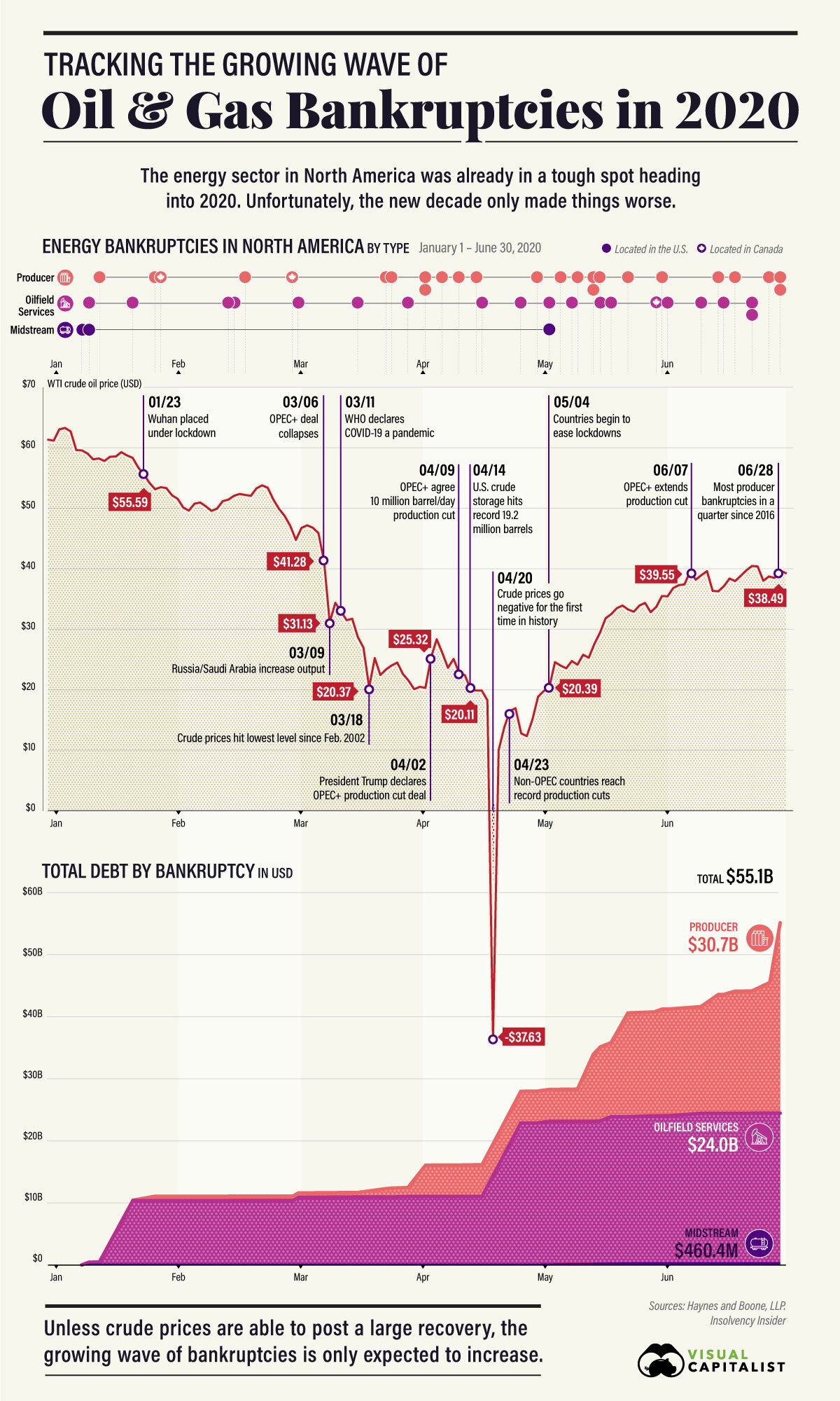
Well, of course they do. While we may be happy with low gas prices at the pump, may this cause problems in the future? I’m not sure but someone has to cover the debt that we see in the graphic here from Tracking the Growing Wave of Oil & Gas Bankruptcies in 2020 by Omri Wallach (7/24/2020).
For oil and gas producers, the second quarter of 2020 saw 18 bankruptcies, the highest quarterly total since 2016.
So far, they’re largely centered in the U.S., which saw a boom of surface-level shale oil production in the 2010’s to take advantage of rising crude prices. As prices have dropped, many heavily leveraged companies have started to run out of options.
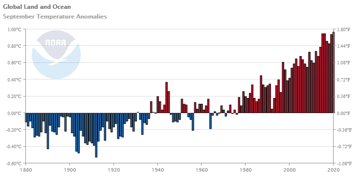
Averaged as a whole, the September 2020 global land and ocean surface temperature was the highest for September in the 141-year record at 0.97°C (1.75°F) above the 20th century average of 15.0°C (59.0°F). This value surpassed the previous record set in 2015 and, again in 2016, by only 0.02°C (0.04°F).
The global land-only surface temperature for September was also the highest on record at 1.47°C (2.65°F) above average. The previous record of 1.40°C (2.52°F) was set in September 2016.
Time series data is available with the link in the box above the climate anomalies map near the top.
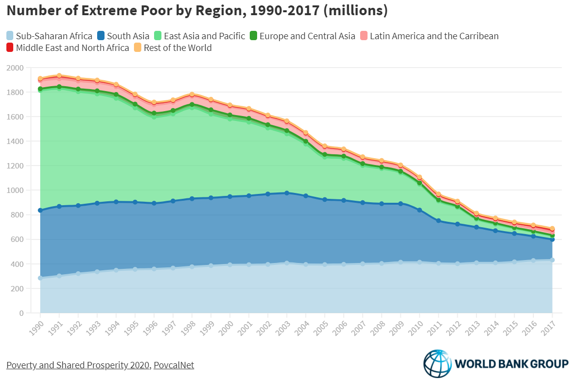
The World Bank Data Blog post Where the extreme poor live by Marta Schoch, Christoph Lanker and Melina Fleury (10/12/2020) provides the graph copied here.
Although the number of poor people has fallen in many regions, most notably East Asia and Pacific, and more recently South Asia, there has been no reduction in Sub-Saharan Africa, where the regional poverty rate remains above 40% in 2017.
The Middle East and North Africa has also seen an increase in the number of poor in recent years, driven largely by the economies in the region that are affected by conflict.