From the eia article The United States installed more wind turbine capacity in 2020 than in any other year by Richard Bowers and Owen Comstock (3/32021):
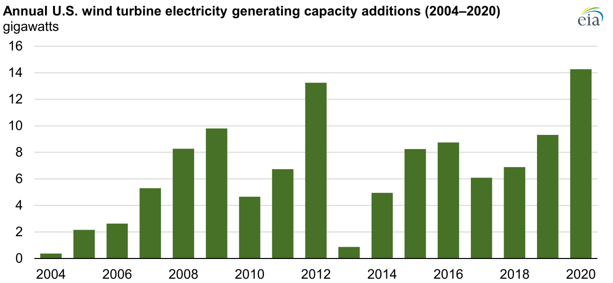
In both 2019 and 2020, project developers in the United States installed more wind power capacity than any other generating technology. According to data recently published by the U.S. Energy Information Administration (EIA) in its Preliminary Monthly Electric Generator Inventory, annual wind turbine capacity additions in the United States set a record in 2020, totaling 14.2 gigawatts (GW) and surpassing the previous record of 13.2 GW added in 2012. After this record year for wind turbine capacity additions, total wind turbine capacity in the United States is now 118 GW.
There are two other graphs in the article and an answer to the question of which state generates the most wind power. There are also links to the data.