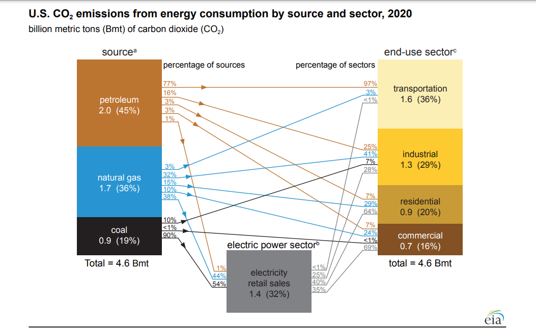
The eia diagram U.S. CO2 emissions from energy consumption by source and sector 2020 provides information on the source of CO2 and how that source is used. Archived energy flow diagrams and energy consumption graphs can be found on the Monthly Energy Review page, along with lots of data.
How big is the ideological divide in the U.S.?
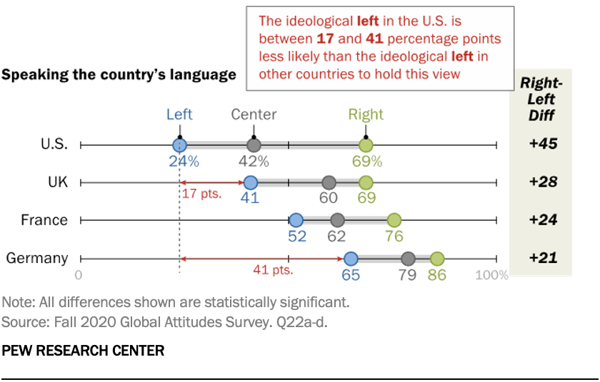
Pew answers the question in their article Ideological divisions over cultural issues are far wider in the U.S. than in the UK, France and Germany by Laura Silver (5/5/2021). In summary (bold added by me):
Across 11 questions on cultural subjects ranging from nationalism to political correctness, the gap between the ideological left and right in the United States – or liberals and conservatives, in the common U.S. parlance – is significantly wider than the ideological gaps found in the European countries surveyed. In some cases, this is because America’s conservatives are outliers. In other cases, it’s because America’s liberals are outliers. In still other cases, both the right and left in the U.S. hold more extreme positions than their European counterparts, resulting in ideological gaps that are more than twice the size of those seen in the UK, Germany or France.
There are a total of eight charts like the one here, plus links to the survey questions and methodology. So, how divided can a country be and still function?
Where are the 1991-2020 U.S. Climate Normals?
 NOAA has this data on the 1991-2020 U.S. Climate Normals Quick Access page.
The 2020 U.S. Climate Normals Quick Access tool provides access to data from the most recent version of the U.S. Climate Normals. This iteration of the Normals product provides 30 year averages of temperature, precipitation, and other climate variables measured at more than 15,000 U.S observation stations from 1991–2020, as well as a set of 15 year supplemental normals for 2006–2020.
The image here is a screen shot of monthly normals for one of the Ithaca, NY locations. On the top right corner of the graph there is a link to download the data, which is also in a table below the graph.
Who voted in 2020?
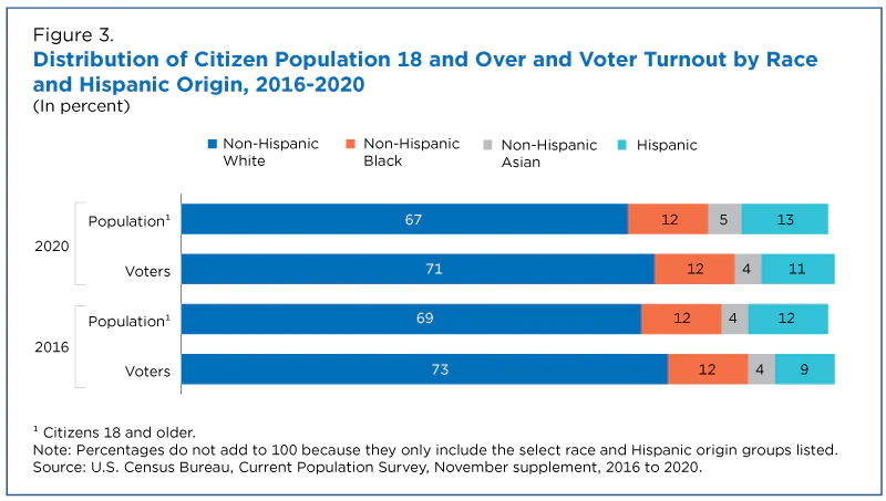 The Census Bureau provides an overview of who voted in 2020 and how that has changed in their article Record High Turnout in the 2020 General Election by Jacob Fabina (4/29/2021).
Turnout rates in 2020 were higher than in the 2016 election for non-Hispanic White, non-Hispanic Black, non-Hispanic Asian, and Hispanic race and origin groups.
The largest increase was for non-Hispanic Asians (Figure 2). Of the non-Hispanic Asian population who were both citizens and of voting age, 59% reported voting in 2020, compared to 49% in 2016.
People with a bachelor’s degree or higher were 32% of the citizen voting-age population in 2016 and 35% in 2020. Their share of the voting population went from 40% to 41% during that time.
Three are a total of five figures and links to data.
What are the energy use and emissions projections for 2021?
 The IEA Global Energy Review 2021 (April 2021) provides an outlook for 2021 energy use and emissions. Energy use to go up:
Global energy demand is set to increase by 4.6% in 2021, more than offsetting the 4% contraction in 2020 and pushing demand 0.5% above 2019 levels. Almost 70% of the projected increase in global energy demand is in emerging markets and developing economies, where demand is set to rise to 3.4% above 2019 levels. Energy use in advanced economies is on course to be 3% below pre-Covid levels.
CO2 to go up:
Demand for all fossil fuels is set to grow significantly in 2021. Coal demand alone is projected to increase by 60% more than all renewables combined, underpinning a rise in emissions of almost 5%, or 1 500 Mt. This expected increase would reverse 80% of the drop in 2020, with emissions ending up just 1.2% (or 400 Mt) below 2019 emissions levels.
Lots of graphs in this report. The data doesn’t seem to be available with the report but the IEA has a data page where you may be able to find data you’d like.
What is the trend in of COVID-19 deaths?
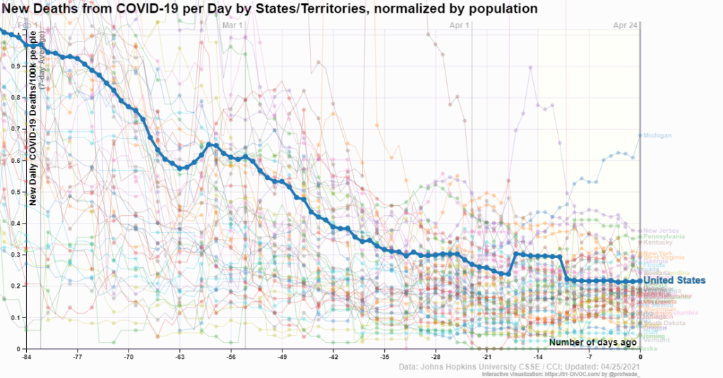 The media tends to focus on extremes and generally bad ones at that. If you focus on Michigan one would come to believe that things aren’t improving much with COVID-19. The graph here is from 91-DIVOC, which has a number of interactive graphs, along with making the data available. Over the last 12 weeks deaths are down about 1/5 and only one state is really going against the downward trend. The trend should continue downward as more folks are vaccinated, so please get vaccinated. Note: At this point we are passing half the U.S. adult population vaccinated.
Is there a place to go to help understand climate?
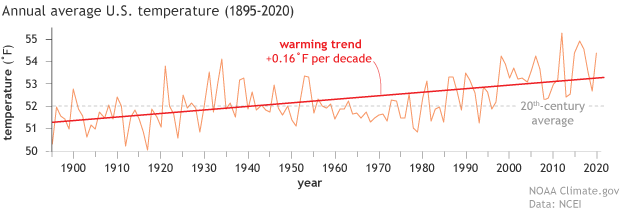 Climate.gov has the page Understanding Climate where they post all of their articles related to climate change. You’ll find information, explanations, graphs, and sources for data related to understanding climate. For example, the April 19, 2021 article Climate change and the 1991-2020 U.S. Climate Normals has the graph copied here. This is a perfect first place to look for educational materials related to climate change, along with graphs and quantitative information for statistics and QL courses.
Happy Earth Day!
What is the relationship between COVID-19 deaths, education, and race/ethnicity?
 The working paper, from the Harvard Center for Population and Development Studies, Intersectional inequalities in COVID-19 mortality by race/ethnicity and education in the United States, Jan 1, 2020-Jan 31, 2021 by J.T. Chen, et. el. (2/23/2021) contains the graph copied here.
It is interesting to note that within educational categories, Hispanic mortality rates were consistently lower than rates among Non-Hispanic Whites. This suggests that the overall increased mortality rates experienced by Hispanics is driven in large part by their overrepresentation in more disadvantaged education groups. Similarly, for the non-Hispanic Black population, their equivalent mortality rates to Non-Hispanic Whites in the two lowest educational strata, and their only slightly elevated risk in the higher educational strata suggests that it is the inequities in educational distribution that drive the overall higher crude rates among the non-Hispanic Black vs non-Hispanic White populations.
This provides evidence that COVID-19 deaths are connected to education more so than race/ethnicity. This, of course, isn’t causation, as education level is likely a marker for risk factors of COVID-19 such as health habits and employment.
This paper also supplies a nice example of Simpson’s paradox. Graph 1b provides mortality rates per 100,000 by race/ethnicity (157 Non-Hispanic White, 199 Non-Hispanic-Black, 171 Hispanic). By education category the Hispanic population had lower death rates than Non-Hispanic White, but in the aggregate it is the other way around.
How hot was March 2021
 From NOAA’s Global Climate Report – March 2021:
Following a strongly negative Arctic Oscillation (AO) in February 2021, a strongly positive AO was present in March 2021. In a positive phase, the jet stream strengthens and circulates the North Pole, confining the cold Arctic Air across the Polar Regions. The AO value for March 2021 was 2.11—the fifth highest March value since 1950. The peak value on March 11 was the ninth highest daily value and the third highest for a day in March. In addition, during March 2021, La Niña continued to be present across the tropical Pacific Ocean; however, it weakened in strength.
The global surface temperature departure of +0.85°C (+1.53°F) in March 2021 was the smallest March temperature departure since 2014 and was the eighth highest for March in the 142-year record. March 2021 also marked the 45th consecutive March and the 435th consecutive month with temperatures, at least nominally, above the 20th-century average.
The data is available near the top of the page under Temperature Anomalies Time Series.
How do humans impact the earth’s energy balance?
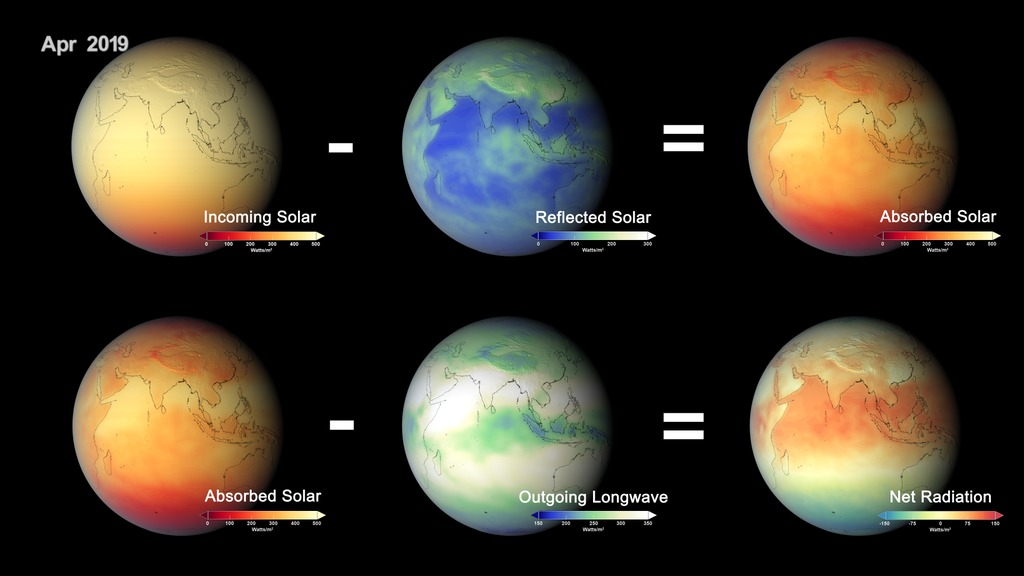 The NASA article, Direct Observations Confirm That Humans Are Throwing Earth’s Energy Budget off Balance, by Sofie Bates (3/25/21) explains:
Climate modelling predicts that human activities are causing the release of greenhouse gases and aerosols that are affecting Earth’s energy budget. Now, a NASA study has confirmed these predictions with direct observations for the first time: radiative forcings are increasing due to human actions, affecting the planet’s energy balance and ultimately causing climate change. The paper was published online on March 25, 2021, in the journal Geophysical Research Letters.
“This is the first calculation of the total radiative forcing of Earth using global observations, accounting for the effects of aerosols and greenhouse gases,” said Ryan Kramer, first author on the paper and a researcher at NASA’s Goddard Space Flight Center in Greenbelt, Maryland, and the University of Maryland, Baltimore County. “It’s direct evidence that human activities are causing changes to Earth’s energy budget.”
The human impact:
The team found that human activities have caused the radiative forcing on Earth to increase by about 0.5 Watts per square meter from 2003 to 2018. The increase is mostly from greenhouse gases emissions from things like power generation, transport and industrial manufacturing. Reduced reflective aerosols are also contributing to the imbalance.
No data in this one, but it provides a good overview of the paper.
