How hot was June 2021?

From NOAA’s Global Climate Report – June 2021:

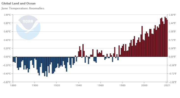
The June 2021 global surface temperature was the fifth highest for June in the 142-year record at 0.88°C (1.58°F) above the 20th century average. Only Junes of 2015 (fourth warmest), 2016 (second warmest), 2019 (warmest), and 2020 (third warmest) were warmer and had a global temperature departure above +0.90°C (+1.62°F). Nine of the 10 warmest Junes have occurred since 2010.

But June seemed hot you say? Yup:

The global land-only surface temperature for June 2021 was the highest on record at 1.42°C (2.56°F) above average. This value surpassed the previous record set in 2019 by +0.11°C (+0.20°F). The ten warmest June global land-only surface temperatures have occurred since 2010. The unusually warm June global land-only surface temperature was mainly driven by the very warm Northern Hemisphere land, which also had its highest June temperature departure at +1.69°C (+3.04°F). The now second highest June temperature for the Northern Hemisphere occurred in 2012 (+1.51°C / +2.72°F).

Time series data is available at the link near the top of the page.


What is the Vegetative Health Index?

From the NOAA STAR Center for Satellite Applications and Research page:

Global and Regional Vegetation Health (VH) is a NOAA/NESDIS system estimating vegetation health, moisture condition, thermal condition and their products.

It contains Vegetation Health Indices (VHI) derived from the radiance observed by the Advanced Very High Resolution Radiometer (AVHRR) onboard afternoon polar-orbiting satellites: the NOAA-7, 9, 11, 14, 16, 18 and 19 and VIIRS from Soumi-NPP satellite.

And

The VH products can be used as proxy data for monitoring vegetation health, drought, soil saturation, moisture and thermal conditions, fire risk, greenness of vegetation cover, vegetation fraction, leave area index, start/end of the growing season, crop and pasture productivity, teleconnection with ENSO, desertification, mosquito-borne diseases, invasive species, ecological resources, land degradation, etc.

The following indices and products are available:
Vegetation Health (VHI)
Vegetation Condition Index (VCI)
Temperature Condition Index (TCI)
Soil Saturation Index (SSI)
No noise Normalized Difference Vegetation Index (SMN)
No noise Brightness Temperature (SMT)
and more.

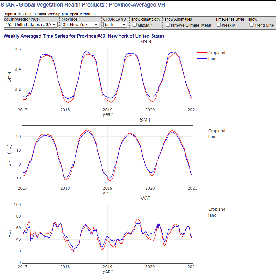
There is a page with maps (and links to shapefiles) and an interactive page with time series graphs for different states. The one for NY is copied here. It seems like there are some uses for stats courses tied to correlations with temperature (and you can add climate max/min to the graphs) and more. There is a page to download data (see left sidebar) but you’ll have to be able to handle netcdf files.

How hot was the Pacific Northwest?

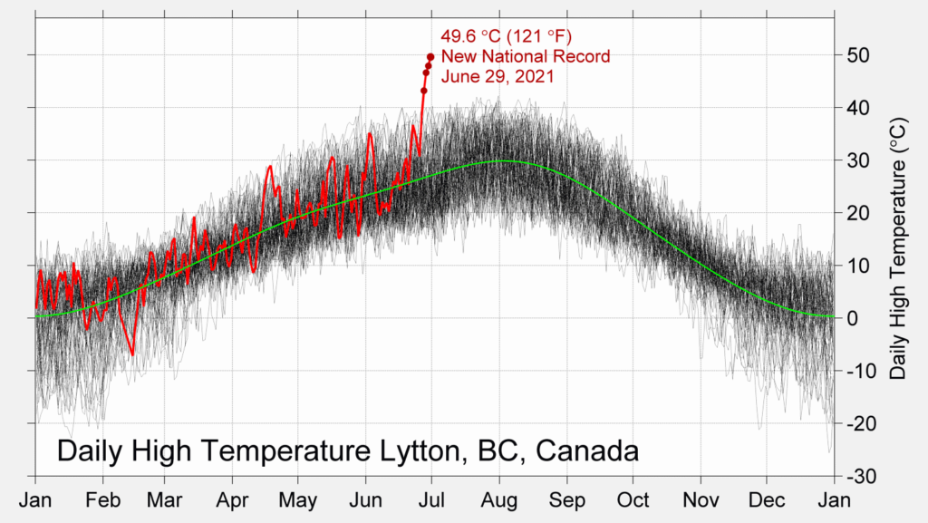
Berkeley Earth summarizes the recent heatwave in the Pacific Northwest in the article The Pacific Northwest Heatwave in Context  (7/6/2021). The graph by Dr. Robert Rohde copied here is striking and really says all that needs to be said. This is a graph that everyone should have to study and understand. This was anything but a typical heatwave.

There are other graphs and links to dedicated data pages for Washington State, Oregon, Seattle, Portland, Vancouver, and Canada. On these pages there are more graphs and links to the data that created the graphs.

Why is life expectancy lower in the U.S.?

As a follow up to the Tuesday post, the Our World in Data article Why is life expectancy in the U.S. lower than other rich countries by Max Roser provides data on categories that contribute to the lower U.S. life expectancy. The article explores eight  categories: Smoking, Obesity, Homicides (graph copied here), Opioid Overdoses, Suicides, Road Accidents, Poverty and Economic Inequality, Access to Healthcare. A few facts from the article:

In the US the (opioid) death rate has increased more than 10-fold since 1990, while opioid overdoses have remained an extremely rare cause of death in other countries. No other country in the world has seen a surge in opioid overdose deaths as large as the US. Today the US has by far the highest opioid overdose death rate.

Deaths in road accidents are also much more common in the US than in most other rich countries. The chart shows that in many countries road deaths are at least 50% less common.

More than two-thirds of Americans (70%) are overweight and more than one-third (36%) is obese.

The charts for each of these categories have a link for the data.

How does life expectancy in the U.S. compare to other countries?

Our World in Data has the answer and more on their page Why is life expectancy in the U.S. lower than in other rich countries?

In the US health spending per capita is up to four times higher, yet life expectancy is lower than in all of these countries.

The US has achieved very substantial progress in health outcomes over the last 140 years: in 1880 the life expectancy of Americans was 39 years, since then it has doubled. But this extremely positive trend has come to an end. While life expectancy for people around the world continued to increase, life expectancy of Americans has declined since 2014. With the pandemic of 2020 – which already caused more than 225,000 deaths due to COVID-19 and 300,000 excess deaths – it is unfortunately already certain that the decline of life expectancy in the US will continue this year.

Normally, Our World in Data includes the data with each graph, but for some reason this one doesn’t have the data. I bet if you emailed them they would make it available.

How much debt do students have by race?

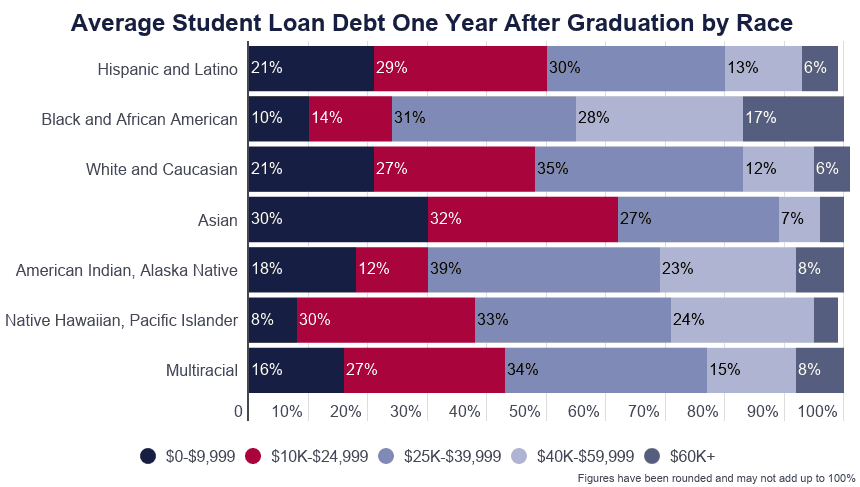
The EducationalData.org post Student Loan Debt by Race by Melanie Hanson (6/9/21) has three excellent graphs such as the one copied here. It may not be surprising that Asians have the least debt given Asians have the highest income, but Hispanic and Latino debt is almost identical to White and Caucasian debt yet their income is typically closer to the Black and African American community.  From a statistical standpoint the first bullet in the highlights

Black and African American college graduates owe an average of $25,000 more in student loan debt than White college graduates.

is a bit misleading. Given the skewness of the data (the 17% in the top category for Black and African American) one should also report a median difference, which looks to be closer to around $10,000. Interestingly, in all cases the median debt is below the $39,000, which is manageable college debt in most cases. The question that comes to mind is how much lower would this be if median income increased at the same pace as the stock market or top 1%?

The article has sources but no easily downloadable data set.


What are stripes again?

About a year ago I posted this about stripes:

The image here from ShowYourStripes has a vertical strip representing global average temperature anomalies from 1850 to 2019 where darker blue is cooler and darker red is warmer. This graphic style, warming stripes, is credited to Ed Hawkins. The ShowYourStripes page has similar graphics for different regions.

These are excellent images to help understand changing climate. For the image this year I chose the Arctic Ocean temperature. Most of the data for creating these images can be found on  Berkeley Earth’s Data Overview page.  If you don’t like the stripes you can select a bar chart instead on the show your stripes page.

Who has access to a smartphone or broadband?

The Pew article Mobile Technology and Home Broadband 2021 by Andrew Perrin (6/3/2021) summarizes the results of their smartphone and home broadband survey.

Smartphone ownership (85%) and home broadband subscriptions (77%) have increased among American adults since 2019 – from 81% and 73% respectively. Though modest, both increases are statistically significant and come at a time when a majority of Americans say the internet has been important to them personally. And 91% of adults report having at least one of these technologies.

There are differences between various groups (see their graph copied here):

The share of Americans with home broadband subscriptions has similarly grown since 2019 – from 73% of adults saying they have one in the previous survey to 77% today. There are more pronounced variations across some demographic groups, particularly in differences by annual household income and educational attainment. For example, 92% of adults in households earning $75,000 or more per year say they have broadband internet at home. But that share falls to 57% among those whose annual household income is below $30,000.

There are other graphs in the article and Pew provides a methodology section with access to data.

How hot was May 2021?

From NOAA’s Global Climate Report – May 2021:

The May 2021 global surface temperature was 0.81°C (1.46°F) above the 20th century average of 14.8°C (58.6°F). This value tied with 2018 as the sixth warmest May in the 142-year record. May 2021 was also the 45th consecutive May and the 437th consecutive month with temperatures, at least nominally, above the 20th century average.

Notable:

According to the May 2021 temperature percentile map, the month of May was characterized by much-warmer-than-average temperatures across parts of northern, western, and southeastern Asia, Africa, northern South America and across parts of the Pacific, Atlantic, and the Indian oceans. The most notable warm temperature departures from average were observed across parts of western and northern Asia and northern Africa, where temperatures were at least 2.5°C (4.5°F) above average. Record-warm May temperatures were observed across parts of northern Africa, western Asia, and small areas across the Atlantic Ocean and the South Pacific Ocean. This encompassed only 3.0% of the world’s surface with a record-warm May temperature—the tenth highest May percentage for record-warm May temperatures since records began in 1951.

The time series data can be found near the top of the page.

What do we know about hurricanes?

The article NASA and Hurricanes: Five Fast Facts by Katy Mersmann (6/1/2021) has the answers.

The 2021 Atlantic hurricane season starts today, June 1. Our colleagues at NOAA are predicting another active season, with an above average number of named storms. At NASA, we’re developing new technology and missions to study storm formation and impacts, including ways to understand Earth as a system.

The third fact:

Climate change is likely causing storms to behave differently. One change is in how storms intensify: More storms are increasing in strength quickly, a process called rapid intensification, where hurricane wind speeds increase by 35 mph (or more) in just 24 hours.

In 2020, a record-tying nine storms rapidly intensified. These quick changes in storm strength can leave communities in their path without time to properly prepare.

Researchers at NASA JPL developed a machine learning model that could more accurately detect rapidly intensifying storms.

There are fantastic images (such as the one copied here – incorporate it into a Calc III course?) and short videos. Climate.gov has a starting point for hurricane data: Historical Hurricane Tracks – GIS Map Viewer.  A past post on hurricanes: Are hurricanes lingering near the coast longer?