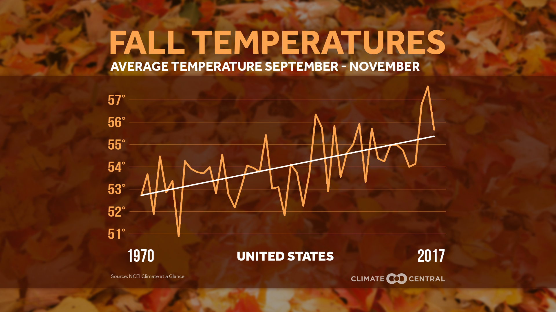
How distracting are cell phones?

The extensive article by Pew Research, How Teens and Parents Navigate Screen Time and Device Distractions by Jingjing Jiang (8/22/18), presents detailed data on cell phone use.  For example,

And 51% of teens say they often or sometimes find their parent or caregiver to be distracted by their own cellphone when they are trying to have a conversation with them.

As they look at their own lives and those of their peers, most teens see things that worry them. Roughly nine-in-ten teens view spending too much time online as a problem facing people their age, including 60% who say it is a major problem.

The article has eight charts, one of which is reposted here.  There is a complete methodology section, which is perfect for a stats class, with enough information to use the data for statistical tests.

How has Arctic sea ice volume changed?

The Guardian article Arctic’s strongest sea ice breaks up for first time on record by Jonathan Watts (8/21/18) includes an animated graph of Arctic sea ice volume by year. We produce a similar graph using monthly average ice volume from PIOMAS (source cited for the data in the article).  The graph clearly displays the change of ice throughout the year and the loss of ice throughout the years.

Freakish Arctic temperatures have alarmed climate scientists since the beginning of the year. During the sunless winter, a heatwave raised concerns that the polar vortex may be eroding.

This includes the Gulf Stream, which is at its weakest level in 1,600 years due to melting Greenland ice and ocean warming. With lower circulation of water and air, weather systems tend to linger longer.

A dormant hot front has been blamed for record temperatures in Lapland and forest fires in Siberia, much of Scandinavia and elsewhere in the Arctic circle.

The data from PIOMA includes monthly and daily ice volumes.  The R script and csv file that produced the graph here can be downloaded.

What is the pay gap between black women and white men?

EPI has the answer in the post Separate is still unequalHow patterns of occupational segregation impact pay for black women by Madison Matthews and Valerie Wilson (8/6/2018).

On average, in 2017, black women workers were paid only 66 cents on the dollar relative to non-Hispanic white men, even after controlling for education, years of experience, and geographic location. A previous blog post dispels many of the myths behind why this pay gap exists, including the idea that the gap would be closed by black women getting more education or choosing higher paying jobs. In fact, black women earn less than white men at every level of education and even when they work in the same occupation. But even if changing jobs were an effective way to close the pay gap black women face—and it isn’t—more than half would need to change jobs in order to achieve occupational equity.

Along with the graph copied here, there is a time series from 2000 to 2016 of the Duncan Segregation Index:

the “Duncan Segregation Index” (DSI) for black women and white men, overall and by education, based on individual occupation data from the American Community Survey (ACS). This is a common measure of occupational segregation, which, in this case identifies what percentage of working black women (or white men) would need to change jobs in order for black women and white men to be fully integrated across occupations.

Data is available for both graphs.

What percent of doctors are female?

OECD has the answer in their post Women make up most of the health sector workers but they are under-represented in high-skilled jobs (3/2017) along with a nice graphic.

The current overall health workforce is mostly composed of women. Nonetheless, female health workers remain underrepresented in highly skilled occupations, such as in surgery. As of 2015, just under half of all doctors are women across OECD countries on average. The variation across countries is significant: in Japan and Korea only around 20% of doctors are women, in Latvia and Estonia this proportion is over 70%.

It is worth noting that the U.S. is well below the OECD average with only 34.1% of its doctors female in 2015, although the current posted data set has the U.S. at 35.06% for 2015 (35.52% for 2016).

Time series data for OECD countries is available at the OECD.stat Health Care Resources page. Data for the U.S. dates back to 1993 (19.59%) through 2016.  For this specific data set click physicians by age and gender on the left side bar.  Within the chart click variable, measure, and year, to change the scope of the data in the spreadsheet. The data can be downloaded in multiple formats.

How much has the High Plains (or Ogallala) aquifer declined?

Source: USGS

The USGS post High Plains Aquifer Groundwater Levels Continue to Decline (6/16/17) summarizes the results from the USGS report Water-Level and Recoverable Water in Storage Changes, High Plains Aquifer, Predevelopment to 2015 and 2013–15.

In 2015, total recoverable water in storage in the aquifer was about 2.91 billion acre-feet, which is an overall decline of about 273.2 million acre-feet, or 9 percent, since predevelopment. Average area-weighted water-level change in the aquifer was a decline of 15.8 feet from predevelopment to 2015 and a decline of 0.6 feet from 2013 to 2015.

A little geography:

The High Plains aquifer, also known as the Ogallala aquifer, underlies about 112 million acres, or 175,000 square miles, in parts of eight states, including: Colorado, Kansas, Nebraska, New Mexico, Oklahoma, South Dakota, Texas and Wyoming. The USGS, at the request of the U.S. Congress and in cooperation with numerous state, local, and federal entities, has published reports on water-level changes in the High Plains aquifer since 1988 in response to substantial water-level declines in large areas of the aquifer.

A more recent article in the Conversation, Farmers are drawing groundwater from the giant Ogallala Aquifer faster than nature replaces it by Char Miller (8/7/18) provides context around the loss of water in the Ogallala. 

In my view, Plains farmers cannot afford to continue pushing land and water resources beyond their limits – especially in light of climate change’s cumulative impact on the Central Plains. For example, a recent study posits that as droughts bake the land, lack of moisture in the soil actually spikes temperatures. And as the air heats up, it further desiccates the soil.

This vicious cycle will accelerate the rate of depletion. And once the Ogallala is emptied, it could take 6,000 years to recharge naturally. In the words of Brent Rogers, a director of Kansas Groundwater Management District 4, there are “too many straws in too small of a cup.”

The USGS post and the Conversation article are useful for a QL based course. The full USGS report has links to water-level data sources starting on page 7.

Where are women less likely than men (ages 30-70) to die of a major disease?

The Our World in Data post, Why do women live longer than men?  by Esteban Ortiz-Ospina and Diana Beltekian (8/14/18) answers the question with the graph copied here.

As the next chart shows, in most countries for all the primary causes of death the mortality rates are higher for men. More detailed data shows that this is true at all ages; yet paradoxically, while women have lower mortality rates throughout their life, they also often have higher rates of physical illness, more disability days, more doctor visits, and hospital stays than men do. It seems women do not live longer than men only because they age more slowly, but also because they are more robust when they get sick at any age. This is an interesting point that still needs more research.

Interestingly, it seems that  except for Bhutan it is only countries in Africa where women are more likely to die of a major disease.  The article is an excellent example of telling a story with data while also posing questions.

The evidence shows that differences in chromosomes and hormones between men and women affect longevity. For example, males tend to have more fat surrounding the organs (they have more ‘visceral fat’) whereas women tend to have more fat sitting directly under the skin (‘subcutaneous fat’). This difference is determined both by estrogen and the presence of the second X chromosome in females; and it matters for longevity because fat surrounding the organs predicts cardiovascular disease.

But biological differences can only be part of the story – otherwise we’d not see such large differences across countries and over time. What else could be going on?

The article has three other graphs beyond this one. One compares life expectancy by country for women and men, one for life expectancy for men and women in the U.S. (and three other countries that can be selected) since 1790, and one for the difference in life expectancy at age 45 since 1790 for selected countries.  All graph can be downloaded  and the data is available for each.

What do we know about nighttime minimum temperatures?

The recent article on Climate.gov Extreme overnight heat in California and the Great Basin in July 2018 by Rebecca Lindsey (8/8/18) provides an overview in context.

As the NCEI’s Deke Arndt has blogged about before, nighttime low temperatures are increasing faster than daytime high temperatures across most of the contiguous United States. For much of the West and Southwest, July’s record-breaking nighttime heat is a new highpoint in a long-term trend—one that has rapidly accelerated in recent decades. In California, average overnight low temperature in July rose by 0.3°F per decade over the historical record (1895-2018), but since 2000, the pace of warming has accelerated to 1.3°F per decade.

Here is an example of why this matters:

According to Tim Brown, director of NOAA’s Western Region Climate Center (WRCC), it’s a pattern that has serious consequences for wildfires and those who combat them. When temperatures cool off overnight, it’s not just a physical relief for firefighters who may be working in conditions that push the limits of human endurance; fire behavior itself relaxes as temperatures drop, winds grow calmer, and relative humidity rises.

The graph here for California July minimum temperature is from the article. A stats course can have students create a similar graph for their hometown. Go to  NOAA’s Local Climatological Data Map. Click on the wrench under Layers. Use the rectangle tool to select your local weather station. Check off the station and Add to Cart. Follow the direction from their being sure to select csv file. You will get an email link for the data within a day.  Note: You are limited in the size of the data to ten year periods. You will need to do this more than once to get the full data set available for your station.

The map here  shows statewide minimum temperature ranks for July 2018.  It is from NOAA’s National Temperature and Precipitation Maps page.  Under products select Statewide Minimum Temperature Ranks and choose the desired time period.  A map similar to the one in the article can be generated by selecting CONUS Gridded Minimum Temperature Ranks.

How much vacation time do workers get?

Statista put together a chart (copied here) of vacation time for 12 countries selected from OECD data  (see table PF2.3.A) of 42 countries in the post Vacation: Americans Get A Raw Deal by Niall McCarthy (8/8/18). Of the 42 countries listed the U.S. is the only one with a statutory minimum days of paid leave of 0. In fact, only 9 countries have a statutory minimum below 20 days.  The medium number of public holidays is 11, while the U.S. has 10. Four countries tie with the maximum of 15 public holidays.  The statista article notes:

The U.S. remains the only advanced economy that doesn’t guarantee paid vacation. Even though some companies are generous and provide their employees with up to 15 days of paid leave annually, almost one in four private sector workers does not receive any paid vacation, according to the Center for Economic and Policy Research.

How does the U.S. use its land?

Bloomberg: https://tinyurl.com/yaq3mp7m

The Bloomberg article Here’s How America Uses Its Land by Dave Merrill and Lauren Leatherby (7/31/2018). The article arrives at the graph copied here and it is worth scrolling through the article to see the graphs along the way with associated facts.

More than one-third of U.S. land is used for pasture—by far the largest land-use type in the contiguous 48 states. And nearly 25 percent of that land is administered by the federal government, with most occurring in the West. That land is open to grazing for a fee.

In exploring the graph it is interesting to note that maple syrup, highways, and golf courses, are categories big enough to be represented. Also note how much space is for cows. The article has potential to be used in a QL based course.

What are the recent Mauna Loa CO2 measurements?

NOAA: https://tinyurl.com/y9opmjxg

The  NOAA article Another Climate Milestone on Mauna Loa (6/7/18) provides an overview of CO2 measurement at the Mauna Loa site.  In particular,

Carbon dioxide levels measured at NOAA’s Mauna Loa Atmospheric Baseline Observatory averaged more than 410 parts per million in April and May, the highest monthly averages ever recorded, scientists from NOAA and Scripps Institution of Oceanography at the University of California San Diego announced today.

There is also this point:

From 2016 to 2017, the global COaverage increased by 2.3 ppm – the sixth consecutive year-over-year increase greater than 2 ppm. Prior to 2012, back-to-back increases of 2 ppm or greater had occurred only twice.

Why Mauna Loa?

The Mauna Loa observatory is ideally located for monitoring CO2 and other greenhouse gases in the atmosphere. Situated at more than 11,000 feet above sea level in the middle of the Pacific Ocean, the site gives researchers the opportunity to sample air that has been well-mixed during its passage across the Pacific and, thanks to its altitude, is minimally influenced by local vegetation or local pollution sources.

The article links directly to CO2 data sets and other resources.  The Calculus Projects page here has a Mauna Loa CO2 project and the Misc Materials page has the CO2 movie.