Tag Archives: statistics

What do we know about nighttime minimum temperatures?

The recent article on Climate.gov Extreme overnight heat in California and the Great Basin in July 2018 by Rebecca Lindsey (8/8/18) provides an overview in context.

As the NCEI’s Deke Arndt has blogged about before, nighttime low temperatures are increasing faster than daytime high temperatures across most of the contiguous United States. For much of the West and Southwest, July’s record-breaking nighttime heat is a new highpoint in a long-term trend—one that has rapidly accelerated in recent decades. In California, average overnight low temperature in July rose by 0.3°F per decade over the historical record (1895-2018), but since 2000, the pace of warming has accelerated to 1.3°F per decade.

Here is an example of why this matters:

According to Tim Brown, director of NOAA’s Western Region Climate Center (WRCC), it’s a pattern that has serious consequences for wildfires and those who combat them. When temperatures cool off overnight, it’s not just a physical relief for firefighters who may be working in conditions that push the limits of human endurance; fire behavior itself relaxes as temperatures drop, winds grow calmer, and relative humidity rises.

The graph here for California July minimum temperature is from the article. A stats course can have students create a similar graph for their hometown. Go to  NOAA’s Local Climatological Data Map. Click on the wrench under Layers. Use the rectangle tool to select your local weather station. Check off the station and Add to Cart. Follow the direction from their being sure to select csv file. You will get an email link for the data within a day.  Note: You are limited in the size of the data to ten year periods. You will need to do this more than once to get the full data set available for your station.

The map here  shows statewide minimum temperature ranks for July 2018.  It is from NOAA’s National Temperature and Precipitation Maps page.  Under products select Statewide Minimum Temperature Ranks and choose the desired time period.  A map similar to the one in the article can be generated by selecting CONUS Gridded Minimum Temperature Ranks.

What is the story of suicides in the U.S.?

The article in the Conversation, Why is suicide on the rise in the US – but falling in most of Europe? by Steven Stack (6/28/18), tries to get at the story. The first chart (copied here), clearly shows that the suicide rate rose from 199-2015 overall and considerably more for the 45-54 age group (stats regression problem here).  There is a second chart showing changes in suicide rates in Western European countries:

However, suicide rates in other developed nations have generally fallen. According to the World Health Organization, suicide rates fell in 12 of 13 Western European between 2000 and 2012. Generally, this drop was 20 percent or more. For example, in Austria the suicide rate dropped from 16.4 to 11.5, or a decline of 29.7 percent.

The obvious question is why?

There has been little systematic research explaining the rise in American suicide compared to declining European rates. In my view as a researcher who studies the social risk of suicide, two social factors have contributed: the weakening of the social safety net and increasing income inequality.

The article has two more charts showing that the U.S. is low on Social Welfare Expenditures as a percent of GDP and is high on inequality. In all instances the data is available for download and there are links to the original sources.

Do we disagree with factual statements that we think are opinions?

The Pew Research Center’s article Distinguishing Between Factual and Opinion Statements in the News by Amy Mitchell, Jeffrey Gottfried, Michael Barthel, and Nami Sumida (6/18/18) addresses this question and more.

A new Pew Research Center survey of 5,035 U.S. adults examines a basic step in that process: whether members of the public can recognize news as factual – something that’s capable of being proved or disproved by objective evidence – or as an opinion that reflects the beliefs and values of whoever expressed it.

We will focus on section 4 Americans overwhelmingly see statements they think are factual as accurate, mostly disagree with factual statements they incorrectly label as opinions. Odds are that a person who identifies a factual statement as opinion will also disagree with the statement (see table copied here).  For example,  41% of those surveyed said that Spending on Social Security, Medicare, and Medicaid make up the largest portion of the U.S. federal budget was an opinion and of those 82% disagreed with the statement.

This is an excellent article for a QL or Stats course as it is rich with data, graphs, and charts. You can also discuss why 41% of those surveyed thought a statement that is measurable (How much of the Federal budget goes to social security, medicare, and medicaid?) was an opinion.  The article also includes detailed information on their methodology and detailed tables of data.


What is the CEO to worker pay gap?

U.S. Publicly held companies now have to report CEO and median worker salaries (this was part of the Dodd-Frank Wall Street Reform and Consumer Protection Act of 2010) and Bloomberg has an article, Alphabet CEO Page Makes a Tiny Fraction
Compared to Its Median Employee by Alicia Ritcey and Jenn Zhao (5/15/18), with an interactive graph (see image).   Mattel “wins” with a CEO to median worker pay ratio of 4,987-1. Walmart “wins” in the consumer staple category with 1,188-1 ratio.  In the interactive graph there is a button on the top right that hides outliers. This is useful, but be conscious of whether it is on or off.

The Guardian article ‘CEOs don’t want this released’: US study lays bare extreme pay-ratio problem by Edward Helmore (5/16/18)  provides some context and a summary.  The Bloomberg graph is being updated daily.  Rep. Keith Elliston’s staff prepared the report Rewarding or Hoarding? An Examination of Pay Ratios Revealed by Dodd-Frank, which has the data of the first 225 Fortune 500 companies to report and and details on the data collection. The data in the report can be used in statistics courses to test differences by sector.  At some point maybe Bloomberg will post a spreadsheet of the data (one can also ask for it too).

Is wage inequality growing?

The EPI article, The State of American Wages 2017 by Elise Gould, has a full summary of growing wage inequality. A few of their key findings:

From 2000 to 2017, wage growth was strongest for the highest-wage workers, continuing the trend in rising wage inequality over the last four decades.

While wage inequality has generally been on the rise for both men and women, wage inequality is higher and growing more among men than among women.

At every decile and at the 95th percentile, wage growth since 2000 was faster for white and Hispanic workers than for black workers.

This is an in depth article with over 30 bullet points of key findings. There are numerous graphs, such as the on posted here, with data sets. The cumulative graph here is broken into female and male graphs farther down in the article. What you will find is that, for example, the increase in the median wages is almost entirely due to increases in the median female wage (7.9% since 2000).  There is a lot to learn in this post and plenty of material for courses.


What is the history of manufacturing employment in the U.S.?

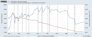
We can answer this question by using FRED. The accompanying graph was created with FRED’s graphing tool (see below for a quick tutorial on creating this graph), which creates an interactive graph that can be downloaded along with the data. The blue line represents total manufacturing jobs, which consistently decreases during a recession (gray bands). Manufacturing jobs peaked in 1979 at just below 20 million and now stand at about 12.5 million. The red line provides another perspective and represents the percent of manufacturing jobs relative to all employment.  In the 1940s manufacturing represented almost 40% of all employment. It has been decreasing ever since and today it is down to around 8.5%.

How to create the graph: Start by searching FRED for manufacturing employment. You should get this.  On the upper right click edit graph and then add line (second button on top). Search employment and click on All Employees: Total Nonfarm Payrolls.  Add the data series. Go to format (third button across the top)  and click right under y-axis position for LINE 2.  Now go to edit line 2 (first button across the top). Under customize data search manufacturing. Click All Employees: Manufacturing. In formula type b/a. Now click add next to All Employees: Manufacturing.  This does it. FRED offers a powerful tool.

What do you know about historical unemployment by race?

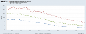
The data, from the U.S. Bureau of Labor Statistics, and a graph by FRED can enlighten you. FRED has Black, Hispanic, and White unemployment data since 1973.  Here we downloaded the graph since the end of the 2008 recession. At its peak (about March 2010) Black unemployment (16.8%) was about twice that of White (8.9%), while Hispanic unemployment was about 50% greater at 12.9%.  Currently, Dec 1017, the spread isn’t as bad but the relationships still exists with unemployment rates at 6.8% (Black), 4.9% (Hispanic), and 3.7% (White). The FRED graph is interactive and you can download the data.

What is the lead-crime hypothesis?

Kevin Drum provides an overview and update of the hypothesis in his detailed post An Updated Lead-Crime Roundup for 2018. In short,

The lead-crime hypothesis is pretty simple: lead poisoning degrades the development of childhood brains in ways that increase aggression, reduce impulse control, and impair the executive functions that allow people to understand the consequences of their actions. Because of this, infants who are exposed to high levels of lead are more likely to commit violent crimes later in life.

He notes further down in the article that

It’s important to emphasize that the lead-crime hypothesis doesn’t claim that lead is solely responsible for crime. It primarily explains only one thing: the huge rise in crime of the 70s and 80s and the equally huge—and completely unexpected—decline in crime of the 90s and aughts. The lead-crime hypothesis is the answer to the question mark in the stylized chart below:

The post has useful graphs for QL based courses, provides an overview of the hypothesis, and the Statistics Projects section of this blog has lead-crime data for projects.

How does a small increase in average temperature increase the chance of extremes?

The Climate Central post, Small Change in Average -Big Change in Extremes, summarizes the idea well with the graph. As the mean shifts to the right, there is a significant increase in the chance of extreme temperature. The animated gif on the site is perfect in expressing the idea.

That’s what we are seeing across much of the country. Average summer temperature have risen a few degrees across the West and Southern Plains, leading to more days above 100°F in Austin, Dallas and El Paso all the way up to Oklahoma City, Salt Lake City, and Boise.  It’s worth noting that this trend has been recorded across the entire Northern Hemisphere, as shown in this WXshift animation.

You should check out the WXshift page they link to. This material is perfect for a stats course. It is also worth pointing out that the pictures here assumes the standard deviation stays the same, but there is evidence that it may be increasing. The effect is a flatter more stretched out density, with even greeter likelihood of extremes.

How strong is the relationship between women’s education and fertility?

Our World in Data has an interactive graph of women’s educational attainment vs fertility, by country and colored by region, from 1950-2010.  The correlation between the average years of education for women and the countries fertility rate is clear.  A world bank article, Female Education and Childbearing: A Closer Look at the Data, from 2015 provides evidence that the relationship is causal.

Why does female education have a direct effect on fertility? The economic theory of fertility suggests an incentive effect: more educated women have higher opportunity costs of bearing children in terms of lost income. The household bargaining model suggests that more educated women are better able to support themselves and have more bargaining power, including on family size.

According to the ideation theory, more educated women may learn different ideas of desired family size through school, community, and exposure to global communication networks. Finally, more educated women know more about prenatal care and child health, and hence might have lower fertility because of greater confidence that their children will survive.

Of course, education isn’t the only factor contributing to fertility rates.  Data is provided by Our World in Data, along with the graph. The data can be used for tests of correlation, regression, and one can compare by county and region for specific years.