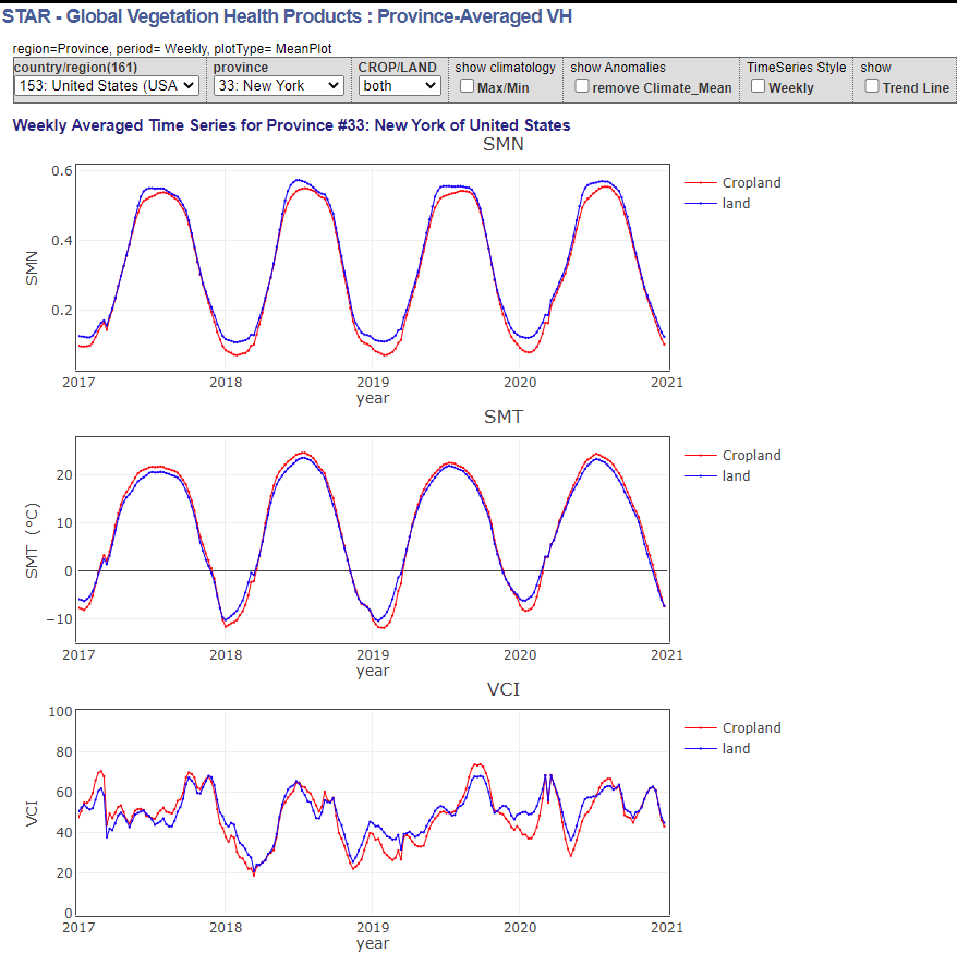
Tag Archives: data source

How hot was the Pacific Northwest?

Berkeley Earth summarizes the recent heatwave in the Pacific Northwest in the article The Pacific Northwest Heatwave in Context  (7/6/2021). The graph by Dr. Robert Rohde copied here is striking and really says all that needs to be said. This is a graph that everyone should have to study and understand. This was anything but a typical heatwave.

There are other graphs and links to dedicated data pages for Washington State, Oregon, Seattle, Portland, Vancouver, and Canada. On these pages there are more graphs and links to the data that created the graphs.

Why is life expectancy lower in the U.S.?

As a follow up to the Tuesday post, the Our World in Data article Why is life expectancy in the U.S. lower than other rich countries by Max Roser provides data on categories that contribute to the lower U.S. life expectancy. The article explores eight  categories: Smoking, Obesity, Homicides (graph copied here), Opioid Overdoses, Suicides, Road Accidents, Poverty and Economic Inequality, Access to Healthcare. A few facts from the article:

In the US the (opioid) death rate has increased more than 10-fold since 1990, while opioid overdoses have remained an extremely rare cause of death in other countries. No other country in the world has seen a surge in opioid overdose deaths as large as the US. Today the US has by far the highest opioid overdose death rate.

Deaths in road accidents are also much more common in the US than in most other rich countries. The chart shows that in many countries road deaths are at least 50% less common.

More than two-thirds of Americans (70%) are overweight and more than one-third (36%) is obese.

The charts for each of these categories have a link for the data.

What are stripes again?

About a year ago I posted this about stripes:

The image here from ShowYourStripes has a vertical strip representing global average temperature anomalies from 1850 to 2019 where darker blue is cooler and darker red is warmer. This graphic style, warming stripes, is credited to Ed Hawkins. The ShowYourStripes page has similar graphics for different regions.

These are excellent images to help understand changing climate. For the image this year I chose the Arctic Ocean temperature. Most of the data for creating these images can be found on  Berkeley Earth’s Data Overview page.  If you don’t like the stripes you can select a bar chart instead on the show your stripes page.

Who has access to a smartphone or broadband?

The Pew article Mobile Technology and Home Broadband 2021 by Andrew Perrin (6/3/2021) summarizes the results of their smartphone and home broadband survey.

Smartphone ownership (85%) and home broadband subscriptions (77%) have increased among American adults since 2019 – from 81% and 73% respectively. Though modest, both increases are statistically significant and come at a time when a majority of Americans say the internet has been important to them personally. And 91% of adults report having at least one of these technologies.

There are differences between various groups (see their graph copied here):

The share of Americans with home broadband subscriptions has similarly grown since 2019 – from 73% of adults saying they have one in the previous survey to 77% today. There are more pronounced variations across some demographic groups, particularly in differences by annual household income and educational attainment. For example, 92% of adults in households earning $75,000 or more per year say they have broadband internet at home. But that share falls to 57% among those whose annual household income is below $30,000.

There are other graphs in the article and Pew provides a methodology section with access to data.

How hot was May 2021?

From NOAA’s Global Climate Report – May 2021:

The May 2021 global surface temperature was 0.81°C (1.46°F) above the 20th century average of 14.8°C (58.6°F). This value tied with 2018 as the sixth warmest May in the 142-year record. May 2021 was also the 45th consecutive May and the 437th consecutive month with temperatures, at least nominally, above the 20th century average.

Notable:

According to the May 2021 temperature percentile map, the month of May was characterized by much-warmer-than-average temperatures across parts of northern, western, and southeastern Asia, Africa, northern South America and across parts of the Pacific, Atlantic, and the Indian oceans. The most notable warm temperature departures from average were observed across parts of western and northern Asia and northern Africa, where temperatures were at least 2.5°C (4.5°F) above average. Record-warm May temperatures were observed across parts of northern Africa, western Asia, and small areas across the Atlantic Ocean and the South Pacific Ocean. This encompassed only 3.0% of the world’s surface with a record-warm May temperature—the tenth highest May percentage for record-warm May temperatures since records began in 1951.

The time series data can be found near the top of the page.

What do we know about hurricanes?

The article NASA and Hurricanes: Five Fast Facts by Katy Mersmann (6/1/2021) has the answers.

The 2021 Atlantic hurricane season starts today, June 1. Our colleagues at NOAA are predicting another active season, with an above average number of named storms. At NASA, we’re developing new technology and missions to study storm formation and impacts, including ways to understand Earth as a system.

The third fact:

Climate change is likely causing storms to behave differently. One change is in how storms intensify: More storms are increasing in strength quickly, a process called rapid intensification, where hurricane wind speeds increase by 35 mph (or more) in just 24 hours.

In 2020, a record-tying nine storms rapidly intensified. These quick changes in storm strength can leave communities in their path without time to properly prepare.

Researchers at NASA JPL developed a machine learning model that could more accurately detect rapidly intensifying storms.

There are fantastic images (such as the one copied here – incorporate it into a Calc III course?) and short videos. Climate.gov has a starting point for hurricane data: Historical Hurricane Tracks – GIS Map Viewer.  A past post on hurricanes: Are hurricanes lingering near the coast longer?


How do we get to know a NOAA buoy?

The NOAA post Meet 5 NOAA buoys that help scientist understand our weather, climate, and ocean health by Caitlin Valentine and Jessica Mkitarian (6/3/2021) provides an overview of NOAA buoys:

But how do NOAA and partner scientists gather data on such a vast environment?

One big way is with buoys, ocean observing platforms that help scientists monitor the global ocean — including in remote, hard-to-reach areas. Some of these buoys float along the ocean surface, gathering data as they drift with currents (sometimes even into the paths of hurricanes!). Some, meanwhile, are moored to the ocean floor, collecting data in the same region and helping scientists observe changes over several years or decades. In honor of Ocean Month, we’re highlighting five buoys that help NOAA scientists monitor and understand the ocean (and the Great Lakes, too!).

There are numerous links in this post that will get you to data (eventually) while the article itself gives an excellent overview of the type of data collected.

How has the land temperature distribution changed?

NASA’s Scientific Visualization Studio’s post Shifting Distribution of Land Temperature Anomalies, 1951-2020 by mark SubbaRao (4/23/2021) provides the animation here.

This visualization shows how the distribution of land temperature anomalies has varied over time. As the planet has warmed, we see the peak of the distribution shifting to the right. The distribution of temperatures broadens as well. This broadening is most likely due to differential regional warming rather than increased temperature variability at any given location.

The data is available:

NASA’s full surface temperature data set – and the complete methodology used to make the temperature calculation – are available at: https://data.giss.nasa.gov/gistemp

You will also find similar shifting normal distribution animations on the animations page.

What are the challenges to moving to clean energy?

Share of top three producing countries in extraction of selected minerals and fossil fuels, 2019.

The iea report The Role of Critical Minerals in Clean Energy Transitions (May 2021) notes:

Alongside a wealth of detail on mineral demand prospects under different technology and policy assumptions, it examines whether today’s mineral investments can meet the needs of a swiftly changing energy sector. It considers the task ahead to promote responsible and sustainable development of mineral resources, and offers vital insights for policy makers, including six key IEA recommendations for a new, comprehensive approach to mineral security.

The executive summary has 11 charts that are all interesting. I chose the one here as it point out potential geopolitical changes. Generally speaking, countries with fossil fuels don’t seem to be the ones with the minerals.

One of the challenges:

Our analysis of the near-term outlook for supply presents a mixed picture. Some minerals such as lithium raw material and cobalt are expected to be in surplus in the near term, while lithium chemical, battery-grade nickel and key rare earth elements (e.g. neodymium, dysprosium) might face tight supply in the years ahead. However, looking further ahead in a scenario consistent with climate goals, expected supply from existing mines and projects under construction is estimated to meet only half of projected lithium and cobalt requirements and 80% of copper needs by 2030.

A great report that can certainly be used as the basis for quantitative discussion related to clean energy. If you click on the charts you can then download the related data.

How hot was April 2021?

From NOAA’s Global Climate Report – April 2021:

The April 2021 global surface temperature was 0.79°C (1.42°F) above the 20th century average of 13.7°C (56.7°F). This was the smallest value for April since 2013 and was the ninth warmest April in the 142-year record. April 2021 marked the 45th consecutive April and the 436th consecutive month with temperatures, at least nominally, above the 20th-century average. December 1984 was the last time a monthly temperature was below average.

Time series data is available near the top of the page.