Tag Archives: data source

What’s new at the EPA?

After about a 4 year hiatus, the EPA’s page Climate Change Indicators in the United Stats has been updated with “Twelve new indicators and several years of data have been added to EPA’s indicator suite.” One new indicator is Permafrost:

The Deadhorse site in northern Alaska had the highest rate of temperature change, at +1.5°F per decade. The Livengood site in interior Alaska was the only site to get cooler over the period of record, though only slightly. Overall, permafrost temperatures have increased at an average rate of 0.6°F per decade.

There are csv files to download the data and background information about the indicators. This is an excellent resource page.

Where are the 1991-2020 U.S. Climate Normals?

NOAA has this data on the 1991-2020 U.S. Climate Normals Quick Access page.

The 2020 U.S. Climate Normals Quick Access tool provides access to data from the most recent version of the U.S. Climate Normals. This iteration of the Normals product provides 30 year averages of temperature, precipitation, and other climate variables measured at more than 15,000 U.S observation stations from 1991–2020, as well as a set of 15 year supplemental normals for 2006–2020.

The image here is a screen shot of monthly normals for one of the Ithaca, NY locations. On the top right corner of the graph there is a link to download the data, which is also in a table below the graph.

Who voted in 2020?

The Census Bureau provides an overview of who voted in 2020 and how that has changed in their article Record High Turnout in the 2020 General Election by Jacob Fabina (4/29/2021).

Turnout rates in 2020 were higher than in the 2016 election for non-Hispanic White, non-Hispanic Black, non-Hispanic Asian, and Hispanic race and origin groups.

The largest increase was for non-Hispanic Asians (Figure 2). Of the non-Hispanic Asian population who were both citizens and of voting age, 59% reported voting in 2020, compared to 49% in 2016.

People with a bachelor’s degree or higher were 32% of the citizen voting-age population in 2016 and 35% in 2020. Their share of the voting population went from 40% to 41% during that time.

Three are a total of five figures and links to data.

What is the trend in of COVID-19 deaths?

The media tends to focus on extremes and generally bad ones at that. If you focus on Michigan one would come to believe that things aren’t improving much with COVID-19. The graph here is from 91-DIVOC, which has a number of interactive graphs, along with making the data available. Over the last 12 weeks deaths are down about 1/5 and only one state is really going against the downward trend. The trend should continue downward as more folks are vaccinated, so please get vaccinated. Note: At this point we are passing half the U.S. adult population vaccinated.

How hot was March 2021

From NOAA’s Global Climate Report – March 2021:

Following a strongly negative Arctic Oscillation (AO) in February 2021, a strongly positive AO was present in March 2021. In a positive phase, the jet stream strengthens and circulates the North Pole, confining the cold Arctic Air across the Polar Regions. The AO value for March 2021 was 2.11—the fifth highest March value since 1950. The peak value on March 11 was the ninth highest daily value and the third highest for a day in March. In addition, during March 2021, La Niña continued to be present across the tropical Pacific Ocean; however, it weakened in strength.

The global surface temperature departure of +0.85°C (+1.53°F) in March 2021 was the smallest March temperature departure since 2014 and was the eighth highest for March in the 142-year record. March 2021 also marked the 45th consecutive March and the 435th consecutive month with temperatures, at least nominally, above the 20th-century average.

The data is available near the top of the page under Temperature Anomalies Time Series.

What were the leading causes of death in 2020?

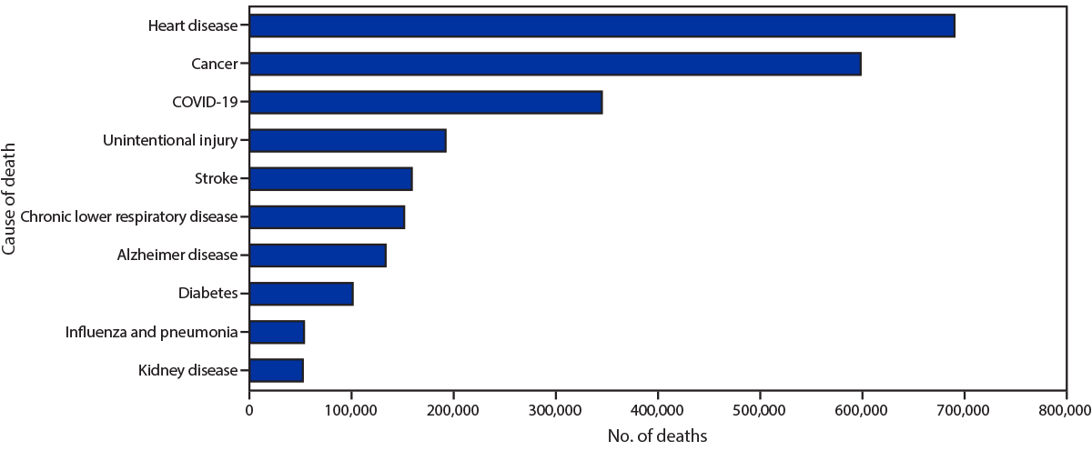
The CDC’s report, Provisional Mortality Data – United States 2020 (3/31/2021) provides the chart presented here.  COVID-19 was the third leading cause of death, although there were only deaths attributed to COVID-19 for nine months of the year. There is also this:

During January–December 2020, the estimated 2020 age-adjusted death rate increased for the first time since 2017, with an increase of 15.9% compared with 2019, from 715.2 to 828.7 deaths per 100,000 population. COVID-19 was the underlying or a contributing cause of 377,883 deaths (91.5 deaths per 100,000). COVID-19 death rates were highest among males, older adults, and AI/AN and Hispanic persons. The highest numbers of overall deaths and COVID-19 deaths occurred during April and December. COVID-19 was the third leading underlying cause of death in 2020, replacing suicide as one of the top 10 leading causes of death (6).

The findings in this report are subject to at least four limitations. First, data are provisional, and numbers and rates might change as additional information is received. Second, timeliness of death certificate submission can vary by jurisdiction. As a result, the national distribution of deaths might be affected by the distribution of deaths from jurisdictions reporting later, which might differ from those in the United States overall. Third, certain categories of race (i.e., AI/AN and Asian) and Hispanic ethnicity reported on death certificates might have been misclassified (7), possibly resulting in underestimates of death rates for some groups. Finally, the cause of death for certain persons might have been misclassified. Limited availability of testing for SARS-CoV-2, the virus that causes COVID-19, at the beginning of the COVID-19 pandemic might have resulted in an underestimation of COVID-19–associated deaths.

There is a table with data of total and covid deaths by age, sex, and race/ethnicity, as  well as another chart.

How’s the labor market for college grads?

The Federal Reserve Bank of New York’s page The Labor Market for Recent College Graduates has a number of graphs related to employment for recent and not so recent grads. For example, their graph here is the percent that are underemployed defined as

The underemployment rate is defined as the share of graduates working in jobs that typically do not require a college degree. A job is classified as a college job if 50 percent or more of the people working in that job indicate that at least a bachelor’s degree is necessary; otherwise, the job is classified as a non-college job. Rates are seasonally adjusted and smoothed with a three-month moving average. College graduates are those aged 22 to 65 with a bachelor’s degree or higher; recent college graduates are those aged 22 to 27 with a bachelor’s degree or higher.

There are graphs for unemployment, underemployed job types, wages and a table of outcomes by major. In all cases the data can be downloaded.

Which top 40 metro areas don’t have a baseball team?

In honor of opening day the Census Bureau posted Major League Baseball is Back on April 1 (No Foolin’) by Derick Moore (3/30/21).

Twenty-five of the top 40 metro areas in the United States have MLB teams. As the ranking table below shows, 20 teams are in the top 21 metros and just five are in the remaining 19 metros.

Which metro area in the top 21 doesn’t have a team? You’ll have to read the article to find out.

If you are looking for baseball data then there is the MLB stats page and a related Statcast search page. If you are an R user the Lahman package has all MLB stats from 1871-2019.

How has unemployment changed over the last year?

The U.S. Bureau of Labor Statistics has an interactive graph of unemployment for cities from Jan 2020 to Jan 2021.

Unemployment rates were higher in January 2021 than a year earlier in 376 of the 389 metro areas, lower in 9 areas, and unchanged in 4 areas. The largest over-the-year unemployment rate increase occurred in Kahului-Wailuku-Lahaina, Hawaii. Rates rose over the year by at least 5.0 percentage points in an additional 11 areas.

Unemployment rates were 10.0 percent or higher in 21 metro areas in January 2021. This was greater than the 4 areas with unemployment rates of at least 10.0 percent in January 2020 but much less than the 339 areas in April 2020, at the onset of the COVID-19 pandemic.

The data is available on the page and provides unemployment rates for metropolitan areas from Jan 2020 to Jan 2021.