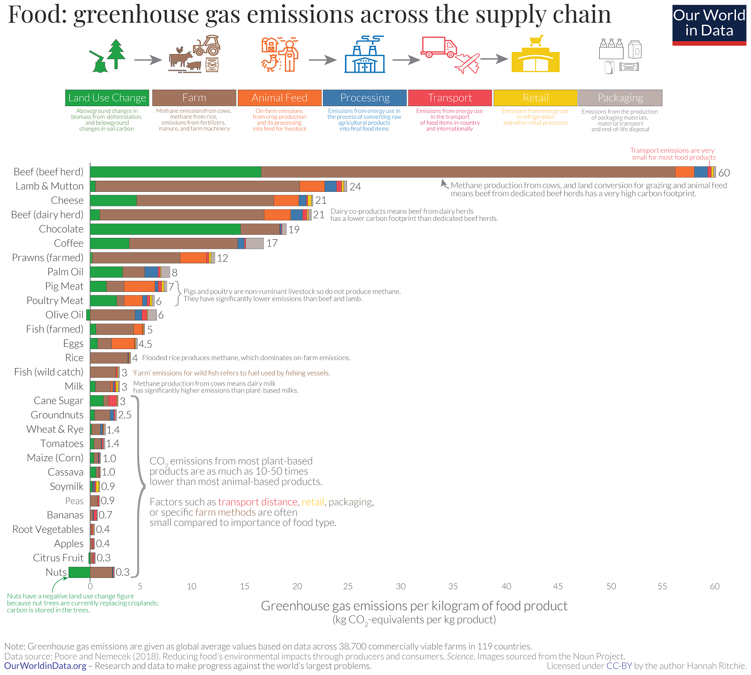
How much does Greenland melting contribute to sea level rise?

From NASA’s Greenland’s Rapid Melt Will Mean More Flooging (12/10/2019):

Increasing rates of global warming have accelerated Greenland’s ice mass loss from 25 billion tons per year in the 1990s to a current average of 234 billion tons per year. This means that Greenland’s ice is melting on average seven times faster today than it was at the beginning of the study period. The Greenland Ice Sheet holds enough water to raise the sea level by 24 feet (7.4 meters).

The graph here is a frame from a short video on the page that is worth watching.  The data for this graph does not seem to be easily available, but data on the melting of Greenland is available at NASA’s Vital Sings Ice Sheets page.

How much has sea level risen?

The Climate.gov post Climate Change: Global Sea Level by Rebecca Lindsey (11/19/2019) notes:

Global mean sea level has risen about 8–9 inches (21–24 centimeters) since 1880, with about a third of that coming in just the last two and a half decades. The rising water level is mostly due to a combination of meltwater from glaciers and ice sheets and thermal expansion of seawater as it warms. In 2018, global mean sea level was 3.2 inches (8.1 centimeters) above the 1993 average—the highest annual average in the satellite record (1993-present)

There are other graphs and information in the post. For example, What’s causing sea level to rise?

Global warming is causing global mean sea level to rise in two ways. First, glaciers and ice sheets worldwide are melting and adding water to the ocean. Second, the volume of the ocean is expanding as the water warms. A third, much smaller contributor to sea level rise is a decline in the amount of liquid water on land—aquifers, lakes and reservoirs, rivers, soil moisture. This shift of liquid water from land to ocean is largely due to groundwater pumping.

There are links to data at the end of the post and NOAA also has sea level data that is accessible.

How hot was Australia in 2019?

The graph here is from the Australian Bureau of Meteorology Climate changes – trends and extremes page.  In 2019, the temperature was 1.52 deg C (2.7 deg F) above the 30 year average from 1961-1990, which is a new record. The second highest year is 2013 at  1.33 deg C above the average. The data is available on the page (there is a link in the box above the graph) and other attributes can be plotted. For instance, the maximum temperature for 2019 was 2.09 deg C (3.76 deg F) above the 30 year average, which is a new record with the second highest in 2013 at 1.59 deg C above the average.

How hot was November 2019?

From the NOAA Global Climate Report – November 2019:

The November 2019 global land and ocean surface temperature was 0.92°C (1.66°F) above average and the second highest November temperature in the 140-year record. Only November 2015 was warmer at +1.01°C (+1.82°F). The five warmest November global land and ocean surface temperature departures from average have occurred since 2013.

The Data can be obtained from the Climate at a Glance page.

What has improved (and not) between rich and poor countries?

The St. Louis Fed post, Healthier Countries, if Not Wealthier Countries by Guillaume Vandenbroucke (12/26/2019) notes

The income gap between rich and poor countries doesn’t seem to be closing. In fact, it seems to be getting wider. However, the gaps between these groups of countries when it comes to health may indeed be narrowing.

For example, the graph copied here provides time series of GDP of high-income countries and Sub-Saharan African countries. The gap between the two cohorts has grown. Yet,

Not surprisingly, sub-Saharan African countries exhibit a lower life expectancy at birth and a higher crude death rate than the high-income countries. What is surprising, however, is that these measures of health are converging to that of the rich countries, unlike GDP per capita.

There are two other graphs in the post. The data is from the world bank and can be found.

What is the role of nuclear energy related to carbon emissions?

The IEA report Nuclear Power in a Clean Energy System (May 2019) has this to say:

Nuclear power has avoided about 55 Gt of CO2 emissions over the past 50 years, nearly equal to 2 years of global energy-related CO2 emissions. However, despite the contribution from nuclear and the rapid growth in renewables, energy-related CO2 emissions hit a record high in 2018 as electricity demand growth outpaced increases in low-carbon power.

According to the chart copied here, nuclear energy generated more TWh then wind, solar, and other renewables combined in 2018. The report has eight charts with links to the data.

How are household numbers changing?

The Our World in Data post, The rise of living alone: how one-person households are becoming increasingly common around the world by Esteban Oritz-Ospina (12/10/2019), provides the chart copied here.

National income per capita and the share of one-person households are strongly correlated…

These correlations are partly due to the fact that people who can afford to, often choose to live alone. Indeed, rising incomes in many countries are likely part of the reason why people are more likely to live alone today than in the past.

But there must be more to it since even at the same level of incomes there are clear differences between regions. In particular, Asian countries have systematically fewer one-person households than African countries with comparable GDP levels.

The article contains two other charts and data.

What progress has been made in the poorest countries?

The World Bank Blog post Chart: Two decades of progress in the world’s poorest countries by Donna Barne (12/11/2019) provides the chart copied here.

The last two decades have seen significant progress in many of the world’s poorest countries. The extreme poverty rate fell from more than 50% to about 30%. Child mortality declined from nearly 14% to 7%. Access to electricity increased by 57% and the share of people using at least basic drinking water and sanitation services increased by 22% and 41%, respectively, among other results.

Below the chart in the post is is a link to the World Bank IDA RMS Database where you can get the data for the chart and more (individual county data or different variables). Note for the chart for this data select IDA total for country.

Is the Arctic “greening”?

MaxNDVI (Maximum Normalized Difference Vegetation Index) during 1982-2018 for the North American Arctic (bottom), Eurasian Arctic (top), and the circumpolar Arctic (middle).


One section of NOAA’s Arctic Report Card: Update for 2019 is on Tundra Greenness.  The graph here from their report is for maximum NDVI:

Normalized Difference Vegetation Index (NDVI), which is sensitive to the unique properties of photosynthetically-active vegetation in the Red and Near Infrared wavelengths. NDVI is highly correlated with the quantity of aboveground vegetation, or “greenness,” of Arctic tundra (Raynolds et al. 2012).

The graph here shows an upward trend, but it’s complicated:

Arctic lands and seas have experienced dramatic environmental and climatic changes in recent decades. These changes have been reflected in progressive increases in the aboveground quantity of live vegetation across most of the Arctic tundra biome—the treeless environment encircling most of the Arctic Ocean. This trend of increasing biomass is often referred to as “the greening of the Arctic.” Trends in tundra productivity, however, have not been uniform in direction or magnitude across the circumpolar region and there has been substantial variability from year to year (Bhatt et al. 2013, 2017; Park et al. 2016; National Academies of Sciences, Engineering, and Medicine 2019). Sources of spatial and temporal variability in tundra greenness arise from complex interactions among the vegetation, atmosphere, sea-ice, seasonal snow cover, ground (soils, permafrost, and topography), disturbance processes, and herbivores of the Arctic system.

The report has two maps and another graph.

Got water?

A 2016 article in Nature, The world’s road to water scarcity: shortage and stress in the 20th century and pathways towards sustainability by M. Kummu et. a., looks at water scarcity and shortages (The dotted red line in the graph copied here is the proportion of the population dealing with water scarcity issues. )

Due to increasing population pressure, changing water consumption behavior, and climate change, the challenge of keeping water consumption at sustainable levels is projected to become even more difficult in the near future5,6.

The increases in population and per capita water consumption resulted in a total water consumption increase from 358 km3 yr−1 in the 1900s to 1500 km3 yr−1 in the 2000s (Fig. 1B).

The article has 6 figures and two data sets available (under electronic supplementary material – right side bar). The richness of the figures makes them useful in a QL or stats course.

A related article from National Geographic, The world’s supply of fresh water is in trouble as mountain ice vanishes by Alejandra Borunda (12/9/2019), discusses the impact of climate change on water supplied by glaciers.

The high mountains cradle more ice and snow in their peaks than exists anywhere else on the planet besides the poles. Over 200,000 glacierspiles of snow, high-elevation lakes and wetlands: All in all, the high mountains contain about half of all the fresh water humans use.

The high mountains are warming faster than the world’s average; temperatures in the high Himalaya, for example, have crept up nearly 3.6 degrees Fahrenheit (2 degrees Celsius) since the beginning of the century, compared to a planetary average of just about 1.8 degrees F (1 degree C).

“120 million people live along the Indus,” says Immerzeel, “but the Indus plain is like a desert. It’s completely reliant on the water from the thick glaciers above.”

Of the five most important water towers in the world, three are in Asia: the Indus, the Tarim, and the Amu Darya.