NASA calls this a climate spiral. The visualization is well done, so watch it. The NASA page includes a link to the data used to make the visualization.
How are 35-44 year-olds doing?
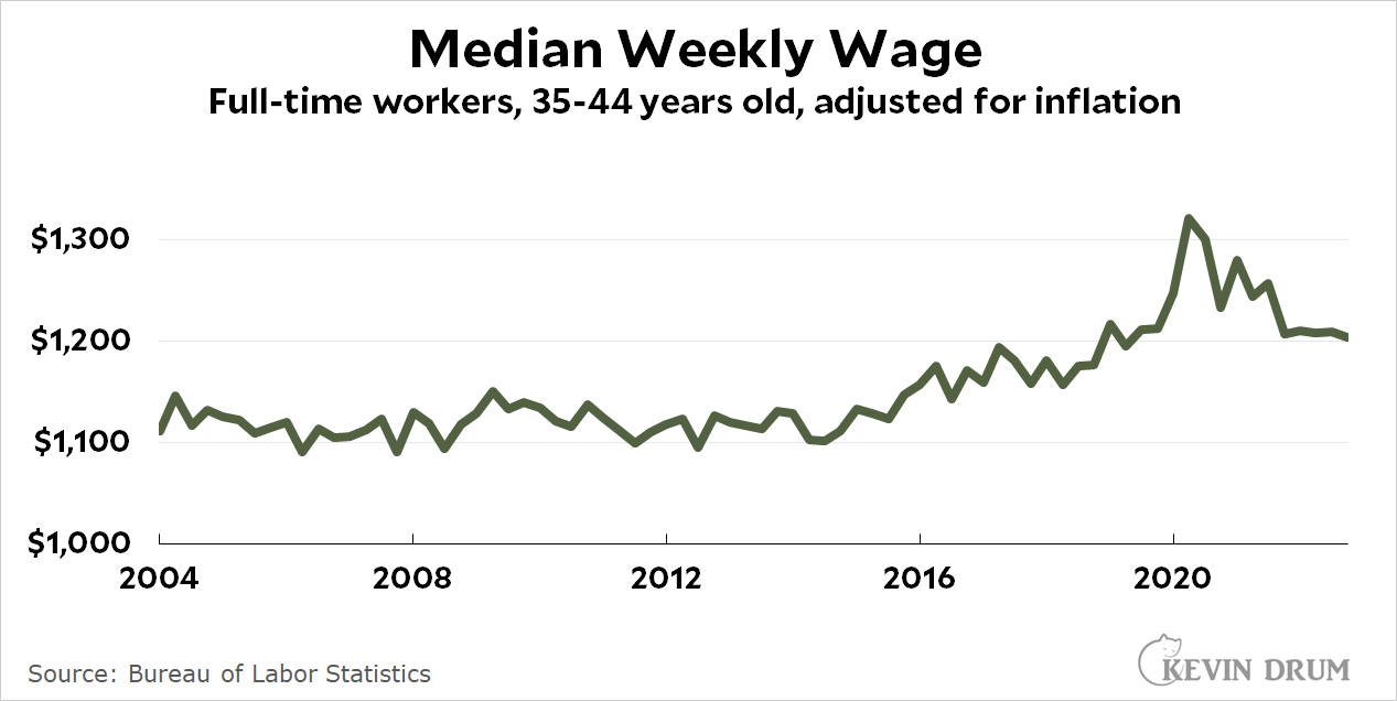
There is a general narrative that younger generation are doing worse then older generations. When a narrative is “common knowledge” it is worth investigating if it is true or not. For the 35-44 year age range Kevin Drum has done just that in his post The (not kids anymore) are doing alright (3/2/2023). He has four graphs one of which is copied here. Some facts:
However, right now their unemployment rate is 2.6%, as low as it’s ever been.
Full-time workers are being paid more today than full-time workers of 20 years ago.
As with the full-time chart, annual earnings are higher now for 35-44 year-olds than they were 20 years ago.
This is not to say everything is perfect, but it does provide evidence that life isn’t that bad for the 35-44 cohort. The question then is why does this narrative exist? The frustrating part here is this data is easily available at the BLS. Maybe journalist could take the time to look up a few facts before they make statements.
What is the new Antarctic sea ice minimum?
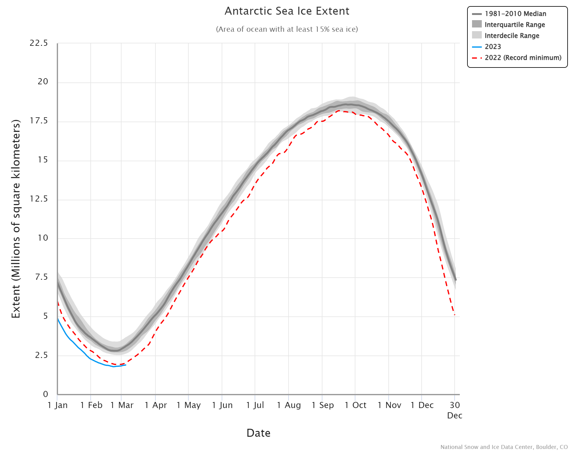 The Antarctic set a new record sea ice minimum at 1.788 million square kilometers beating out last years 1.924 million square kilometers. The graph here comes from the National Snow and Ice Data Center’s (NSIDC) Charctic Interactive Sea Ice Graph. This is a great tool that allows the user to select Arctic or Antarctic, choose color schemes, and select the years to display. A link near the top right corner of the graph allows users to download the data and the graph.
How hot was January 2023?
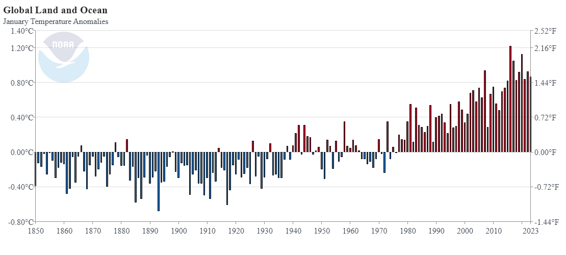 From NOAA’s January 2023 Global Climate Report:
January 2023 was the seventh-warmest January for the globe in NOAA’s 174-year record. The January global surface temperature was 1.57°F (0.87°C) above the 20th-century average of 53.6°F (12.0°C). January 2023 marked the 47th consecutive January and the 527th consecutive month with global temperatures, at least nominally, above the 20th-century average.
A few highlights:
This January, Europe had an unusually mild month that set a record for the warmest January on record. Europe’s surface temperature exceeded the previous January record set in 2007 by 0.16°C (0.28°F).
The Hawaiian region tied a 1941 record for its warmest January on record.
The contiguous U.S. had its sixth-warmest January on record. Seven states in the northeastern U.S.—New Hampshire, Vermont, Massachusetts, Rhode Island, Connecticut, New Jersey and Maine—had their warmest January on record.
Data is available at the top of the page.
What is the status of the Great Salt Lake?
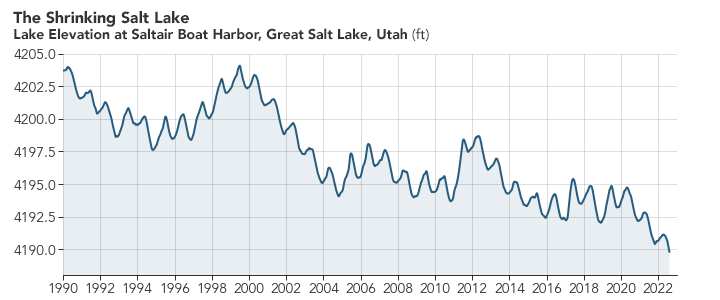
You may be seeing articles about the Great Salt Lake in the news and how it drying up is an environmental problem. NASA Earth Observatory had a great article last summer, The Great Shrinking Lake, with maps and data about the loss of water.
Though water levels in the Great Salt Lake can fluctuate by year, they have generally been declining for decades. At the lake’s highest recorded level in 1986, mean water elevation reached as high as 4,211.6 feet (1,283.7 meters). Since 1986, the lake has dropped about 22 feet, hitting a new record low on July 3, 2022. By August 10, 2022, water levels had dropped slightly more—to 4,189.6 feet (1,276.9 meters).
Now 20 feet may not seem like a lot, but click the NASA link and take a look at the then and now map with the slider. The surface area of the lake had decreased dramatically. The NASA post also has a well-done animated graph. If you want data about the Great Salt Like go to Hydroshare page Collection of Great Salt Lake Data. Daily updated lake elevation and drought maps can be found at the Great Salt Lake Water Level page.
Has Lake Mead improved?

If you have been following my Lake Mead post you might be curious if the rain in the west has improved the situation. Well, you probably looked at the graph by now and realized that the levels haven’t risen much. Based on the graph it seems that Dec to Jan is typically the biggest jump in levels with the max occurring each year between Jan and March. I’ll check back once the March data is in, but this certainly seems like a problem that is only getting worse.
The graph here is from the data on the Lake Mead at Hoover Dam, End of Month Elevation (feet) page by the Bureau of Reclamation. The Sept Lake Mead post.
How have commodity prices changes in the last month?
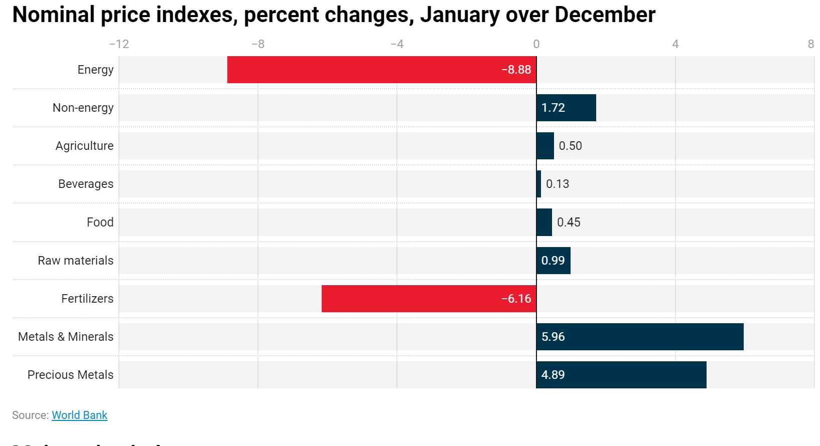
The World Bank has a monthly report that monitors commodity price movements, the pink sheet, highlighted in the post Energy prices dropped in January; non-energy inched up – Pink Sheet by John Bafffes and Maria Hazel Macadangdang (2/8/2023).
Energy prices dropped 8.9% in January, led by natural gas in Europe (-44%) and coal (-16.1%), the World Bank’s Pink sheet reported. Non-energy prices gained 1.7%, led by metals.
The pink sheet linked to in the article has plenty of data. Quiz question: Which commodity had the largest percent change? See the third graph for the answer.
By party, what are the biggest difference in top concerns?
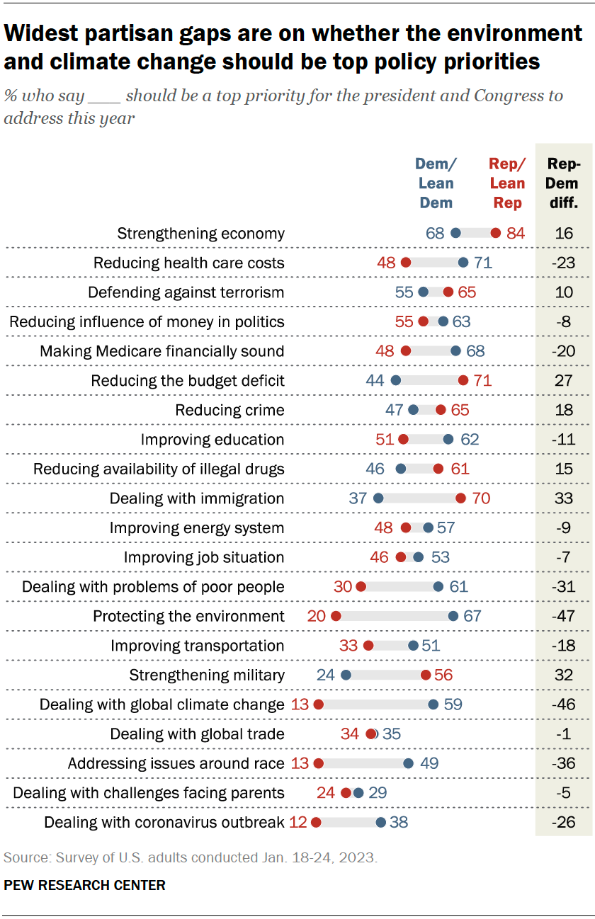
The pew article Economy Remains the Public’s Top Policy Priority; COVID-19 Concerns Decline Again (2/6/23) provides the graph here. The three biggest gaps:
The largest gaps between Republicans and Democrats are on protecting the environment and dealing with global climate change. Two-thirds of Democrats say environmental protection should be a top priority, compared with 20% of Republicans. Similarly, 59% of Democrats say this about climate change versus just 13% of Republicans.
Democrats also are much more likely than Republicans to prioritize addressing issues around race (49% top priority among Democrats vs. 13% among Republicans)
One might expect that the biggest gaps would come in categories where one group is very positive and the other not and it does for the top category of protecting the environment (67-20). Interesting though the third biggest gap on issues around race does not even get a majority on the top group (Dems at 49%). What about the smallest gap where the low group is still above 50%? Reducing the influence of money in politics (55-63).
There are other breakdowns in the article including by race and by age. Great quantitative literacy article. There is also a methodology
How have incarceration rates changed?
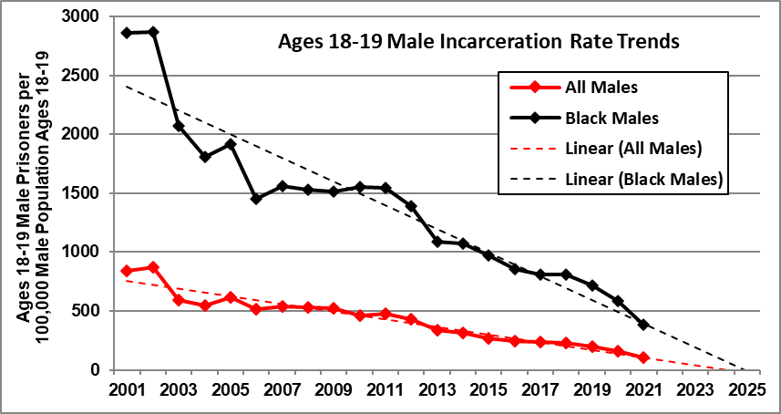
Rick Nevin has an excellent post, Update: Continuing trend toward zero youth incarceration (1/18/2023), that summarizes trends in incarceration rates. There are five interesting graphs, but the one here might surprise folks the most. There has been steady decrease in the gap between Black male incarceration rates and the overall male incarceration rates. Some quotes:
It is remarkable – and exasperating – that the debate over crime and incarceration almost entirely ignores divergent trends by age. Youth crime and incarceration are vanishing as arrest and incarceration rates are still increasing for adults over 50. The only crime theory that explains this divergence is the impact of birth year trends in preschool lead exposure.
The steeper decline in Black incarceration rates since 2001 reflects the fact that Black children recorded steeper blood lead declines associated with slum clearance over the 1960s and city air lead declines since the early-1970s (explained here).
I don’t think it is widely known that youth incarceration rates have been decreasing while over 50 have been increasing.
It is especially exasperating that criminal justice reform advocates ignore incarceration trends by age. Those trends should inform incarceration reduction strategies, to have the greatest impact and to generate the least resistance from “tough-on-crime” advocates.
We do not have a “mass incarceration” problem for youths. Not anymore. Reductions in preschool lead exposure have caused massive declines in youth crime and incarceration. We do still have mass incarceration for adults over 50, and it’s getting worse.
There are links to the data in the first sentence. Check out my lead crime project in the Statistics Projects section.
Will the Antarctic set a new sea ice minimum?
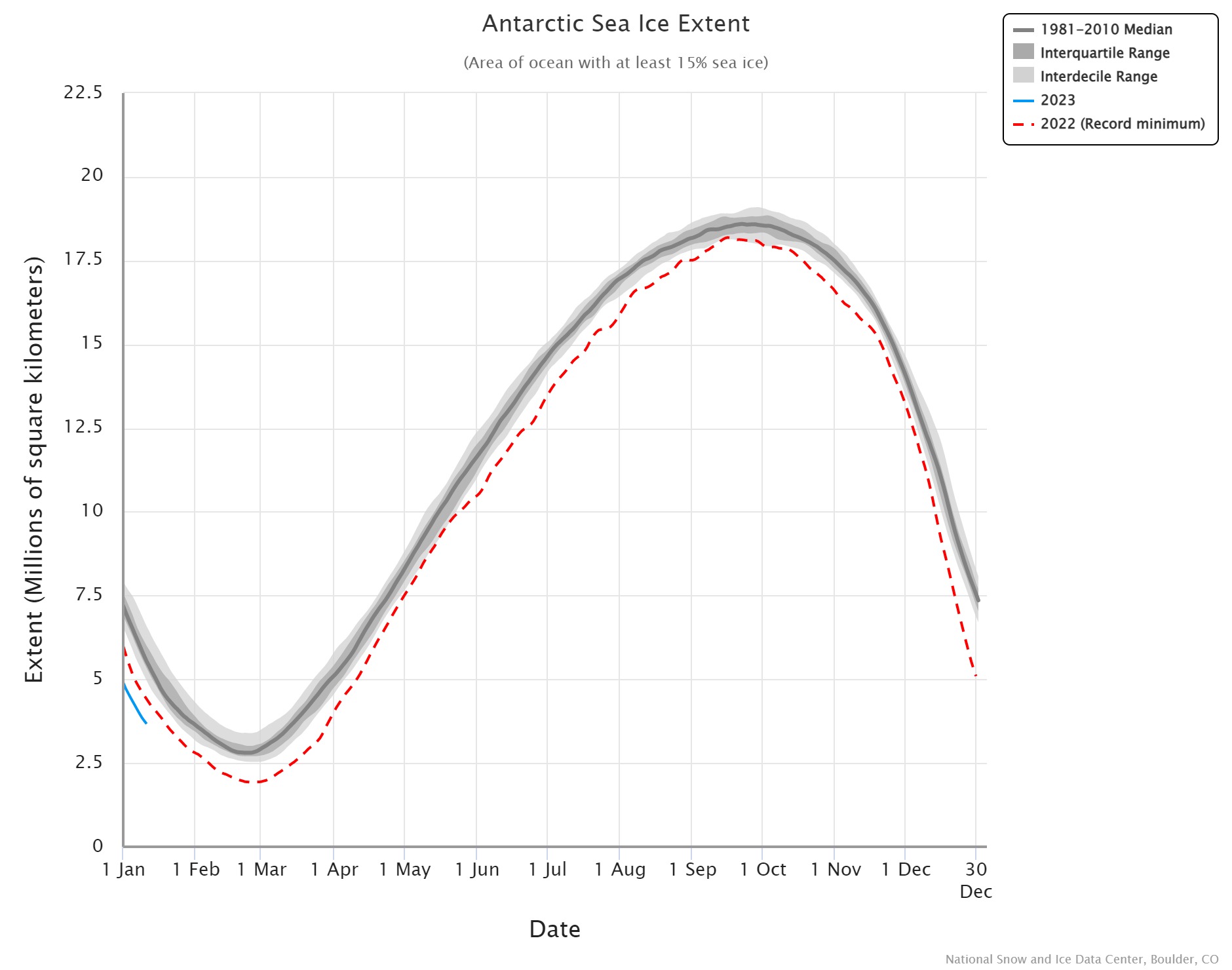 Currently, 2022 is the record minimum for Antarctic sea ice extent, but based on the graph here from the Charctic Interactive Sea Ice Graph from NSIDC 2023 seems primed to beat that record. The Charctic interactive Sea Ice Graph is a fun tool that lets users select years to graph. The menu at the top allows for downloading images as well as data.