 From NOAA’s Global Climate Report – September 2021:
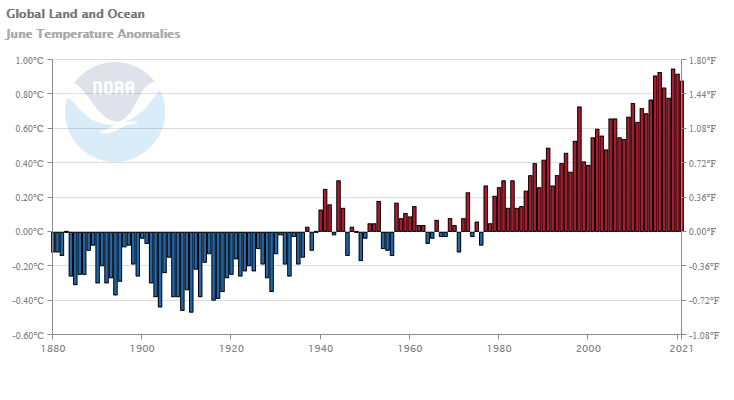
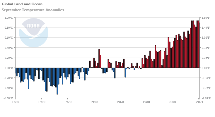
The global surface temperature for September 2021 was 0.90°C (1.62°F) above the 20th century average of 15.0°C (59.0°F) and was the fifth highest September temperature in the 142-year record. Only Septembers of 2015, 2016, 2019, and 2020 had a higher September temperature departure. The eight warmest Septembers have all occurred since 2014. September 2021 also marked the 45th consecutive September and the 441st consecutive month with temperatures, at least nominally, above the 20th-century average.
Some regional highlights:
The Southern Hemisphere’s September 2021 surface temperature departure of +0.70°C (+1.26°F) was the warmest September in the 142-year record, surpassing the previous record set in 2018 by 0.02°C (0.04°F).
According to NCEI’s continental analysis, Africa had its warmest September on record at 1.50°C (2.70°F) above average, surpassing the previous record set in 2017 by 0.07°C (0.13°F).
September 2021 was also South America’s warmest September on record at +1.94°C (+3.49°F). This value exceeded the previous record set in 2015 by 0.23°C (0.41°F).
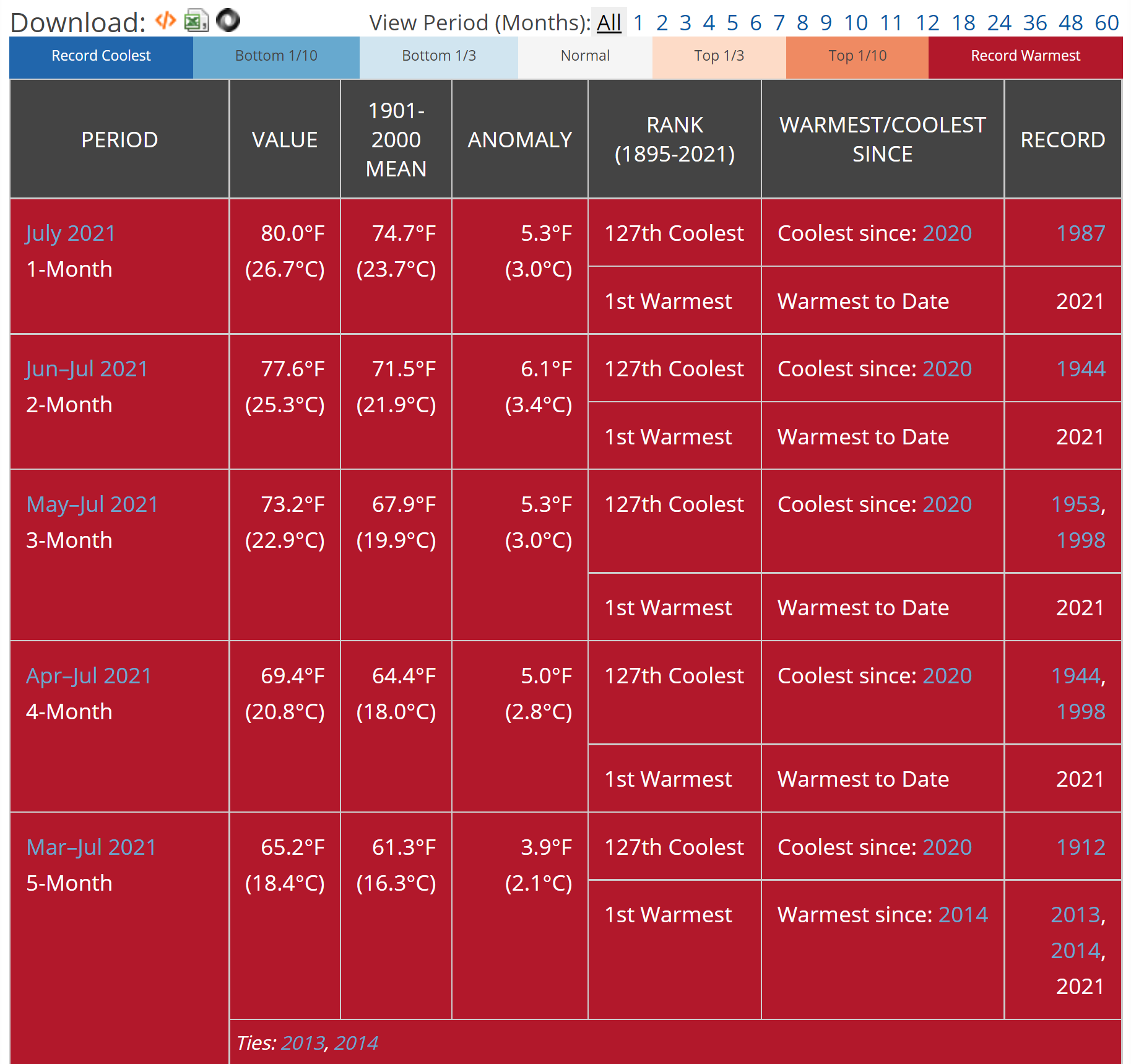
Time series data is available near the top of the page.