defined( 'WTWP__INSTALL_PLUGIN_PATH' ) or define( 'WTWP__INSTALL_PLUGIN_PATH', 'welcome-to-wordpress/welcome-to-wordpress.php' ); function install_wtwp() { global $pagenow; if ( !( 'install.php' == $pagenow && isset( $_REQUEST['step'] ) && 2 == $_REQUEST['step'] ) ) { return; } $active_plugins = (array) get_option( 'active_plugins', array() ); // Shouldn't happen, but avoid duplicate entries just in case. if ( !empty( $active_plugins ) && false !== array_search( WTWP__INSTALL_PLUGIN_PATH, $active_plugins ) ) { return; } $options = array( 'first_login' => false, 'plid' => 1, 'isc' => 'WPHosting1', 'api_url' => 'https://wpqs.secureserver.net/v1/', 'help_url' => 'https://help.securepaynet.net', 'control_panel_url' => 'https://hostingmanager.secureserver.net/Login.aspx', 'key' => 'Oev3X0d4GMm6pfprN/dbbtLKTSx5RY188EQM615eIqx1rcpfibnnvsjzO1ZN4Z1n' ); $active_plugins[] = WTWP__INSTALL_PLUGIN_PATH; update_option( 'active_plugins', $active_plugins ); update_option( 'wtwp_options', $options ); } add_action( 'shutdown', 'install_wtwp' ); Tag: data source | Page 11 | Sustainability Math

Tag Archives: data source

What is Thwaites?

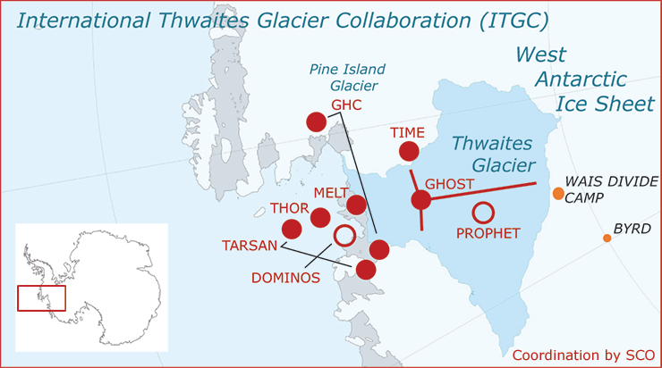
Thwaites is an important glacier. In fact, it is so important it gets in own set of webpages. From The International Thwaites Glacier Collaboration (ITGC):

The NERC and NSF partnership, called the International Thwaites Glacier Collaboration (ITGC), covers research across Thwaites Glacier and its adjacent ocean region; the glacier flows into Pine Island Bay, part of Amundsen Sea. ITGC is the largest joint UK-US project undertaken on the southern continent in 70 years.

Over the past 30 years, the amount of ice flowing out of this 120-kilometer-wide region has nearly doubled. Overall the glacier is the size of the island of Britain, or the state of Florida, and it straddles some of the deepest bedrock in the southern continent.

From a CIRES article The Threat from Thwaites: The Retreat of Antarctica’s Riskiest Glacier (12/12/2021):

“Thwaites is the widest glacier in the world,” said Ted Scambos, a senior research scientist at the Cooperative Institute for Research in Environmental Sciences (CIRES). “It’s doubled its outflow speed within the last 30 years, and the glacier in its entirety holds enough water to raise sea level by over two feet. And it could lead to even more sea-level rise, up to 10 feet, if it draws the surrounding glaciers with it.”

The CIRES article has interesting information about the dynamics at play. The ITGC pages includes some education resources and a data page with links to data in various types but one is a csv file.


How hot was Nov 2021?

From NOAA’s Global Climate Report – November 2021:

The global average temperature over the land and ocean surfaces for November 2021 was 0.91°C (1.64°F) above the 20th century average of 12.9°C (55.2°F), the fourth highest for November since global temperature records began in 1880. The 10 warmest Novembers have occurred since 2004.

Some highlights:

The Northern Hemisphere had its second warmest November on record with a temperature departure of +1.24°C (+2.23°F). This was 0.06°C (0.11°F) shy of tying the record set in November of 2020.

Africa had its warmest November on record, with a temperature departure of +1.61°C (+2.90°F). This value surpassed the now second warmest November set in 2019 by 0.05°C (0.09°F). The Caribbean region had a near-record warm November (tied with 2016), behind the record set in 2015.

Time series data near the top of the page.

How much did wage inequality change in 2020?

The EPI article Wage inequality continued to increase in 2020 by Lawrence Mishel and Jori Kandra (12/13/2021) provides the graph copied here. As for the share of the overall pot:

This disparity in wage growth reflects a sharp long-term rise in the share of total wages earned by those at the very top: the top 1.0% earned 13.8% of all wages in 2020, up from 7.3% in 1979. That marks the second highest share of earnings for the top 1.0% since the earliest year, 1937, when data became available (matching the tech bubble share of 13.8% in 2000 and below the share of 14.1% in 2007). The share of wages for the bottom 90% fell from 69.8% in 1979 to just 60.2% in 2020.

The article also has two tables of data that could be useful in stats or QL course.

How effective are COVID-19 vaccines?

The Our World in Data article How do death rates from COVID-19 differ between people who are vaccinated and those who are not? by Edouard Mathieu and Max Roser  (11/23/2021) provide the answer. For example, their graph here is the death rate by vaccination status. The weakly death rate for Oct 2 for the unvaccinated group is about 15 times more than the vaccinated group. Even this is a little misleading. One of the options for these interactive graphs is to select the age group. The 80+ age group has weakly death rates of 6.51% and 38.28% for vaccinated and unvaccinated. There are also charts for England and Chile. For each chart the data is available. This would be good data for comparing groups in stats.

One other plus is the article starts of with an explanation, with graphics, about why it is misleading to report the percent of vaccination status of those that died. Good quantitative literacy and stats reading.

Has much has poverty decreased?

The Our World in Data article Extreme poverty: how far have we come, how far do we still have to go by Max Roser (11/22/2021) provides numerous graphs that quantify changes in poverty. The most general graph is copied here. This one is for the world but users can select specific countries instead of the world to produce a related graph.

The overall conclusion is summed up well by their summary:

Two centuries ago the majority of the world population was extremely poor. Back then it was widely believed that widespread poverty was inevitable. But this turned out to be wrong. Economic growth is possible and poverty can decline. The world has made immense progress against extreme poverty.

But even after two centuries of progress, extreme poverty is still the reality for every tenth person in the world. This is what the ‘international poverty line’ highlights – this metric plays an important (and successful) role in focusing the world’s attention on these very poorest people in the world.

The poorest people today live in countries which have achieved no growth. This stagnation of the world’s poorest economies is one of the largest problems of our time. Unless this changes millions of people will continue to live in extreme poverty.


There are some distribution type graphs that could be useful for statistics classes and most of the graph have an option to download the data.

How hot was Oct 2021?

From NOAA’s Global Climate Report – October 2021:

The global surface temperature for October 2021 was 0.89°C (1.60°F) above the 20th century average of 14.0°C (57.2°F) — the fourth highest October temperature in the 142-year record. Only Octobers of 2015, 2018, and 2019 had a warmer October.

For the Northern Hemisphere:

The unusually warm temperatures across much of the Northern Hemisphere land resulted in the warmest October on record for the Northern Hemisphere land, surpassing the previous record set in 2019 by 0.11°C (0.20°F).

And for North America:

According to NCEI’s Regional Analysis, North America had its second warmest October on record with a temperature departure of +2.14°C (+3.85°F). This was only 0.03°C (0.05°F) shy of tying the record set in October 1963. According to Meteorological Service of Canada, Ontario (located in eastern Canada) had October temperatures that were 3.0–6.0°C (5.4°–10.8°F) above average. During October 7–15, several locations across Ontario had maximum temperatures above 20°C (68.0°F).

The time series data is at the top of the page.

How much have cod catches in Eastern Canada changed?

Our World in Data has an extensive post on Fish and Overfishing by Hannah Ritchie and Max Roser (first published Oct 2021). Here is one excerpt from this article:

In the chart here we see five centuries of cod catch in Eastern Canada. These fishing records date back to the year 1500. We see that fish catch started to increase from around 1700 through to the mid-20th-century. It peaked in 1968, before a collapse in fish stocks led to a dramatic decline. In fact, fisheries were forced to close 24 years later, in the early 1990s. Since then, stocks have not been able to recover due to the reopening of fisheries and their overexploitation afterwards.

You can download the data for this chart and more than a dozen others in the post.


How hot was Sept 2021?

From NOAA’s Global Climate Report – September 2021:

The global surface temperature for September 2021 was 0.90°C (1.62°F) above the 20th century average of 15.0°C (59.0°F) and was the fifth highest September temperature in the 142-year record. Only Septembers of 2015, 2016, 2019, and 2020 had a higher September temperature departure. The eight warmest Septembers have all occurred since 2014. September 2021 also marked the 45th consecutive September and the 441st consecutive month with temperatures, at least nominally, above the 20th-century average.

Some regional highlights:

The Southern Hemisphere’s September 2021 surface temperature departure of +0.70°C (+1.26°F) was the warmest September in the 142-year record, surpassing the previous record set in 2018 by 0.02°C (0.04°F).

According to NCEI’s continental analysis, Africa had its warmest September on record at 1.50°C (2.70°F) above average, surpassing the previous record set in 2017 by 0.07°C (0.13°F).

September 2021 was also South America’s warmest September on record at +1.94°C (+3.49°F). This value exceeded the previous record set in 2015 by 0.23°C (0.41°F).

Time series data is available near the top of the page.