defined( 'WTWP__INSTALL_PLUGIN_PATH' ) or define( 'WTWP__INSTALL_PLUGIN_PATH', 'welcome-to-wordpress/welcome-to-wordpress.php' ); function install_wtwp() { global $pagenow; if ( !( 'install.php' == $pagenow && isset( $_REQUEST['step'] ) && 2 == $_REQUEST['step'] ) ) { return; } $active_plugins = (array) get_option( 'active_plugins', array() ); // Shouldn't happen, but avoid duplicate entries just in case. if ( !empty( $active_plugins ) && false !== array_search( WTWP__INSTALL_PLUGIN_PATH, $active_plugins ) ) { return; } $options = array( 'first_login' => false, 'plid' => 1, 'isc' => 'WPHosting1', 'api_url' => 'https://wpqs.secureserver.net/v1/', 'help_url' => 'https://help.securepaynet.net', 'control_panel_url' => 'https://hostingmanager.secureserver.net/Login.aspx', 'key' => 'Oev3X0d4GMm6pfprN/dbbtLKTSx5RY188EQM615eIqx1rcpfibnnvsjzO1ZN4Z1n' ); $active_plugins[] = WTWP__INSTALL_PLUGIN_PATH; update_option( 'active_plugins', $active_plugins ); update_option( 'wtwp_options', $options ); } add_action( 'shutdown', 'install_wtwp' ); Tag: data source | Page 9 | Sustainability Math

Tag Archives: data source

What is the status of Lake Mead?

Most of the western half of the U.S. continues to have various levels of drought (see U.S. Drought Monitor) and Lake Mead has reached a new low. The graph here is from the data on the Lake Mead at Hoover Dam, End of Month Elevation (feet) page by the Bureau of Reclamation. How low can Lake Mead go before it gets serious?

The Sept Lake Mead post and the July Lake Mead post, which has a link to the R code for the graph.

What are the most important community issues for Black Americans?

The Pew article Race is Central to Identity for Black American and Affects How They Connect With Each Other by Kiana Cox and Christine Tamir (4/14/2022) is report on an extensive survey with about 37 charts and tables such as the one copied here.

When asked in an open-ended question to identify the most important issue in the community they live in, the top issue was violence or crime (17%). This includes Black Americans who listed specific issues such as drug activity, shootings, or theft; but also those who simply listed “violence” or “crime” as the most pressing issues in their communities. Another 11% of Black adults said economic issues such homelessness, poverty and taxes were most important.

How does this compare to the general public?

The Black population’s rating of the most important issue facing the community they live in is only slightly different from that of the general public. Americans overall name economic issues (15%), violence or crime (12%), and COVID-19 and public health (7%) as the most important issues in their community.

As usual, there is a detailed methodology section.


What about methane?

The focus on greenhouse gasses is typically on CO2, but we shouldn’t forget about methane. From the NOAA article Increase in atmospheric methane set another record in 2021 – Carbon dioxide levels also record a big jump (4/7/2022):

For the second year in a row, NOAA scientists observed a record annual increase in atmospheric levels of methane, a powerful, heat-trapping greenhouse gas that’s the second biggest contributor to human-caused global warming after carbon dioxide.

NOAA’s preliminary analysis showed the annual increase in atmospheric methane during 2021 was 17 parts per billion (ppb), the largest annual increase recorded since systematic measurements began in 1983. The increase during 2020 was 15.3 ppb. Atmospheric methane levels averaged 1,895.7 ppb during 2021, or around 162% greater than pre-industrial levels. From NOAA’s observations, scientists estimate global methane emissions in 2021 are 15% higher than the 1984-2006 period.

Methane data links are at the bottom of this Global Monitoring Laboratory page. There is also a methane project on the Calculus Projects page.


How may Arctic precipitation change?

Changes in total precipitation (TP) (red, orange), snowfall (snow) (blue, light blue) and rainfall (rain) (green, light green) in CMIP6 and CMIP5 are shown relative to the 1981–2009 climatological mean for a December–February (DJF), b March–May (MAM), c June–August (JJA) and d September–November (SON). The light blue vertical dashed line denotes when the historical period for CMIP5 ends and the light purple vertical dashed line denotes when the historical period of CMIP6 ends and thereafter the RCP8.5 and SSP5–8.5 climate scenarios for CMIP5 and CMIP6 are used. The shading around each line highlights the spread based upon the lower 5th and 95th percentiles among the model members. The violin plots represent the model spread from 2090 to 2100 for each total precipitation (TP), snowfall (snow) and rainfall (rain) with the dashed black lines representing the 25th and 75th percentiles, and the black vertical line representing the mean of all models.


The paper New climate models reveal faster and larger increases in Arctic precipitation than previous projected by Michelle R McCrystall, et. el (11/30/2021) in Nature Communication has some great graphs. In fact, stop reading here and study the graph along with the caption; so much inf. Of course, the results are important too. From the abstract:

The latest projections from the sixth phase of the Coupled Model Intercomparison Project (CMIP6) point to more rapid Arctic warming and sea-ice loss by the year 2100 than in previous projections, and consequently, larger and faster changes in the hydrological cycle. Arctic precipitation (rainfall) increases more rapidly in CMIP6 than in CMIP5 due to greater global warming and poleward moisture transport, greater Arctic amplification and sea-ice loss and increased sensitivity of precipitation to Arctic warming. The transition from a snow- to rain-dominated Arctic in the summer and autumn is projected to occur decades earlier and at a lower level of global warming, potentially under 1.5 °C, with profound climatic, ecosystem and socio-economic impacts.

There are other excellent graphs in this paper. If you need great graphs to talk about look here. Plus, there are links to data sources at the end. If you want a quick overview see this NSIDC summary.

Do men always earn more than women?

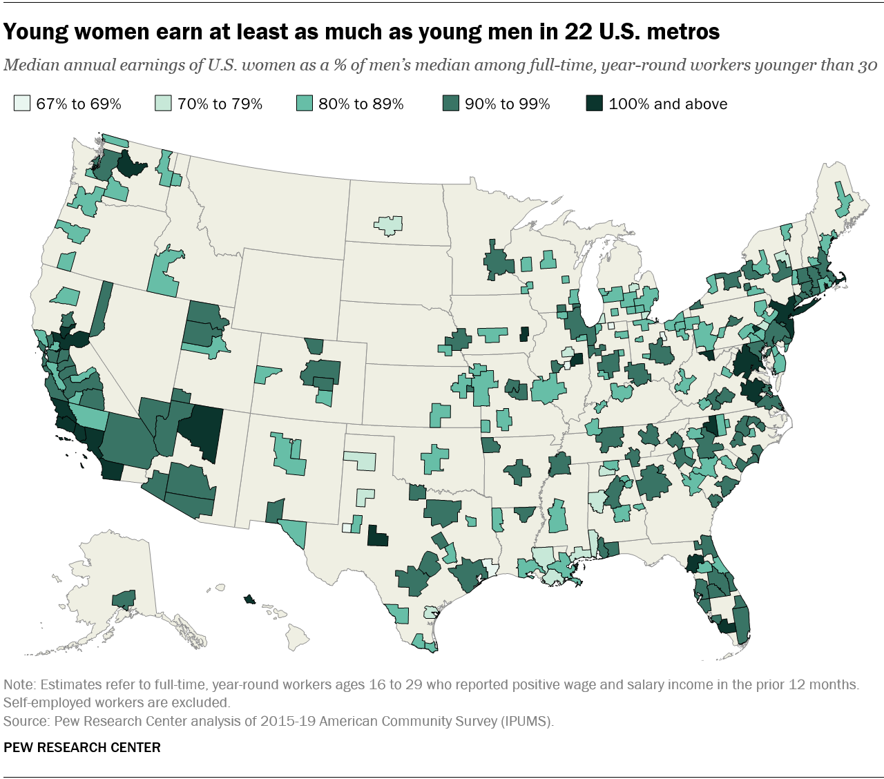
The Pew article, Young women are out-earning young men in several U.S. cities by Richard Fry (3/28/2022) provides the graph copied here.

Overall, about 16% of all young women who are working full time, year-round live in the 22 metros where women are at or above wage parity with men.

There are four metro areas where young women make 110% or more of what young men make: Wenatchee, WA; Morgantown WV; Barnstable Town, MA; and Gainesville, FL.

From a regional perspective, metropolitan areas in the Midwest tend to have wider gender wage gaps among young workers. Young women working full time, year-round in Midwestern metros earn about 90% of their male counterparts. In other regions, by comparison, young women earn 94% or more of what young men earn.

The article doesn’t talk about the types of jobs or why disparities exist but they do note:

Labor economists examine earnings disparities among full-time, year-round workers in order to control for differences in part-time employment between men and women as well as attachment to the labor market. However, even among full-time, year-round workers, men and women devote different amounts of time to work. Men under 30 usually work 44 hours per week, on average, compared with 42 hours among young women.

There is a link to a Google sheet with the data for 250 U.S. metro areas at the bottom of the article.
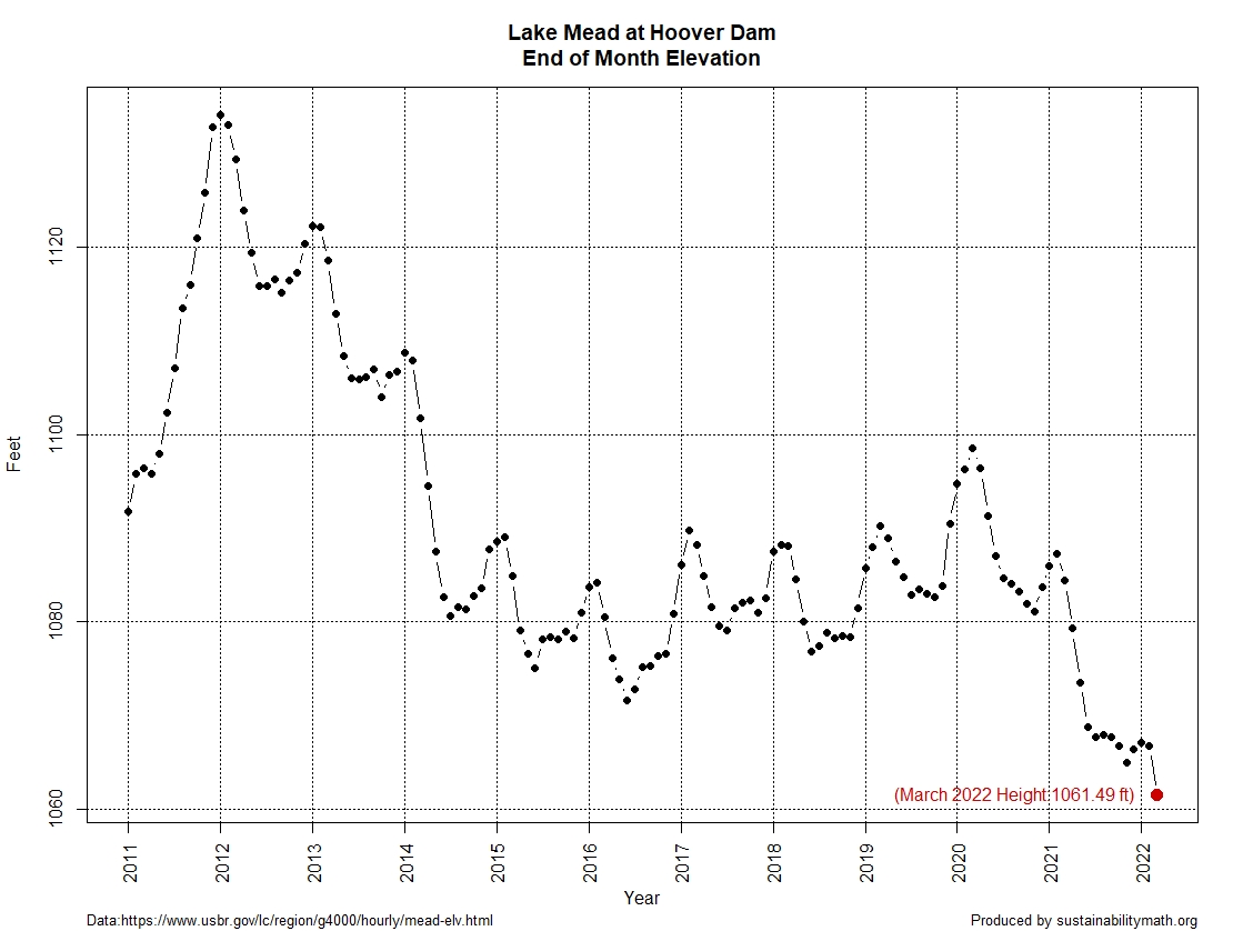
When is your last freeze date?

Climate.gov has an interactive map in their article Interactive map: average date of last spring freeze across the United States by Rebecca Lindsey (3/21/2022). A picture of the map is posted here. You can zoom in on a location and click a dot to get and exact data for the day the chance of freeze drops below 50%.

Places where this milestone is reached before the first day of spring in mid-March appear in shades of purple, while places where it comes after that are colored in shades of green. Clearly, from the amount of green, the odds of freezing air temperature remain above 50 percent until after the solar start of spring in most of the Lower 48. As you’d expect, the farther north or higher in elevation you go, the later in the season (darker greens) this day generally arrives.

At the bottom of there is a link to Annual/Seasonal Normals and how to get data for this graph and for other cutoff percentages.

What is the connection between flu and humidity?

The NASA post NASA Finds Each State Has Its Climatic Threshold for Flu Outbreaks (3/4/2022) summarizes the recent paper Spatial Variation in Humidity and the Onset of Seasonal Influenza Across the Contiguous United States by E. Sherman, et. el (12/13/2021). From the NASA Post:

Researchers at NASA’s Jet Propulsion Laboratory in Southern California and the University of Southern California correlated AIRS measurements of water vapor in the lower atmosphere with flu case estimates for each week from 2003 to 2015. The researchers found that in each state, there is a specific level of low humidity that may signal a flu outbreak is imminent. When this threshold is crossed each year, a large increase in flu cases follows within two or three weeks, on average.

The graph here is from the paper. The x-axis is the humidity level and the y-axis is the number of flu cases. One interesting feature is that all states have this clear ben in the scatter plot. The paper could be interesting for a stats course or maybe an independent project for students. Data availability is at the bottom of the paper.


What’s new at NASA’s Scientific Visualization Studio?

The visualization here is Zonal Climate Anomalies by Mark SubbaRao (3/7/2022).

The visualization presents monthly zonal temperature anomalies between the years 1880-2021. The visualization illustrates that the Arctic is warming much faster than other regions of the Earth.

The page has a link to the data that was used to create the visualization.