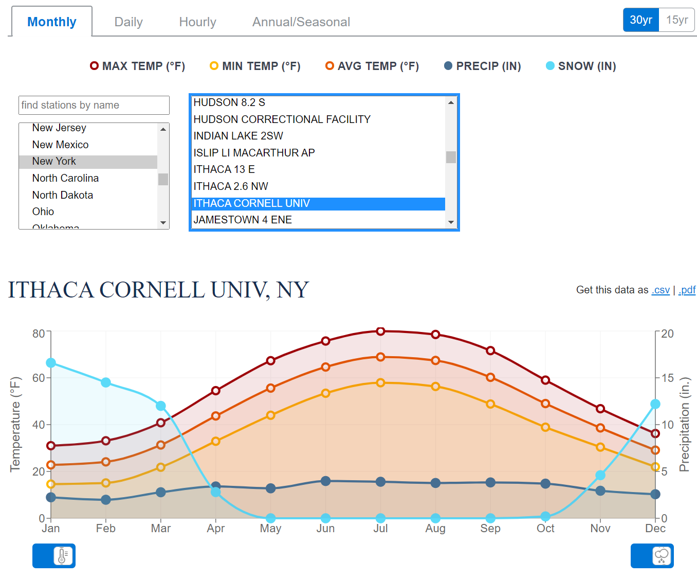
The 2020 U.S. Climate Normals Quick Access tool provides access to data from the most recent version of the U.S. Climate Normals. This iteration of the Normals product provides 30 year averages of temperature, precipitation, and other climate variables measured at more than 15,000 U.S observation stations from 1991–2020, as well as a set of 15 year supplemental normals for 2006–2020.
The image here is a screen shot of monthly normals for one of the Ithaca, NY locations. On the top right corner of the graph there is a link to download the data, which is also in a table below the graph.
Following a strongly negative Arctic Oscillation (AO) in February 2021, a strongly positive AO was present in March 2021. In a positive phase, the jet stream strengthens and circulates the North Pole, confining the cold Arctic Air across the Polar Regions. The AO value for March 2021 was 2.11—the fifth highest March value since 1950. The peak value on March 11 was the ninth highest daily value and the third highest for a day in March. In addition, during March 2021, La Niña continued to be present across the tropical Pacific Ocean; however, it weakened in strength.
The global surface temperature departure of +0.85°C (+1.53°F) in March 2021 was the smallest March temperature departure since 2014 and was the eighth highest for March in the 142-year record. March 2021 also marked the 45th consecutive March and the 435th consecutive month with temperatures, at least nominally, above the 20th-century average.
The data is available near the top of the page under Temperature Anomalies Time Series.
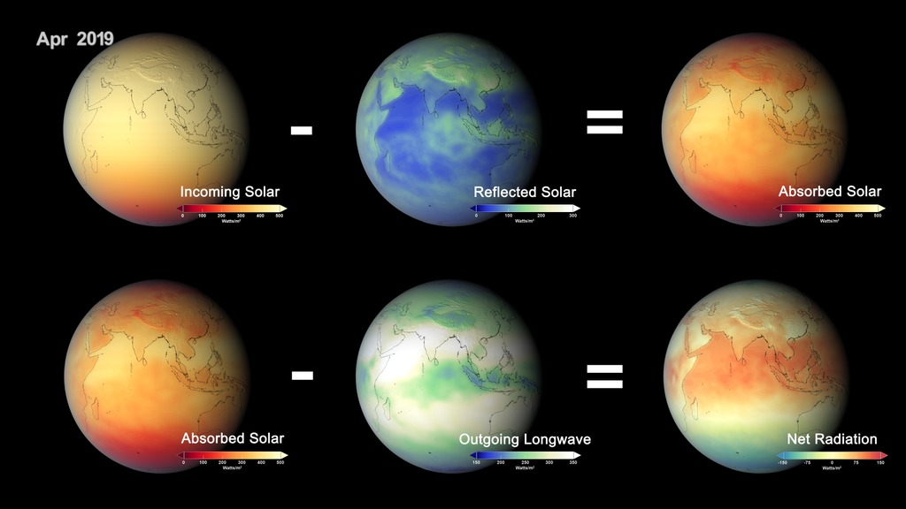
Climate modelling predicts that human activities are causing the release of greenhouse gases and aerosols that are affecting Earth’s energy budget. Now, a NASA study has confirmed these predictions with direct observations for the first time: radiative forcings are increasing due to human actions, affecting the planet’s energy balance and ultimately causing climate change. The paper was published online on March 25, 2021, in the journal Geophysical Research Letters.
“This is the first calculation of the total radiative forcing of Earth using global observations, accounting for the effects of aerosols and greenhouse gases,” said Ryan Kramer, first author on the paper and a researcher at NASA’s Goddard Space Flight Center in Greenbelt, Maryland, and the University of Maryland, Baltimore County. “It’s direct evidence that human activities are causing changes to Earth’s energy budget.”
The human impact:
The team found that human activities have caused the radiative forcing on Earth to increase by about 0.5 Watts per square meter from 2003 to 2018. The increase is mostly from greenhouse gases emissions from things like power generation, transport and industrial manufacturing. Reduced reflective aerosols are also contributing to the imbalance.
No data in this one, but it provides a good overview of the paper.
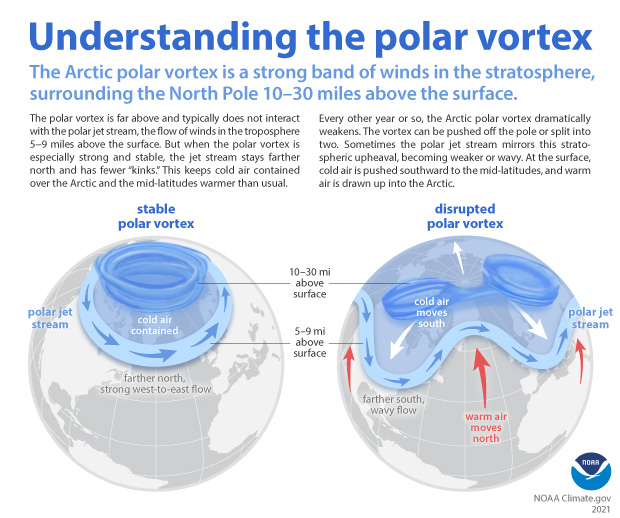
When the Arctic polar vortex is especially strong and stable (left globe), it encourages the polar jet stream, down in the troposphere, to shift northward. The coldest polar air stays in the Arctic. When the vortex weakens, shifts, or splits (right globe), the polar jet stream often becomes extremely wavy, allowing warm air to flood into the Arctic and polar air to sink down into the mid-latitudes. NOAA Climate.gov graphic, adapted from original by NOAA.gov.
The climate.gov article Understanding the Arctic polar vortex by Rebecca Lindsey (3/5/2021) is a complete primer on the polar vortex, jet stream, and what we know (and don’t) abut the connection to climate change.
According to NOAA stratosphere expert Amy Butler, people often confuse the polar vortex with the polar jet stream, but the two are in completely separate layers of the atmosphere. The polar jet stream occurs in the troposphere, at altitudes between 5-9 miles above the surface. It marks the boundary between surface air masses, separating warmer, mid-latitude air and colder, polar air. It’s the polar jet stream that plays such a big role in our day-to-day winter weather in the mid-latitudes, not the polar vortex.
Any relationships to climate change is unclear, for example:
The uncertainty due to a relatively short history of observations isn’t the only reason experts can’t dismiss the possibility that something could be up with polar vortex. Some climate model experiments do predict that continued warming will lead to a weakening of the polar vortex. “It’s true that when you run some high-resolution climate models, with a realistic stratosphere, and a realistic sea ice layer, and you reduce sea ice cover, these models predict that the polar vortex gets weaker,” Butler said. And some studies combining models and observations have shown a connection between low sea ice extent in the Barents and Kara Seas of the eastern Arctic, sudden stratospheric warming events, and cold winters in North America.
At the same time, other model simulations predict that warming and sea ice loss will lead to a stronger polar vortex. Part of the reason for the disagreement is that the impact of Arctic surface warming and sea ice loss on the atmospheric waves that can disrupt the polar vortex is very sensitive to exactly where and when the sea ice loss occurs, and that hasn’t been consistent across model simulations.
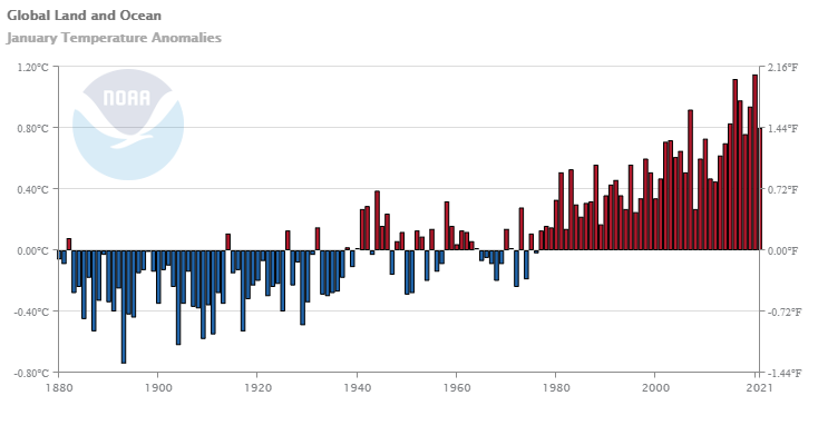
No data in this article but there are some useful graphs, such as the one copied here, and the article is just generally interesting.
The January 2021 global land and ocean surface temperature was 0.80°C (1.44°F) above the 20th century average and ranked as the seventh warmest January in the 142-year global records. January 2021 also marked the 45th consecutive January and the 433rd consecutive month with temperatures, at least nominally, above the 20th-century average.
Only 7th warmest but
The year began with a La Niña episode in the tropical Pacific Ocean that started in August 2020. The El Niño-Southern Oscillation (ENSO) can affect global temperatures. La Niña tends to cool global temperatures slightly, while El Niño tends to boost global temperatures. With a slightly cool start to the year, there is only a 2.9% chance of 2021 ending as the warmest year on record. However, there is an over 99% chance of the year ranking among the 10 warmest years on record.
and
According to NCEI’s regional analysis, North America, as a whole, had its second warmest January on record, with a temperature departure from average of +3.96°C (+7.13°F). This was only 0.10°C (0.18°F) shy of tying the record warm January set in 2006.
and
As a whole, about 5.93% of the world’s surface had a record-warm January temperature–the third highest January percentage since records began in 1951. Only Januarys of 2016 (15.73%) and 2020 (7.05%) had a higher percentage of record warm January temperatures. Meanwhile, much of northern Asia was at least 2.0°C (3.6°F) colder than average, in stark contrast to most of 2020, when the region was well above average.
As always the report is worth reading and the data in the graph is available.
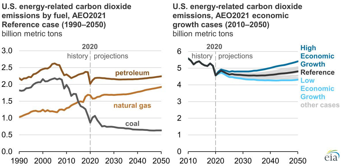
EIA projects that U.S. energy-related CO2 emissions will increase in the latter years of the projection as a result of increasing economic growth that leads to growing industrial energy requirements. EIA projects energy use in transportation will increase as vehicle fuel efficiency plateaus in the mid-2020s and becomes outweighed by increases in vehicle travel demand.
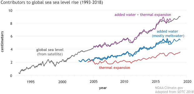
The Climage.gov article Climate Change: Global Sea Level by Rebecca Lindsey (1/25/2021) provides a nice overview of rising sea levels. It is easy to forget that thermal expansion of water is a significant contributor to sea level rise.
Global mean sea level has risen about 8–9 inches (21–24 centimeters) since 1880, with about a third of that coming in just the last two and a half decades. The rising water level is mostly due to a combination of meltwater from glaciers and ice sheets and thermal expansion of seawater as it warms.
To estimate how much of the observed sea level rise is due to thermal expansion, scientists measure sea surface temperature using moored and drifting buoys, satellites, and water samples collected by ships. Temperatures in the upper half of the ocean are measured by a global fleet of aquatic robots. Deeper temperatures are measured by instruments lowered from oceanographic research ships.
To estimate how much of the increase in sea level is due to actual mass transfer—the movement of water from land to ocean—scientists rely on a combination of direct measurements of melt rate and glacier elevation made during field surveys, and satellite-based measurements of tiny shifts in Earth’s gravity field. When water shifts from land to ocean, the increase in mass increases the strength of gravity over oceans by a small amount. From these gravity shifts, scientists estimate the amount of added water.
The are other graphs in the article and links to data (note the link at the end of the article).
The combined global average temperature over the land and ocean surfaces for November 2020 was 0.97°C (1.75°F) above the 20th century average of 12.9°C (55.2°F). This was the second warmest November in the 141-year global record, behind the record warm November set in 2015 (+1.01°C / +1.82°F).
Some highlights:
According to NCEI’s regional analysis, Oceania had its warmest November on record, with a temperature departure from average of +2.06°C (+3.71°F). This value shattered the previous record of 1.85°C (3.33°F) by 0.21°C (0.38°F).
Australia had its warmest November in the nation’s 111-year record with a national mean temperature departure of +2.47°C (+4.45°F). This surpassed the now second highest November temperature set in 2014 by 0.40°C (0.72°F).
So far this year:
The January–November 2020 global temperature was the second highest on record at 1.00°C (1.80°F) above average and only 0.01°C (0.02°F) shy of tying the record set in 2016. According to NCEI’s Annual Rankings Outlook, there is a 54% chance of 2020 ending as the warmest year on record.
Time series data is available near the top of the page.
From the NOAA Global Climate Report – October 2020:
The October 2020 global land and ocean surface temperature was the fourth highest for October since global records began in 1880 at 0.85°C (1.53°F) above the 20th century average of 14.0°C (57.1°F). Only Octobers of 2015 (+1.03°C / +1.85°F), 2019 (+0.95°C / +1.71°F), and 2018 (+0.93°C / +1.67°F) were warmer. The ten warmest Octobers have occurred since 2005, while the seven highest October temperature departures from average have occurred in the last seven years (2014–2020). October 2020 also marks the 44th consecutive October and the 430th consecutive month with temperatures, at least nominally, above the 20th century average.
Europe was warm:
According to NCEI’s regional analysis, Europe had its warmest October on record, with a temperature departure of +2.17°C (+3.91°F). This surpassed the previous record set in 2001 by 0.06°C (0.11°F).
For the year so far:
Averaged as a whole, this was the second warmest January–October for global land and ocean, with a temperature departure at 1.0°C (1.8°F) above the 20th century average. This value is only 0.03°C (0.05°F) shy of tying the record set in January–October 2016. According to our Global Annual Temperature Rankings Outlook, the year 2020 is very likely to rank among the three warmest years on record.
The data is available in the additional resources box near the top of the page.
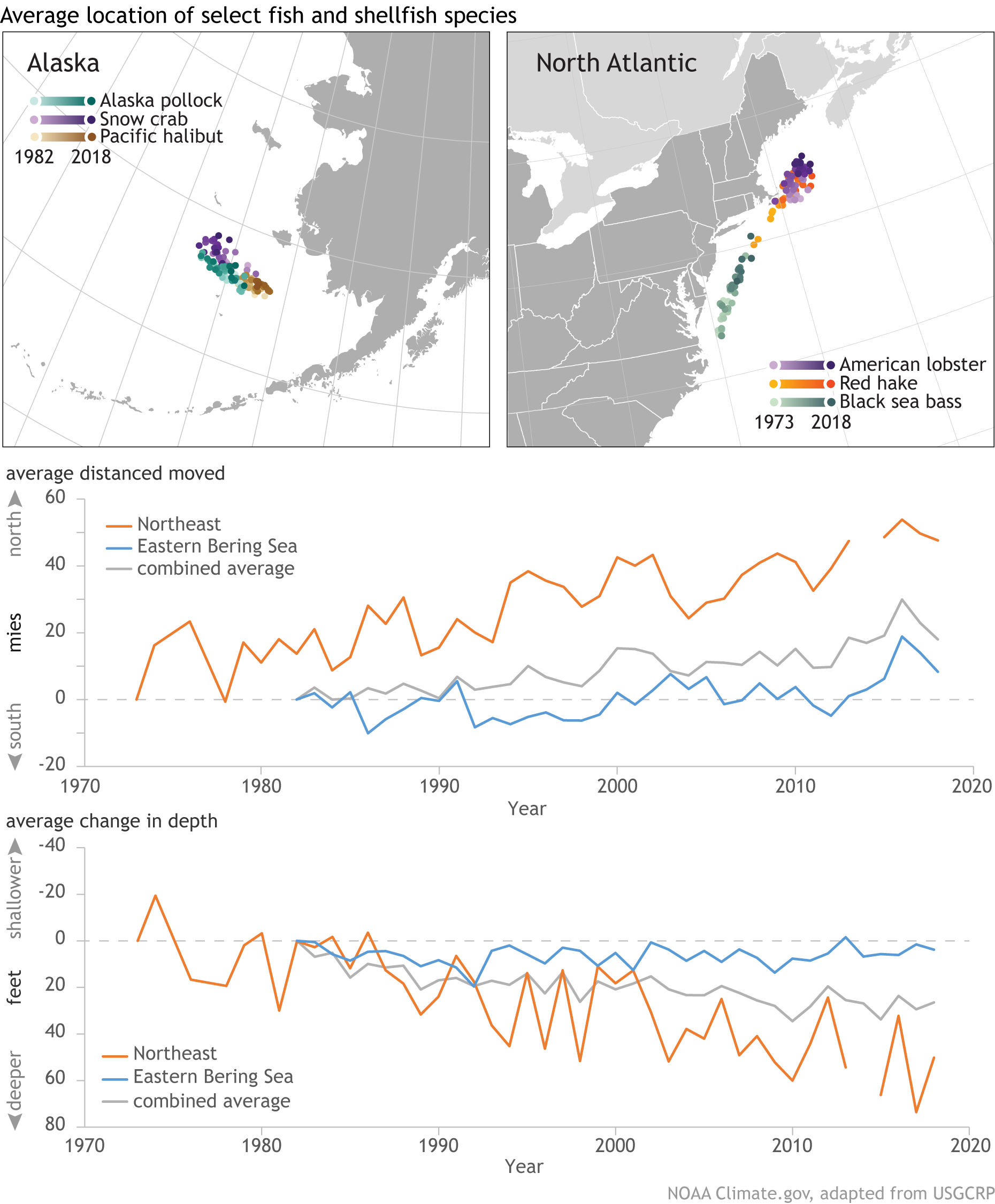
The graphs show the annual change in latitude and depth of 140 marine species along the northeastern U.S. coast and in the eastern Bering Sea. Changes in geographic distribution have been aggregated across all 140 species. In waters off the Northeast, fish and shellfish are moving northward at a significant rate; in the eastern Bering Sea, they are still shifting northward but at a lesser rate. Likewise, marine species in both regions are moving to deeper waters, but the rate of change in depth is especially high along the northeastern coast.
 NOAA has this data on the 1991-2020 U.S. Climate Normals Quick Access page.