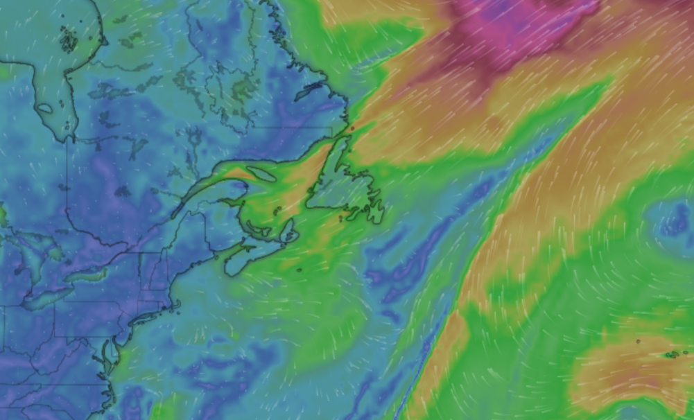
Curious about current wind patterns around the globe? Check out Windy.com. This is one of those posts that I’m not sure how to use it in a math class, but the website is so cool I’m posting about it. The graph here is a still image but the wind currents are shown moving in real time on the webpage. NOAA’s Climage.gov page Windy has suggestions on how to use the page in classrooms. Take a look, really, and leave a comment if you have a thought on how to use this in a math classroom.
How many billion dollar disasters in 2021?
 The NOAA Billion-Dollar Weather and Climate Disasters page keeps track of these events.
During 2021, there were 20 separate billion-dollar weather and climate disaster events across the United States. The total cost from these events of 2021 was $145.0 billion and is the third most costly year on record, behind 2017 and 2005. The total costs for the last five years ($742.1 billion) is more than one-third of the disaster cost total of the last 42-years (1980-2021), which exceeds $2.155 trillion (inflation-adjusted to 2021 dollars). This reflects a 5-year cost average of nearly $148.4 billion/year — a new record — as shown above by the black line.
The chart copied here is interactive on their page and has lots of information. You can also select a state or region and get a similar chart. Data can be downloaded.
What are the trends in drug overdose deaths?
 The Pew article Recent surge in U.S. drug overdose deaths has hit Black men the hardest by John Gramlich (1/19/2022) provides the graph copied here.
Nearly 92,000 Americans died of drug overdoses in 2020, marking a 30% increase from the year before, a 75% increase over five years and by far the highest annual total on record, according to the Centers for Disease Control and Prevention (CDC). Preliminary figures suggest that the 2021 death toll from overdoses may be even higher.
Overall
While overdose deaths in the U.S. were on the rise long before the outbreak of COVID-19 in March 2020, such fatalities have accelerated during the pandemic, the CDC has noted.
Nationwide, the monthly number of drug overdose deaths had never exceeded 6,500 before March 2020. Between March and December 2020, there were more than 7,100 such deaths each month, including nearly 9,400 in May 2020 alone.
There does not appear to be direct links to the data but there is plenty of quantitative info in the article.
Who’s been vaccinated?
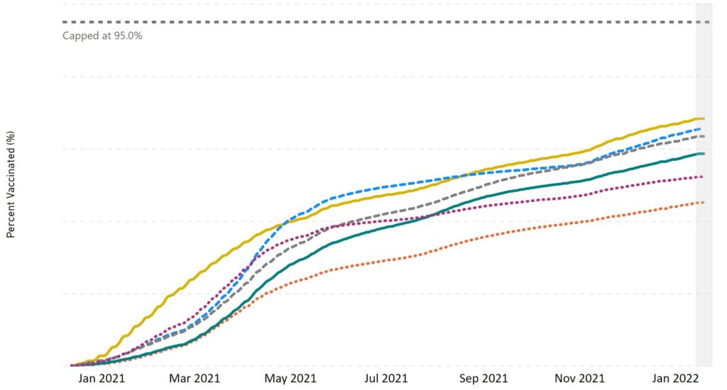
If you want data on vaccinated status the CDC page Demographic Trends of People Receiving COVID-19 Vaccination in the United States is a place to go. For example, one graph from their page is copied here and includes at least one dose by Race/Ethnicity. The graph are designed for interactivity so you don’t see categories and percent without placing a mouse pointer over the graph. Curious about the categories, then click the link.
What is interesting is they have administered data, the graph here, but also results from survey data. They aren’t the same. This seems like something to discuss or study in a stats or QL course. There are multiple interactive graphs and plenty of quantitative information.
How hot was 2021, ENSO version?
From NOAA’s Global Climate Report – Annual 2021:
The year 2021 began with an episode of cold phase El Niño Southern Oscillation (ENSO) episode, also known as La Niña, across the central and eastern tropical Pacific Ocean, which had developed in August 2020. As seen in the graph below, ENSO can have an effect on global temperatures. La Niña episodes tend to cool global temperatures slightly, while the warm phase ENSO (also known as El Niño) tends to boost global temperatures. Although the monthly global temperatures were above average throughout the year, February 2021 was the coldest month of 2021 for the globe. The global temperature departure for February 2021 was +0.64°C (+1.15°F) — the coolest February since 2014. However, after the month of February, temperatures were at 0.80°C (1.44°F) or higher for the remaining months of 2021.
The net result:
The year culminated as the sixth warmest year on record for the globe with a temperature that was 0.84°C (1.51°F) above the 20th century average. The years 2013–2021 all rank among the ten warmest years on record.
Time series data available at the top. ENSO status data must be somewhere but there doesn’t appear to be a link; just the graph.
How hot was Dec 2021?
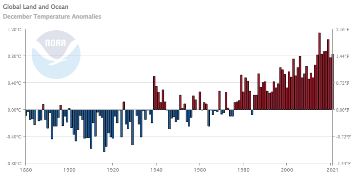 From NOAA’s Global Climate Report – December 2021:
The December 2021 global surface temperature tied with 2016 as the fifth highest in the 142-year record at 0.83°C (1.49°F) above the 20th century average. Eight of the 10 warmest Decembers have occurred since 2014. December 2021 also marked the 37th consecutive December and the 444th consecutive month with temperatures, at least nominally, above the 20th century average.
Regionally?
During the month of December, the most notable warm temperature departures were present across much of the contiguous U.S. and across parts of eastern Canada, northern Mexico, and southern Asia, where temperatures were at least 2.5°C (4.5°F) above average. Record-warm December temperatures were present across a large area of the southwestern Pacific Ocean and small areas across North America, South America, Africa, Asia, and the Atlantic Ocean. Meanwhile, the most notable cool temperatures were observed across the western half of Canada and across parts of Scandinavia and northern Russia. However, no land or ocean areas had a record-cold December temperature.
Time series data is available at the top of the page.
What are the four most populated countries?
The U.S. Census Bureau post U.S. Population Estimated at 332,403,650 on Jan 1, 2022 by Derick Moore (12/30/2021) is a nice summary of the U.S. population. At the bottom there is an interesting graph with, maybe, some surprises. The first is that India is expected to overtake China around 2025. Second is that Nigeria is expected to pull into third place in the 2040s.
How quickly is U.S. population growing?
In January 2022, the United States is expected to experience a birth every nine seconds and one death every 11 seconds. Meanwhile, net international migration is expected to add one person to the U.S. population every 130 seconds.
The combination of births, deaths and net international migration increases the U.S. population by one person every 40 seconds.
Plenty of QL info in the article and links to various clocks, dashboards and data.
Has Lake Mead Risen?
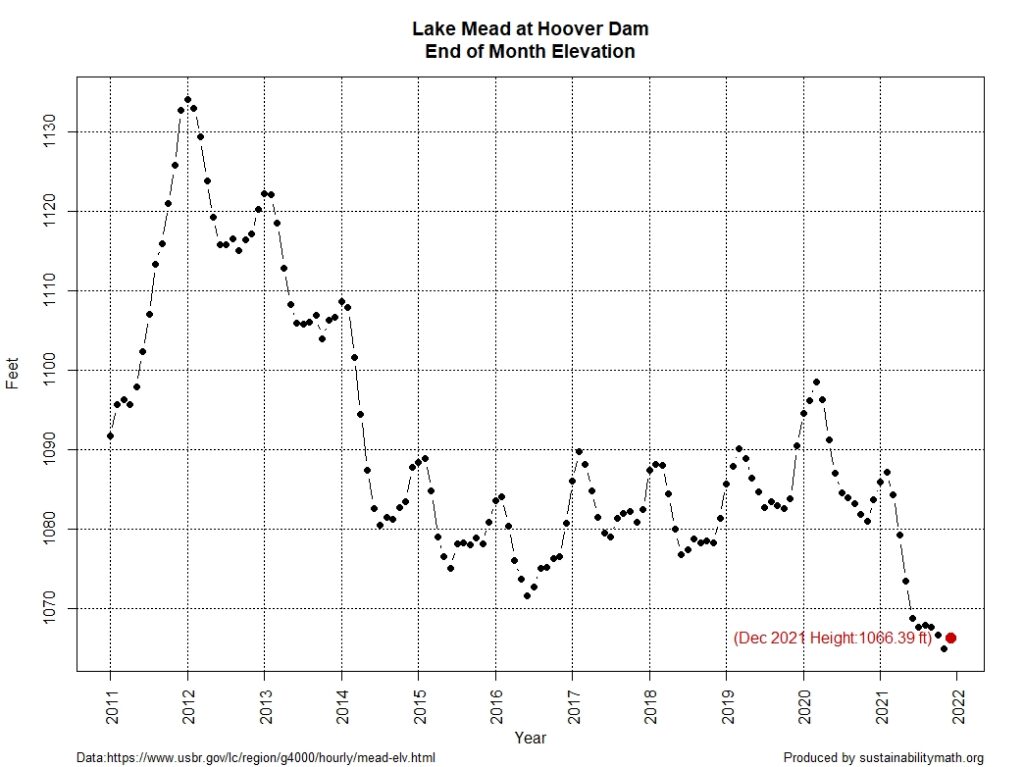
Despite some drought relief out west (see U.S. Drought Monitor , still drought but generally less severe) Lake Mead has made little improvement. The graph here is from the data on the Lake Mead at Hoover Dam, End of Month Elevation (feet) page by the Bureau of Reclamation.
The Sept Lake Mead post and the July Lake Mead post, which has a link to the R code for the graph.
What is the Global Climate Dashboard?
 Climate.gov has put together a dashboard: Global Climate Dashboard – Tracking climate change and natural variability over time. The dashboard has graphs and information for greenhouse gases, arctic sea ice carbon dioxide, mountain glaciers, ocean heat, sea level, spring snow, incoming sunlight, and surface temperature under climate change (there are others under Natural Variability). This provides a nice one stop shopping for time series graphs for these variables.
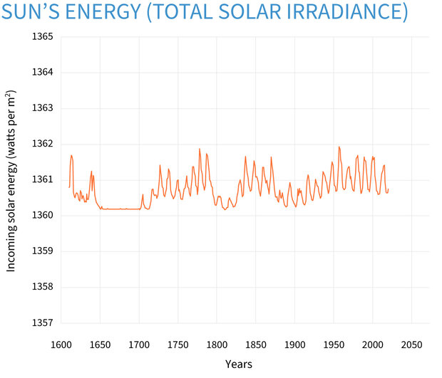
For example, copied here is the graph for incoming sunlight:
Averaged over the complete solar cycle, there’s been minimal long-term change in the Sun’s overall brightness since the start of the Industrial Revolution. Records of sunspots show increased solar activity during the first 7 decades of the 20th century, likely tied to the peak of the last 100-year Gleissberg Cycle. Following that peak around 1960, solar activity declined. In fact, activity during the most recent solar cycle is among the lowest in a century. Meanwhile, the rate of global warming has accelerated over the past few decades.
Each variable is linked to a page with detailed information about the given variable. There don’t appear to be direct links to data but there are plenty of graphs.
How much has the Ocean warmed?
 Climate.gov provides an updated on ocean heat in the Climate Change: Ocean Heat Content article by Luann Dahlman and Rebecca Lindsey (updated 10/12/2021):
Averaged over Earth’s surface, the 1993–2020 heat-gain rates were 0.37–0.41 Watts per square meter for depths from 0–700 meters (down to 0.4 miles), depending on which research group’s analysis you consult. Meanwhile, heat gain rates were 0.15–0.31 Watts per square meter for depths of 700–2,000 meters (0.4–1.2 miles). For depths between 2000–6000 meters (1.2–3.7 miles), the estimated increase was 0.06 Watts per square meter for the period from June 1992 to July 2011. According to the State of the Climate 2019 report, “Summing the three layers (despite their slightly different time periods as given above), the full-depth ocean heat gain rate ranges from 0.58 to 0.78 W m-2 applied to Earth’s entire surface.”
The article has helpful short summaries on how heat moves and measuring ocean heat. They link to Global Ocean Heat and Salt Content: Seasonal, Yearly, and Pentadal Fields for the data.
