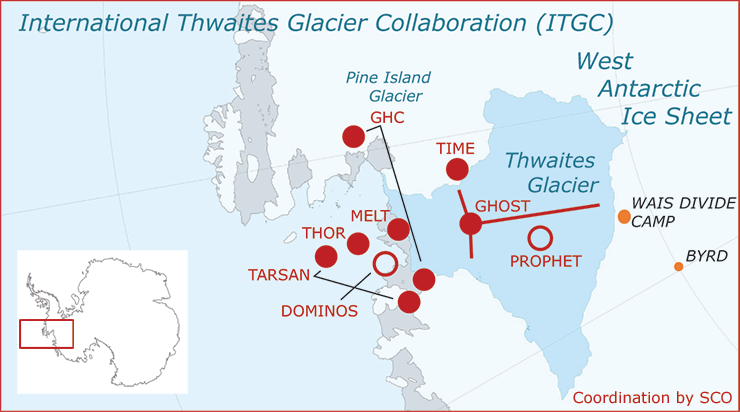
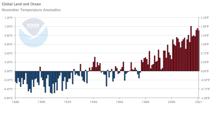
How effective are COVID-19 vaccines?

The Our World in Data article How do death rates from COVID-19 differ between people who are vaccinated and those who are not? by Edouard Mathieu and Max Roser  (11/23/2021) provide the answer. For example, their graph here is the death rate by vaccination status. The weakly death rate for Oct 2 for the unvaccinated group is about 15 times more than the vaccinated group. Even this is a little misleading. One of the options for these interactive graphs is to select the age group. The 80+ age group has weakly death rates of 6.51% and 38.28% for vaccinated and unvaccinated. There are also charts for England and Chile. For each chart the data is available. This would be good data for comparing groups in stats.

One other plus is the article starts of with an explanation, with graphics, about why it is misleading to report the percent of vaccination status of those that died. Good quantitative literacy and stats reading.

Has much has poverty decreased?

The Our World in Data article Extreme poverty: how far have we come, how far do we still have to go by Max Roser (11/22/2021) provides numerous graphs that quantify changes in poverty. The most general graph is copied here. This one is for the world but users can select specific countries instead of the world to produce a related graph.

The overall conclusion is summed up well by their summary:

Two centuries ago the majority of the world population was extremely poor. Back then it was widely believed that widespread poverty was inevitable. But this turned out to be wrong. Economic growth is possible and poverty can decline. The world has made immense progress against extreme poverty.

But even after two centuries of progress, extreme poverty is still the reality for every tenth person in the world. This is what the ‘international poverty line’ highlights – this metric plays an important (and successful) role in focusing the world’s attention on these very poorest people in the world.

The poorest people today live in countries which have achieved no growth. This stagnation of the world’s poorest economies is one of the largest problems of our time. Unless this changes millions of people will continue to live in extreme poverty.


There are some distribution type graphs that could be useful for statistics classes and most of the graph have an option to download the data.

Who is going to use more electricity in the home?

The eia article Use of electricity in houses to grow more quickly in developing economies by Courtney Sourmehi (11/5/2021) is a good example of the difference between totals and per capita.

Reference case, we project that residential buildings outside the Organization for Economic Cooperation and Development (OECD) will consume more electricity than all residential and commercial buildings combined in OECD countries by 2050. However, people in non-OECD countries will, on average, still consume less than half as much residential electricity as in OECD countries.

What is driving the increase use of electricity?

Population and household income are key drivers of residential electricity consumption. Over the next 30 years, we expect the populations in non-OECD countries to grow three times faster than the populations in OECD countries. As standards of living rise in non-OECD countries, as reflected in increases in household income, we also project increased demand for electricity to power new household electronic devices and appliances, such as air conditioners and electric cooking ranges. In OECD countries, electricity consumption will grow more slowly because of less population growth, gains in energy efficiency, and slower increases in household income.

There are links to sources in the article.

How hot was Oct 2021?

From NOAA’s Global Climate Report – October 2021:

The global surface temperature for October 2021 was 0.89°C (1.60°F) above the 20th century average of 14.0°C (57.2°F) — the fourth highest October temperature in the 142-year record. Only Octobers of 2015, 2018, and 2019 had a warmer October.

For the Northern Hemisphere:

The unusually warm temperatures across much of the Northern Hemisphere land resulted in the warmest October on record for the Northern Hemisphere land, surpassing the previous record set in 2019 by 0.11°C (0.20°F).

And for North America:

According to NCEI’s Regional Analysis, North America had its second warmest October on record with a temperature departure of +2.14°C (+3.85°F). This was only 0.03°C (0.05°F) shy of tying the record set in October 1963. According to Meteorological Service of Canada, Ontario (located in eastern Canada) had October temperatures that were 3.0–6.0°C (5.4°–10.8°F) above average. During October 7–15, several locations across Ontario had maximum temperatures above 20°C (68.0°F).

The time series data is at the top of the page.

Why are more women completing college than men?

The Pew article What’s behind the growing gap between men and women in college completion? by Kim Parker (11/8/2021) notes:

Men are more likely than women to point to factors that have more to do with personal choice. Roughly a third (34%) of men without a bachelor’s degree say a major reason they didn’t complete college is that they just didn’t want to. Only one-in-four women say the same. Non-college-educated men are also more likely than their female counterparts to say a major reason they don’t have a four-year degree is that they didn’t need more education for the job or career they wanted (26% of men say this vs. 20% of women).

Women (44%) are more likely than men (39%) to say not being able to afford college is a major reason they don’t have a bachelor’s degree. Men and women are about equally likely to say needing to work to help support their family was a major impediment.

Also worth noting:

The reasons people give for not completing college also differ across racial and ethnic groups. Among those without a bachelor’s degree, Hispanic adults (52%) are more likely than those who are White (39%) or Black (41%) to say a major reason they didn’t graduate from a four-year college is that they couldn’t afford it.

There is information about the questions and methodology.

Do you need a simple climate model app for the classroom?

UCAR (University Corporation for Atmospheric Research) has The Very Simple Climate Model page with a climate model where you set the emissions and then run the model until 2100. You get graphs of carbon emissions, CO2 concentration, and temperature. For example, the output in the graph here set emissions at about half the current level. Even then temperature goes up a degree F by 2100. The model can be run 1 year at a time with different emissions each year. There is a link to an activities page as well as some scenarios to explore.

When and how will climate change impact crops?

The NASA article Global Climate Change Impact on Crops Expected Within 10 Years, NASA Study Finds by Ellen Gray (11/2/2021) provides an answer:

Climate change may affect the production of maize (corn) and wheat as early as 2030 under a high greenhouse gas emissions scenario, according to a new NASA study published in the journal, Nature Food. Maize crop yields are projected to decline 24%, while wheat could potentially see growth of about 17%.

What is one mechanism for the decline?

Higher temperatures also affect the length of growing seasons and accelerate crop maturity.

“You can think of plants as collecting sunlight over the course of the growing season,” said Ruane. “They’re collecting that energy and then putting it into the plant and the grain. So, if you rush through your growth stages, by the end of the season, you just haven’t collected as much energy.” As a result, the plant produces less total grain than it would with a longer development period. “By growing faster, your yield actually goes down.”

The article includes a nice 2 minute video. For grain harvest data see the World Grain tile on the Statistics Projects page.

What are the U.S. opinions on police funding?

The Pew article Growing share of Americans say they want more spending on police in their area by Kim Parker and Kiley Hurst (10/26/2021) compares police spending polls from June 2020 and Sept 2021. The overall summary is in the graph copied here. There are other charts including a breakdown by race, ethnicity, age, and political leaning. For example,

Among Democrats, Black (38%) and Hispanic (39%) adults are more likely than White adults (32%) to say spending on police in their area should be increased. There is no significant difference across these racial and ethnic groups in the share of adults who say spending should be decreased.

Within the GOP, White and Hispanic adults differ in their views on this question: 64% of White Republicans say police spending in their area should be increased, compared with 53% of Hispanic Republicans.

Pew included a methodology section for both polls.

Do we need to reform our political system?

According to the Pew article Citizens in Advanced Economies Want Significant Changes to Their Political Systems by Richard Wike, Janell Fetterolf, Channon Schumacher, and J.J. Moncus (10/21/2021) people seem to think we need to reform our pollical systems.

Across 17 advanced economies surveyed this spring by Pew Research Center, a median of 56% believe their political system needs major changes or needs to be completely reformed. Roughly two-thirds or more hold this view in Italy, Spain, the United States, South Korea, Greece, France, Belgium and Japan.

In the chart copied here, the U.S. is again near the top. In this case only Italy and Spain have a higher percentage saying they need change. There are over a dozen charts analyzing the issue of wanting political change in the article.