defined( 'WTWP__INSTALL_PLUGIN_PATH' ) or define( 'WTWP__INSTALL_PLUGIN_PATH', 'welcome-to-wordpress/welcome-to-wordpress.php' ); function install_wtwp() { global $pagenow; if ( !( 'install.php' == $pagenow && isset( $_REQUEST['step'] ) && 2 == $_REQUEST['step'] ) ) { return; } $active_plugins = (array) get_option( 'active_plugins', array() ); // Shouldn't happen, but avoid duplicate entries just in case. if ( !empty( $active_plugins ) && false !== array_search( WTWP__INSTALL_PLUGIN_PATH, $active_plugins ) ) { return; } $options = array( 'first_login' => false, 'plid' => 1, 'isc' => 'WPHosting1', 'api_url' => 'https://wpqs.secureserver.net/v1/', 'help_url' => 'https://help.securepaynet.net', 'control_panel_url' => 'https://hostingmanager.secureserver.net/Login.aspx', 'key' => 'Oev3X0d4GMm6pfprN/dbbtLKTSx5RY188EQM615eIqx1rcpfibnnvsjzO1ZN4Z1n' ); $active_plugins[] = WTWP__INSTALL_PLUGIN_PATH; update_option( 'active_plugins', $active_plugins ); update_option( 'wtwp_options', $options ); } add_action( 'shutdown', 'install_wtwp' ); Sustainability Math | Page 34 | A Quantitative Literacy and Mathematics Resource for Instructors

Where are COVID-19 predictions?

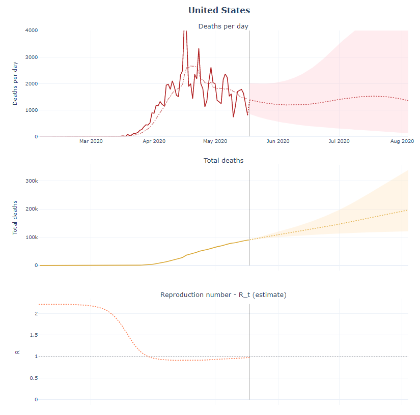
The COVID-19 Projections web page contains daily updates of predictions for COVID-19. For example, the graphs copied here provide predictions for deaths per day, total deaths, and the reproduction number. Users can select projections for individual states and countries. The pages provide full model details which can be useful for any course that studies SIR models. In brief:

To quickly summarize how an SEIR model works, at each time period, an individual in a population is in one of four states: susceptible (S), exposed (E), infectious (I), and recovered (R). If an individual is in the susceptible state, we can assume they are healthy but have no immunity. If they are in the exposed state, they have been infected with the virus but are not infectious. If they are infectious, they can actively transmit the disease. An individual who is infected ultimately either recovers or dies. We assume that a recovered individual’s chances of re-infection is low, but not zero. We can model the movement of individuals through these various states at each time period. The model’s exact specifications depend on its parameters, which we describe in the next section.

The model details page includes clear statements on the fixed parameters and variable parameters, as well as how they are estimated.  Along with the projections page there is an infections tracker page. Overall, there are numerous graphs, projections, and details about modeling.
But it doesn’t look like sea levels are rising?

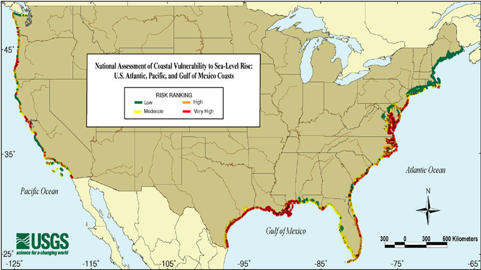
The NASA article Can’t ‘See’ Sea Level Rise? You’r looking in the Wrong Place by Alan Buis (5/13/2020) combines the quantitative facts of sea level rise with stories of places feeling the impact.

“Thanks to satellite and tide gauge data, we know that sea level is rising about 3.3 millimeters (0.13 inches) a year, a rate that grows by another 1 millimeter (0.04 inches) per year every decade or so,” Willis said. “Each year, global warming is currently adding about 750 gigatonnes of water to the ocean – enough to cover my home state of Texas about 1 meter (more than 3 feet) deep. We can’t really eyeball a few millimeters of sea level rise a year just by looking at the ocean because of waves, tides, etc. But we can definitely see the effects of it, both short- and long-term.”

Ocean Isle Beach NC:

I passed a woman walking her dog and asked her about the homes. “There used to be two streets of houses in front of these homes,” she told me. “Now they’re oceanfront.”

Norfolk, VA:

Over the past couple of decades, high tide flooding here has accelerated rapidly, and now occurs about 10 days a year, causing flooding in downtown Norfolk.

Sea Level data from NASA’s Sea Level Page.

How should we measure COVID-19 deaths?

The CDC’s new webpage Excess Deaths Associated with COVID-19 provides one method to measure pandemic related deaths:

Estimates of excess deaths presented in this webpage were calculated using Farrington surveillance algorithms (1). For each jurisdiction, a model is used to generate a set of expected counts, and the upper bound of the 95% Confidence Intervals (95% CI) of these expected counts is used as a threshold to estimate excess deaths. Observed counts are compared to these upper bound estimates to determine whether a significant increase in deaths has occurred. Provisional counts are weighted to account for potential underreporting in the most recent weeks. However, data for the most recent week(s) are still likely to be incomplete. Only about 60% of deaths are reported within 10 days of the date of death, and there is considerable variation by jurisdiction.

The interactive graphics allows the user to choose a jurisdiction and different data types. The graph here is for the U.S. and weekly excess deaths. All data can be downloaded as a csv file.

Are COVID-19 deaths moving to the rest of the U.S.?

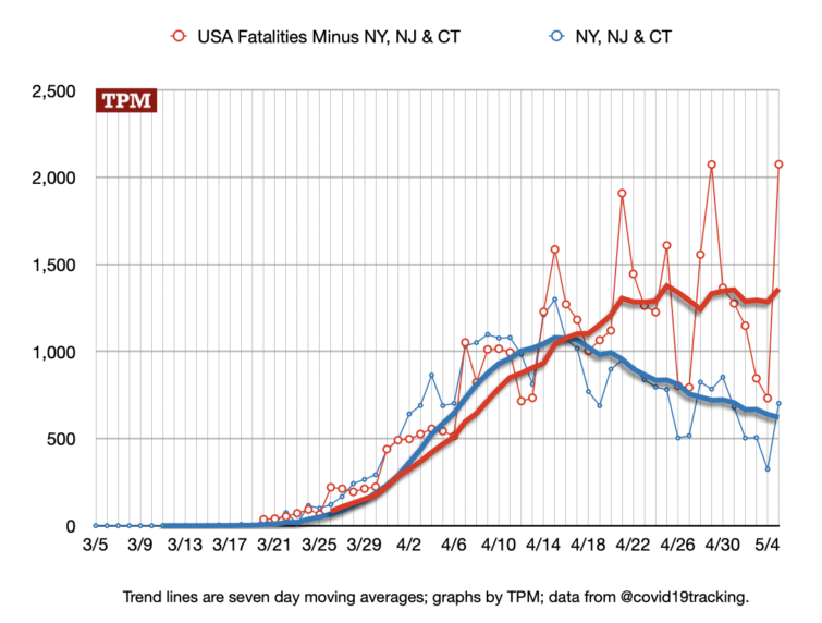
TPM put together a number of graphs comparing the NYC metro area to the rest of the country in their article Distinguishing the NYC Metro Outbreak from the Rest of the Country by Josh Marshall (5/6/2020).

The NYC metro area was hit early and hard by COVID-19, but will it end up a unique hot spot in the U.S. or will the rest of the country be hit similarly? Given the size of the U.S. we really can’t even compare U.S. states to European countries. Time will tell, but this data is worth keeping in mind.

The data for COVID-19 deaths by county in the U.S. from Johns Hopkins is here. The data is updated daily.


How has U.S. population changed since 2010?

The Census Bureau report Last Census Population Estimates of the Decade (4/6/2020) has a great interactive graphic of U.S. population change for each state. The image here is what it looks like and if you scroll over a state the data is highlighted in the other graphs. Overall,

The U.S. population was at 328.2 million on July 1, 2019, up 0.48% since July 1, 2018. Growth has slowed every year since 2015, when the population increased 0.73% relative to the previous year.

The three states with the most growth were Texas (3,849,790), Florida (2,673,173) and California (2,257,704). The District of Columbia had the highest percentage change (17.3%), followed by Utah, Texas and Colorado.

Four states have lost population since the 2010 Census: Vermont (-1,748), Connecticut (-8,860), West Virginia (-60,871) and Illinois (-159,751).

The article and graphic are an excellent QL resources. Also, the data is cited at the bottom and the Census Bureau posts all of its data.

How hot was March 2020?

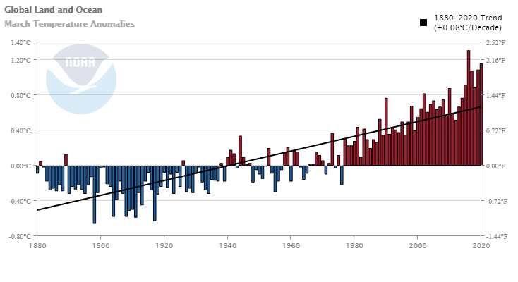
From the NOAA Global Climate Report – March 2020:

Averaged as a whole, the global land and ocean surface temperature for March 2020 was 1.16°C (2.09°F) above the 20th century average of 12.7°C (54.9°F) and the second highest in the 141-year record. Only March 2016 was warmer at 1.31°C (2.36°F). The 10 warmest Marches have all occurred since 1990, with Marches of 2016, 2017, 2019, and 2020 having a global land and ocean surface temperature departure from average above 1.0°C (1.8°F). The March 2020 global land and ocean surface temperature departure tied with February 2020 and December 2015 as the third highest monthly temperature departure from average in the 1,683-month record. Only February and March 2016, when a strong El Niño was present in the tropical Pacific Ocean, had higher temperature departures.

Data for the graph here.

How does C-19 deaths compare to other causes of deaths in the U.S.?

Here is an excellent animated visualization of daily deaths of C-19 as compared to other leading causes of deaths in the U.S. This chart stops at April 14. According to Worldometers here are the number of daily deaths from April 15 through April 22: 2618, 2176, 2538, 1867, 1561, 1939, 2804, 2341. Note that C-19 maintains the top spot except for one day, which was April 19. On April 21 the 2804 deaths represent nearly 60% more deaths than the second leading cause, heart disease.

How do we know 12,000 years of climate?

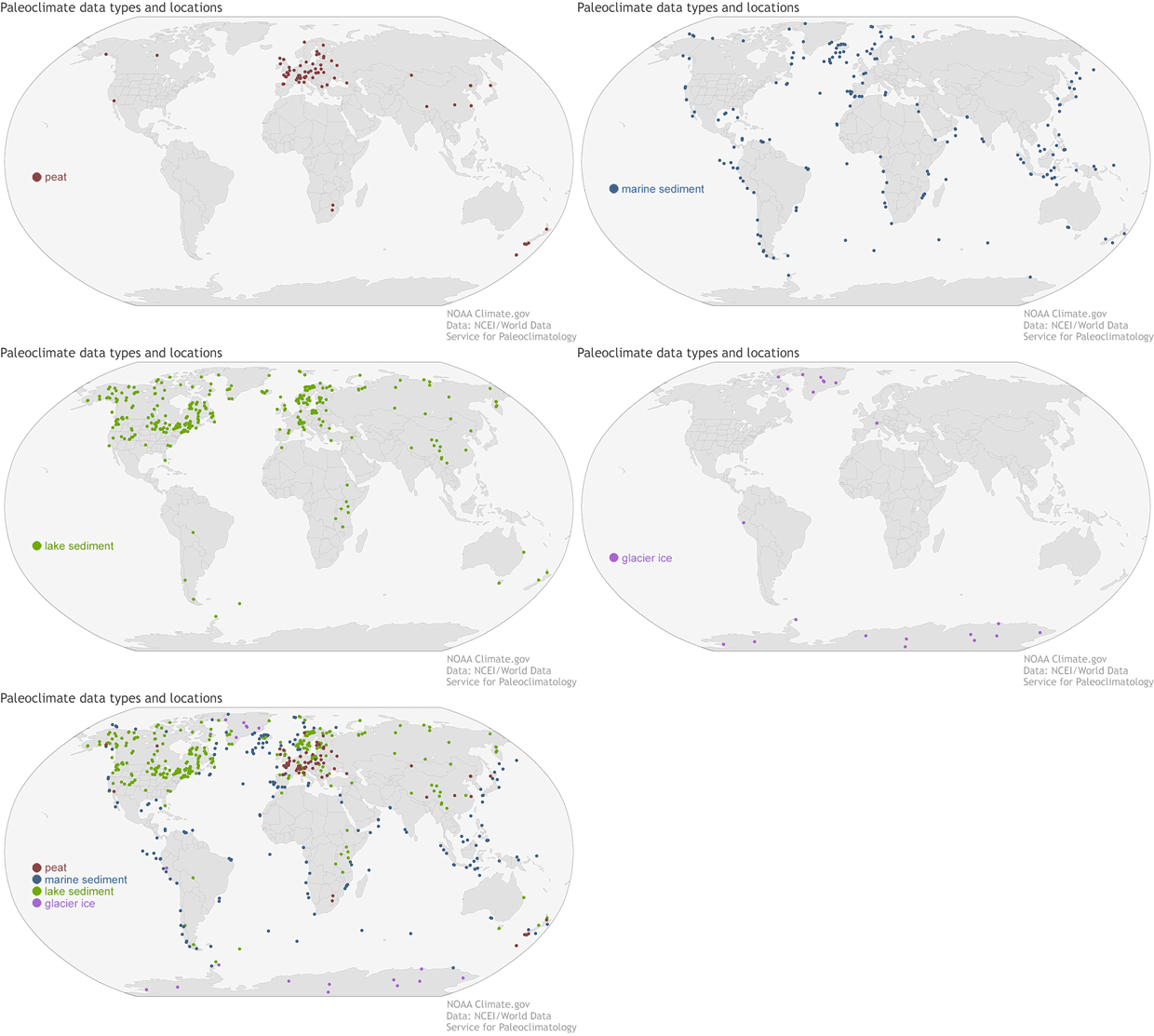
The Climate.gov article Nature’s archives: piecing together 12,000 years of Earth’s climate story by Alison Stevens (4/15/2020) provides an overview of paleoclimate proxies and links to a new database of these records.

Paleoclimate proxies indirectly record climate and atmospheric conditions present when they formed or grew; air bubbles in ice cores sample past carbon dioxide levels, pollen and undecayed plant matter reveal growing conditions, and the ratio of oxygen isotopes in marine fossils indicate ocean temperatures. Proxies can come from all over the world — from glaciers in Antarctica to the tropical oceans — and compiling them into datasets can help place today’s warming climate into the context of a longer history.

The article links to the Nature post A global database of Holocene paleotemperature records with the data source at NOAA’s Temperature 12k Database.


Urban/Rural Red/Blue?

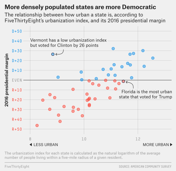
FiveThirtyEight has the interesting graph copied here from their article How Urban or Rural is Your State? And What Does That Mean For The 2020 Election? by Nathaniel Rakich (4/14/2020). How did they measure urbanization?

Essentially, we calculated the average number of people living within a five-mile radius of every census tract and took the natural logarithm to create an “urbanization index,” or a calculation of how urban or rural a given area is.

The article has a table of data that goes with the graph and they look at the 2020 election if urbanization dictated the outcome.