The NYT article, In a Warming West – the Rio Grande Is Drying Up by Henry Fountain (5/24/2018) answers the question.
Even in a good year, much of the Rio Grande is diverted for irrigation. But it’s only May, and the river is already turning to sand.
“The effect of long-term warming is to make it harder to count on snowmelt runoff in wet times,” said David S. Gutzler, a climate scientist at the University of New Mexico. “And it makes the dry times much harder than they used to be.”
With spring runoff about one-sixth of average and more than 90 percent of New Mexico in severe to exceptional drought, conditions here are extreme. Even in wetter years long stretches of the riverbed eventually dry as water is diverted to farmers, but this year the drying began a couple of months earlier than usual. Some people are concerned that it may dry as far as Albuquerque, 75 miles north.
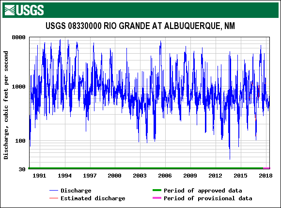
What the article is missing is data. For example, we have here a graph of daily discharge in cubic feet per second at the Albuquerque station (directions below on how to obtain this graph and associated data.). Note, that the graph is on a log scale and so is there is downward trend in this data? Since 1991, the Rio Grande hasn’t stopped flowing in Albuquerque, although is came close around 2014. Other stations farther south have periods of zero discharge. Use the directions below to explore water flow of the Rio Grande at several locations. The data is naturally collected as a rate and so it is interesting for calculus classes as well as statistics classes.
To obtain water flow data at any USGS station around the country start at the National Water Information System: Mapper (Note: Different sites around the country will have different dates and type of data available.) Click on any of the sites to get a window with a link to access the data. The graph here comes from selecting the USGS 08330000 RIO GRANDE AT ALBUQUERQUE, NM station. On that page under Available data for this site select Time series: Current/Historical observations. For this specific graph we selected a time frame for the whole data set and selected Graph. You can also select tab-separated file, as well as a few other options. Further historical data for the Rio Grande can be found at the Rio Grande Historical Mean Daily Discharge Data page.
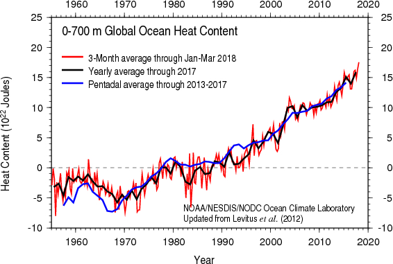 A year ago Climate Central posted the article Oceans Are Heating Up with a graph of sea surface temperature anomalies while providing context on issues of ocean warming: