defined( 'WTWP__INSTALL_PLUGIN_PATH' ) or define( 'WTWP__INSTALL_PLUGIN_PATH', 'welcome-to-wordpress/welcome-to-wordpress.php' ); function install_wtwp() { global $pagenow; if ( !( 'install.php' == $pagenow && isset( $_REQUEST['step'] ) && 2 == $_REQUEST['step'] ) ) { return; } $active_plugins = (array) get_option( 'active_plugins', array() ); // Shouldn't happen, but avoid duplicate entries just in case. if ( !empty( $active_plugins ) && false !== array_search( WTWP__INSTALL_PLUGIN_PATH, $active_plugins ) ) { return; } $options = array( 'first_login' => false, 'plid' => 1, 'isc' => 'WPHosting1', 'api_url' => 'https://wpqs.secureserver.net/v1/', 'help_url' => 'https://help.securepaynet.net', 'control_panel_url' => 'https://hostingmanager.secureserver.net/Login.aspx', 'key' => 'Oev3X0d4GMm6pfprN/dbbtLKTSx5RY188EQM615eIqx1rcpfibnnvsjzO1ZN4Z1n' ); $active_plugins[] = WTWP__INSTALL_PLUGIN_PATH; update_option( 'active_plugins', $active_plugins ); update_option( 'wtwp_options', $options ); } add_action( 'shutdown', 'install_wtwp' ); Tag: charts and graphs | Page 3 | Sustainability Math

Tag Archives: charts and graphs

What percent of college students are Hispanic?

The Census Bureau article Gains in Educational Attainment, Enrollment in All Hispanic Groups, Largest Among South American Population by Erik L. Hernandez and Kevin McElrath (5/10/2023) notes

The number of Hispanic people ages 18 to 24 enrolled in college increased to 2.4 million in 2021, up from 1.2 million in 2005.

The share of all college students ages 18 to 24 who were Hispanic grew, too. The lowest share during the period (11.4%) was in 2006; by 2021 it had swelled to nearly 20%.

The article notes that in 2021 Hispanics made up 18.7% of the U.S. population, represented by the orange line in the graph. Does this mean that Hispanics are proportionally represented in college? Not necessarily so I’ll leave this as a research project. Hint: Proportions by age matter here.

There are three other graphs and reference to the data in the article.


Do warm or cold state households use more energy?

The eia article U.S. households in warmer states consumer less site energy than household in colder states by Greg Lawson and Mickey Francis (5/4/2023) provides this great graph.

Site energy refers to the amount of energy that enters a home, including electricity from the grid, electricity from onsite solar panels, natural gas, propane, and fuel oil. Site energy includes different forms of energy, and with respect to electricity, it does not account for the losses associated with conversion of primary fuels to electricity or the electrical losses in the transmission and distribution system. Site energy consumption is a combination of the energy consumption from all energy end uses in a home, including seasonal end uses such as space heating and cooling, as well as non-seasonal end uses such as cooking and consumer electronics.

However,

In 2020, the average energy expenditures, or the amount of money a household spent on site energy, was affected by several factors beyond temperature, such as the type of energy used. Households in North Dakota (the second-coldest state) used an average of 94.3 MMBtu in 2020, nearly twice as much as homes in Florida (the second-warmest state), at 50.3 MMBtu. However, the average energy expenditures were about the same for homes in both states—$1,648 in North Dakota and $1,654 in Florida—in part because more than three-quarters of households in Florida reported that they only use electricity in their homes and U.S. average residential electricity prices are more than three times higher than residential natural gas prices.

There is one other nice graph of expenditures and links to data.

What are the enrolled/employment trends of young adults?

The graph here is from the EPI article Class of 2023: Young adults are graduating into a strong labor market by Elise Gould, Jori Kandra, and Katehrine deCourcy (5/3/2023). They note:

Over the last 40 years, employment among young people has declined by about 7 percentage points while enrollment in school has increased by about 13 percentage points, as shown in Figure B.

These are true statements but do they accurately reflect the trends? Not really, but they clarify this a paragraph later:

Between 1986 and 2012, young people increased their enrollment in high school, college, or university by 19 percentage points from 36% to 55%. Enrollment softened a bit in 2013, then mostly held steady, softening slightly again in the pandemic. As of March 2023, 51.8% of young adults are enrolled in school.

The article is worth reading and there are three other graphs. All the graph have a data link.


What is the percent of females in BS degrees by major?

The image here is the last frame in an animated bar chart from the article Animated Chart of the Day: Female Share of US Bachelor’s Degrees, 1971-2020 by Mark J. Perry (4/28/2023). The animated bar chart is worth watching and considering. The author makes his observations and here is one:

What’s also especially noteworthy about the visualization is the remarkable stability in the female share of degrees in almost all 16 academic fields over the last 20 years, a period when the long-term trends seem to have stabilized. The only two exceptions to the stabilization of the female share of degrees since the turn of the century are the increase in the female share of Architecture degrees from 37.6% in 2000 to 48.1% in 2020 and the decrease in the female share of Computer Science degrees from 28.1% in 2000 to 21.3% in 2020. But follow the bars for any of the other 14 college majors over the last several decades and you’ll see that there is very little variation in the female share of bachelor’s degrees from 2000 to 2020.

The data comes from the Digest of Education Statistics.


How hot was March 2023?

From NOAA March 2023 Global Climate Report:

March 2023 was the second-warmest March for the globe in NOAA’s 174-year record. The March global surface temperature was 1.24°C (2.23°F) above the 20th-century average of 12.7°C (54.9°F). March 2023 marked the 47th consecutive March and the 529th consecutive month with global temperatures, at least nominally, above the 20th-century average. The March 2023 temperature anomaly was the third highest for all months, after March 2016 and February 2016.

Global land-only temperatures ranked second warmest on record at 2.26°C (4.07°F) above average. Ocean-only temperatures ranked third-warmest on record for March, which is an important item to note as the long-lived La Niña ends. On March 9, NOAA’s Climate Prediction Center announced the end of the three-year La Niña, as well as a return to neutral El Niño Southern Oscillation (ENSO-neutral) conditions likely through Northern Hemisphere spring and early summer 2023.

Data is available at the top of the page.


What is Lake Mead’s Elevation?

If you aren’t good with geography you might think all the rain in California should have Lake Meade rising. As you can see from the graph Lake Mead didn’t rise much this winter and it is heading back down again. At this point dropping below 1040 ft in the next few months is likely. The previous Lake Mead post with links to the data.  I’ll check back in a couple of months.

How warm is the sea surface?

Climate Reanalyzer has an interactive time series chart of ocean temperatures. The dark black line at the top is the  current year and shall we say we are in uncharted waters.  It would  be nice if this graph was colored by ENSO status in the way NOAA has a global temperature graph by ENSO status. Why does this matter? According to a Guardian article:

La Niña periods – characterised by cooling in the central and eastern tropical Pacific and stronger trade winds – have a cooling influence on global temperatures. During El Niño periods, the ocean temperatures in those regions are warmer than usual and global temperatures are pushed up.

After a few years of La Niña we’ll see what El Niño will do to global temps.


What is the most recent PIP (poverty and inequity platform) update?

The World Bank article March 2023 global poverty update from the World Bank: the challenge of estimating poverty in the pandemic (3/29/2023) reports on poverty updates:

Global poverty estimates were updated today on the Poverty and Inequality Platform (PIP). This update includes new regional poverty aggregates in 2020 and 2021 for Latin America and the Caribbean, and in 2020 for Europe and Central Asia, and the group of advanced countries. These are the regions for which we now have sufficient survey data available during the COVID-19 pandemic. In total, 113 new country-years have been added, bringing the total number of surveys to more than 2,100.

The summary with calculus terms:

It is still the case that global poverty has been falling since the 1990s, and at a slower rate since 2014 (World Bank 2022). Extreme poverty has been falling in all regions, except the Middle East and North Africa due to conflict and fragility (World Bank 2020). Roughly 60% of the world’s extreme poor in 2019 lived in Sub-Saharan Africa alone, while 81% of the global poor at the poverty line of $3.6.

The PIP itself is a page worth exploring. It doesn’t look like much but if you start clicking you’ll find there is much to discover. Try the calculator on the bottom right of the graph or trying clicking a country.

How has electricity generation changed?

First some good news. The eia report Renewable generation surpassed coal and nuclear in the U.S. electric power sector in 2022 by Katherine Antonio (3/27/2023) notes

Last year, the U.S. electric power sector produced 4,090 million megawatthours (MWh) of electric power. In 2022, generation from renewable sources—wind, solar, hydro, biomass, and geothermal—surpassed coal-fired generation in the electric power sector for the first time. Renewable generation surpassed nuclear generation for the first time in 2021 and continued to provide more electricity than nuclear generation last year.

On the other hand, in 2021 solar, wind, hydro, and geothermal made up 18.5% of electricity generation and that moved to only 20.25% in 2022.  You can get his data from the electricity data browser from the eia. It is a great tool that provides graphs and downloads of the selected data.

What’s up with maternal mortality?

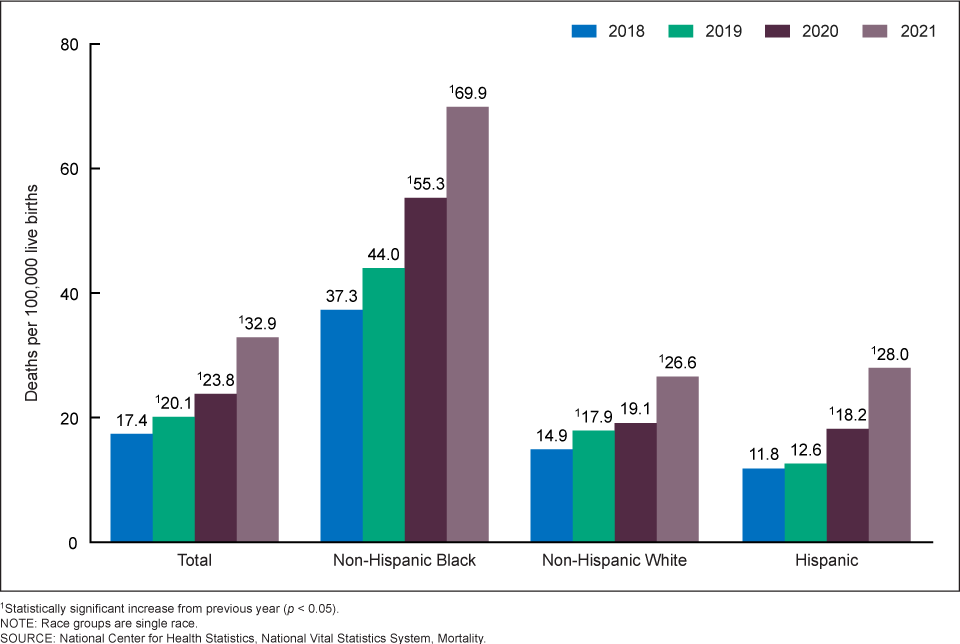
There has been some talk in the news about increasing maternal mortality in the U.S. This is due to the new CDC report Maternal Mortality Rates  in the United States, 2021 by Donna L. Hoyert (3/16/2023). The graph here is one from the report. Clearly the upward trend started before COVID and there is a racial difference. We should note that another graph shows upward trends by age group too.

Rates in 2021 were 20.4 deaths per 100,000 live births for women under age 25, 31.3 for those aged 25–39, and 138.5 for those aged 40 and over (Figure 2 and Table). The rate for women aged 40 and over was 6.8 times higher than the rate for women under age 25. Differences in the rates between age groups were statistically significant. The increases in the rates between 2020 and 2021 for each of these age groups were statistically significant.

The article includes a table of data and the number of births women 40+ have increased, which might explain some,  but not all, of the increase. Either way, the data is waiting for analysis is a statistics class.

As to the racial differences. In 2019 Kevin Drum reported on this in his post How Can We Reduce Black Maternal Mortality? He makes a case that the differences aren’t explained by racism; it is longish and worth reading.  A few quotes:

The differences in allostatic load are tiny—about the equivalent of one IQ point on an intelligence test—and Hispanics have a higher allostatic load than either blacks or whites but the lowest maternal mortality rate.

Poor blacks report less stress and higher levels of optimism than both poor whites and poor Hispanics. Put all this together and the toxic stress/weathering hypotheses look shaky.

What it seems to tell us is that there’s a difference in when black mothers die. Any pregnancy-related death within a year of delivery is counted as maternal mortality, and the difference in IHM rates suggests that in white hospitals black mothers die at high rates in the hospital, while in black hospitals they die at high rates after going home.
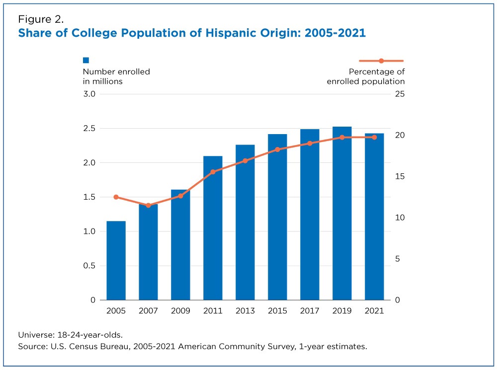