 The Pew article Republicans continue to see a national political climate more comfortable for Democrats than for GOP by Bradley Jones (12/8/2021) is another example of the disconnect in the U.S.
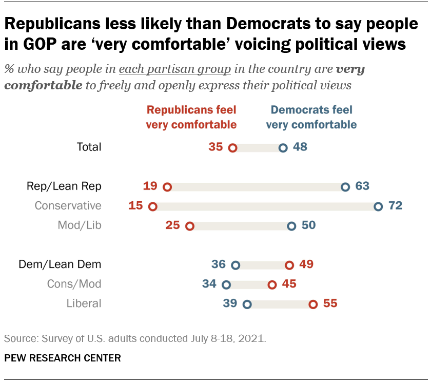
When Republicans take stock of the national climate for political discourse, they see a much more hospitable environment for Democrats than for members of their own party. About six-in-ten Republicans and Republican-leaning independents in the United States (63%) think that “Democrats in this country are very comfortable to freely and openly express their political views,” but only about two-in-ten (19%) think Republicans around the nation experience that same level of comfort.
Responses from Dems go the other way but aren’t as extreme. Pew provides the questions asked and the methodology.