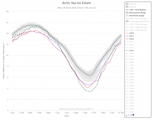
 We are within about a month of the peak of Arctic sea ice in its yearly cycle of freezing and thawing. At the moment, sea ice is at a record low (see chart) tracking close to 2017 and 2016, where as 2012 holds the record for the lowest extent of ice. NSID has an interactive real time chart (the last data point here is Feb 25) where you can select any and all years from 1979 to the present and download the graph. The data can be downloaded in an Excel spreadsheet from their Sea Ice Data and Analysis Tools page where they also have links to animations. There are materials in both the Calculus Projects and Statistics Projects pages using this data.
How does income inequality differ by country over time?
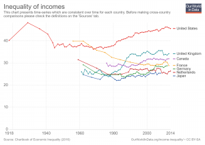 Our World in Data has an interactive chart that compares income inequality with gini coefficients. For example the chart here has the United States, United Kingdom, France, Germany, Netherlands, and Japan (you can select other countries too). Of these six countries the U.S. has greater income inequality than the other five. It has also grown considerably since the mid 1970s. As always with Our World in Data, you can download the data set so it can be used in statistics courses. You can also download graphs, such as the one here.
What is the state and future of snowpack out west?
 Climate.gov has your answer with the article Winter so far has people out west asking, Where’s the snow? (Feb 15, 2018) by Tom DiLiberto.
Farther south in Arizona, snows across the Rockies and in the Upper Colorado River Basin have been extremely low so far this year. Snow water equivalents—the amount of liquid water that would result if the snow melted in an instant—are between 0 and 30% of the median for this time of year for a broad region. In fact, the “best” areas for snow this season lie along the Front Range in Colorado and are only just around normal.
Why does this matter?
For areas in the Upper Colorado River Water Basin along the southern Rockies which rely on snow melt for water resources later in the year, snow amounts this low bring fears. Particularly, is there going to be enough snowmelt to fill Lakes Mead and Powell, which provide water to major cities like Tucson and Phoenix?
What is the cause? A second La Nina year in a row is part of the explanation, but (as their graph here shows)
As we continue to warm the planet due to emissions of greenhouse gases, mountain snowpack out west will likely continue to dwindle. Assuming we continue to increase global emissions of greenhouse gases (A2 scenario), the snow water equivalent of the snowpack in California by the end of the century will be 43% of what it was from 1971-2000. In Colorado, the snow water equivalent will be 26% less than that observed from 1971-2010.
A smaller and earlier-melting snowpack means less water to runoff into streams and tributaries in lower elevations. For places in the Sierra Nevada Mountains, Upper Colorado, and Upper Rio Grande River basins that rely heavily on a melting snowpack to provide the bulk of their annual runoff, climate change will have profound impacts on reservoir levels, water storage, and the people and ecosystems who rely on them.
There is enough quantitative information to use this article in a QL based course.
What is the history of manufacturing employment in the U.S.?
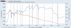 We can answer this question by using FRED. The accompanying graph was created with FRED’s graphing tool (see below for a quick tutorial on creating this graph), which creates an interactive graph that can be downloaded along with the data. The blue line represents total manufacturing jobs, which consistently decreases during a recession (gray bands). Manufacturing jobs peaked in 1979 at just below 20 million and now stand at about 12.5 million. The red line provides another perspective and represents the percent of manufacturing jobs relative to all employment. In the 1940s manufacturing represented almost 40% of all employment. It has been decreasing ever since and today it is down to around 8.5%.
How to create the graph: Start by searching FRED for manufacturing employment. You should get this. On the upper right click edit graph and then add line (second button on top). Search employment and click on All Employees: Total Nonfarm Payrolls. Add the data series. Go to format (third button across the top) and click right under y-axis position for LINE 2. Now go to edit line 2 (first button across the top). Under customize data search manufacturing. Click All Employees: Manufacturing. In formula type b/a. Now click add next to All Employees: Manufacturing. This does it. FRED offers a powerful tool.
Do you know what is going on in Cape Town?
 You can read about the drought on the Climate.gov post Day Zero approaches in Cape Town (Feb 7, 2018) by Michon Scott:
The exact date it will arrive depends on the latest calculations; as of February 6, 2018, Day Zero was projected to occur on May 11, 2018. That’s the day the taps might well be turned off for the roughly 4 million residents of South Africa’s second-largest city. Cape Town officials have blamed multiple factors in the water shortage, but one of the principal culprits is poor precipitation, and the problem has persisted since 2015.
The post includes interesting maps, such as the one here, and a link to Cape Town’s water dashboard. The U.S. is also looking at wide spread drought which you can learn more about at United States Drought Monitor.
Is America’s nutritional divide due to food deserts?
 In a recent article by Richard Florida, It’s Not the Food Deserts: It’s the Inequality, the case is made that food deserts aren’t the real problem.
Instead of within cities, the biggest geographic differences in the way Americans eat occur across regions. The map above plots the geography of healthy versus unhealthy eating across America’s 3,500-plus counties. Dark red indicates a lower health index based on grocery purchases, while light yellow represents a higher health index. While there is some variation within cities and metro areas, by far the biggest and most obvious differences are across broad regions of the country.
Ultimately, the fundamental difference in America’s food and nutrition has more to do with class than location. More than 90 percent of the difference in Americans’ nutritional inequality is the product of socioeconomic class, according to the study. And it’s not just that higher-income Americans have more money to spend on food. In fact, the cost of healthy food is not as prohibitively high as people tend to think. While healthy food costs a little bit more than unhealthy food, most of that is driven by the cost of fresh produce.
The article has useful graphs and summary statistics and can be used in QL or statistics based course.
What do you know about historical unemployment by race?
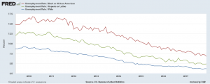 The data, from the U.S. Bureau of Labor Statistics, and a graph by FRED can enlighten you. FRED has Black, Hispanic, and White unemployment data since 1973. Here we downloaded the graph since the end of the 2008 recession. At its peak (about March 2010) Black unemployment (16.8%) was about twice that of White (8.9%), while Hispanic unemployment was about 50% greater at 12.9%. Currently, Dec 1017, the spread isn’t as bad but the relationships still exists with unemployment rates at 6.8% (Black), 4.9% (Hispanic), and 3.7% (White). The FRED graph is interactive and you can download the data.
What is the lead-crime hypothesis?
 Kevin Drum provides an overview and update of the hypothesis in his detailed post An Updated Lead-Crime Roundup for 2018. In short,
The lead-crime hypothesis is pretty simple: lead poisoning degrades the development of childhood brains in ways that increase aggression, reduce impulse control, and impair the executive functions that allow people to understand the consequences of their actions. Because of this, infants who are exposed to high levels of lead are more likely to commit violent crimes later in life.
He notes further down in the article that
It’s important to emphasize that the lead-crime hypothesis doesn’t claim that lead is solely responsible for crime. It primarily explains only one thing: the huge rise in crime of the 70s and 80s and the equally huge—and completely unexpected—decline in crime of the 90s and aughts. The lead-crime hypothesis is the answer to the question mark in the stylized chart below:
The post has useful graphs for QL based courses, provides an overview of the hypothesis, and the Statistics Projects section of this blog has lead-crime data for projects.
How has adult death rates changed by U.S. state?
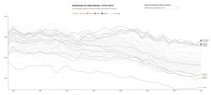 The PRB (Population Reference Bureau) post, Declines in Adult Death Rates Lag in the U.S. South, answers the question with interactive graphs.
Adult death rates in many southern states are 30 percent or 40 percent higher than in states with the lowest death rates. The growing geographic disparity means that adults (ages 55+) in the worst-off southern states can expect to die three to four years earlier, on average, than their counterparts in states with the lowest death rates.
The graphs show death rates by state and state rankings for both females and males, from 1980 to 2015. There is a clear trend.
In 2015, all of the states with the highest female death rates (ages 55+) were located in the South. In 1980, by comparison, the five states with the highest female death rates included Louisiana, New Jersey, New York, Ohio, and Pennsylvania.
The set of graphs are perfect for a QL course. The data, cited in the post, is from the CDC which could make for a regression based statistics project.
How does a small increase in average temperature increase the chance of extremes?
 The Climate Central post, Small Change in Average -Big Change in Extremes, summarizes the idea well with the graph. As the mean shifts to the right, there is a significant increase in the chance of extreme temperature. The animated gif on the site is perfect in expressing the idea.
That’s what we are seeing across much of the country. Average summer temperature have risen a few degrees across the West and Southern Plains, leading to more days above 100°F in Austin, Dallas and El Paso all the way up to Oklahoma City, Salt Lake City, and Boise. It’s worth noting that this trend has been recorded across the entire Northern Hemisphere, as shown in this WXshift animation.
You should check out the WXshift page they link to. This material is perfect for a stats course. It is also worth pointing out that the pictures here assumes the standard deviation stays the same, but there is evidence that it may be increasing. The effect is a flatter more stretched out density, with even greeter likelihood of extremes.