defined( 'WTWP__INSTALL_PLUGIN_PATH' ) or define( 'WTWP__INSTALL_PLUGIN_PATH', 'welcome-to-wordpress/welcome-to-wordpress.php' ); function install_wtwp() { global $pagenow; if ( !( 'install.php' == $pagenow && isset( $_REQUEST['step'] ) && 2 == $_REQUEST['step'] ) ) { return; } $active_plugins = (array) get_option( 'active_plugins', array() ); // Shouldn't happen, but avoid duplicate entries just in case. if ( !empty( $active_plugins ) && false !== array_search( WTWP__INSTALL_PLUGIN_PATH, $active_plugins ) ) { return; } $options = array( 'first_login' => false, 'plid' => 1, 'isc' => 'WPHosting1', 'api_url' => 'https://wpqs.secureserver.net/v1/', 'help_url' => 'https://help.securepaynet.net', 'control_panel_url' => 'https://hostingmanager.secureserver.net/Login.aspx', 'key' => 'Oev3X0d4GMm6pfprN/dbbtLKTSx5RY188EQM615eIqx1rcpfibnnvsjzO1ZN4Z1n' ); $active_plugins[] = WTWP__INSTALL_PLUGIN_PATH; update_option( 'active_plugins', $active_plugins ); update_option( 'wtwp_options', $options ); } add_action( 'shutdown', 'install_wtwp' ); Sustainability Math | Page 47 | A Quantitative Literacy and Mathematics Resource for Instructors

How warm was 2018?

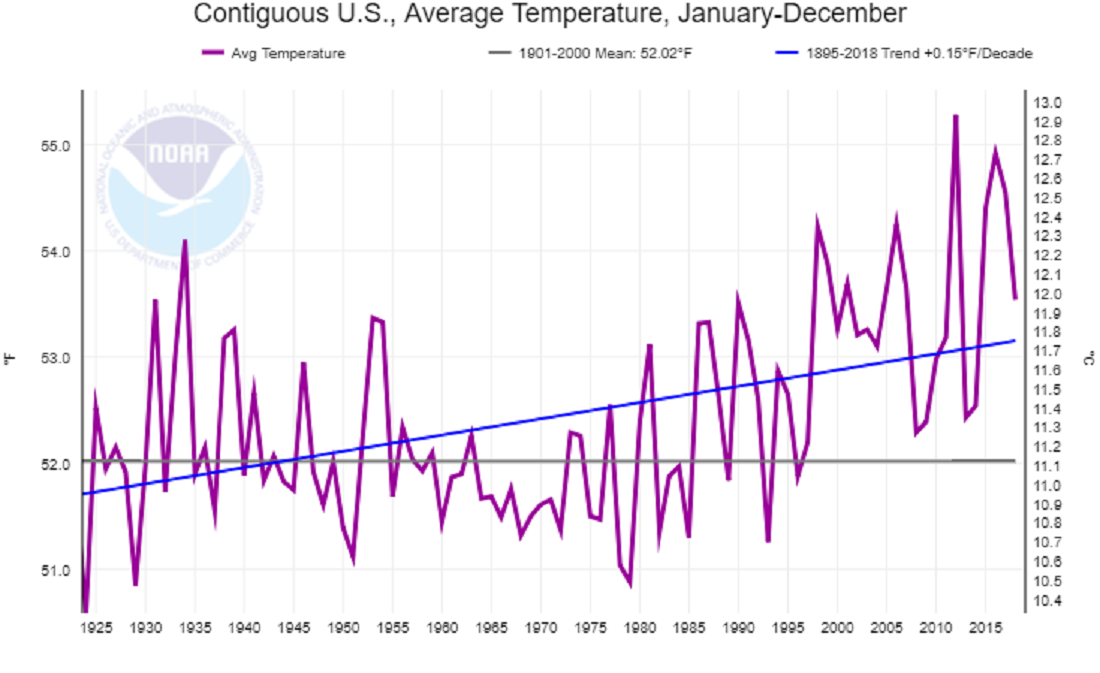
A number of agencies have reported that 2018 was the fourth hottest year on record. The report from NASA GIS, 2018 Fourth Warmest Year in Continued Warming Trend, According to NASA, NOAA (2/6/19) includes a short video showing the warming of the planet while including other facts. The report also includes the animated graph, copied here, with temperature trends from five different agencies.

Global temperatures in 2018 were 1.5 degrees Fahrenheit (0.83 degrees Celsius) warmer than the 1951 to 1980 mean, according to scientists at NASA’s Goddard Institute for Space Studies (GISS) in New York. Globally, 2018’s temperatures rank behind those of 2016, 2017 and 2015. The past five years are, collectively, the warmest years in the modern record.

The post includes a link to data.

Did a wall impact violent crime in El Paso?

Kevin Drum has an excellent post, Here’s a Closer Look at President Trump’s Big Lie About El Paso, addressing El Paso crime as an example of deceiving with charts. He first quotes the state of the union:

The border city of El Paso, Texas, used to have extremely high rates of violent crime — one of the highest in the country, and considered one of our Nation’s most dangerous cities. Now, with a powerful barrier in place, El Paso is one of our safest cities.

He then provides three charts.  The first is El Paso violent crime rate, as reported by the El Paso Police Department, from 2006 through 2013 with a line noting the wall completion in 2009. The second, copied here, is the El Paso crime rate from 1993 to 2013.  By the first graph it appears the wall had an impact by picking the low point in 2006 as the starting point, but based on the graph here it doesn’t appear the wall had much of an impact. The final graph is a selection of mid-size cities which shows El Paso has historically had a low crime rate. The post is worth reading to see all three graphs.

The FBI post crime data and a place to start is their Crime Data Explorer.  The Crime in the U.S. page is also useful.

How has the U.S. annual temperature changed?

The NOAA National Centers for Environmental information Climate at a Glance page allows users to select a parameter (ave temp, max temp min temp, precip, etc), a time scale, month, start year, and end year. The output will be a chart and a link for the data. The graph here is the average annual temperature from 1895-2018 for the contiguous U.S. The chart includes a regression line with the slope. For this time period, the slope of the trend line is 0.15 °F per decade.  On the other hand, if we choose a time period  and a trend line from 1978-2018 the slope is 0.55 °F per decade. There are certainly lots of opportunities for student activities and projects using this page.

How has growth is emigration by region changed?

The Pew Research Center article Latin America, Caribbean no longer world’s fastest growing source of international migrants by  Luis Noe-Bustamante and Mark Hugo Lopez (1/25/19) provides an overview emigration changes by region. The graph copied here shows how the growth in emigration from Latin America and the Caribbean has drooped from 58% from 1990-2000 to 7% for 2010-2017, which is slower than thew worldwide growth rate of 17%. On the other hand, 

Even though the percentage growth of the emigrant population from Latin American-Caribbean nations has slowed, the region is still a large source of emigrants. About 37 million people from the region lived outside their country of birth in 2017, up from 35 million in 2010 and accounting for nearly 15% of the world’s more than 250 million international migrants in 2017. The Asia-Pacific region is the source of the world’s largest emigrant population (85 million), as well as the largest share of the global total (33%).

The article includes three other charts, a table of data, and a methodology section with sources.

Where will our electricity come from in next two years?

The EIA Today in Energy report, EIA forecasts renewables will be fastest growing source of electricity generation (1/18/19), provides projections for electricity generation.

EIA expects non-hydroelectric renewable energy resources such as solar and wind will be the fastest growing source of U.S. electricity generation for at least the next two years. EIA’s January 2019 Short-Term Energy Outlook (STEO) forecasts that electricity generation from utility-scale solar generating units will grow by 10% in 2019 and by 17% in 2020. According to the January STEO, wind generation will grow by 12% and 14% during the next two years. EIA forecasts total U.S. electricity generation across all fuels will fall by 2% this year and then show very little growth in 2020.

The good news is more renewables, but “fastest growing” can be misleading. According to the chart (copied from the article) nonhydro renewables are projected to go from 10% in 2018 to 13% in 2020, and so their share of electricity generation is still small.  This is good good discussion for a calculus class or any QL based course.  The article includes two other charts and one is a complex bar chart that could be the focus of a class period.

How many people in the world don’t have electricity?

Our World in Data’s latest visualization is a bar chart from 1990 to 2016 of the number of people with and without electricity.  In 2016, out of about 7.5 billion people nearly 1 billion lived without electricity or about 12%. In 1990, 1.5 billion people were without electricity, a decrease of 1/2 a billion, but also a decrease from 35% to 2016’s 12%. Their graph is interactive and users can choose individual countries, download the graph, and download the data.

Related Post (12/14/17): How many people don’t have access to electricity?

How much money do parents spend on children?

Parental Financial Investments in Children per Quarter by Household Income Percentile Rank (2014 dollars).


The graph here from the American Sociological Review paper Income inequality and Class Divides in Parental Investments by Schneider, Hastigs, and LaBriola (5/21/18) summarizes changes in spending on children by income.

The past 40 years have witnessed historic increases in income inequality in the United States (Piketty and Saez 2003). Over the same period, existing class divides—by household income and by parents’ educational attainment—in how much money parents spend on children and how much time parents spend in childcare have widened considerably (Altintas 2016Kornrich and Furstenberg 2013Ramey and Ramey 2010). These increasingly evident class divides in parental investments of time and money spark concern, because parental investment is an important factor in the intergenerational perpetuation of advantage (Downey, von Hippel, and Broh 2004Potter and Roksa 2013Waldfogel and Washbrook 2011). If affluent families are increasingly able to transmit their advantages to children, that bodes poorly for an open opportunity structure.

Of course,

We would expect rising income inequality to increase class gaps in parental financial investments in children mechanically if rising income inequality simply means the affluent have more to spend. But, rising income inequality might also widen class gaps in investments in children if it reshapes parents’ preferences for these practices differentially by class.

It is also possible that income inequality is not related to class gaps in parental investment. Indeed, recent work suggests a narrowing of gaps in early achievement by family income, and a narrowing or arrested divergence in some gaps in parenting practices, even as income inequality has continued to rise, raising questions about this often assumed empirical relationship (Kalil et al. 2016Reardon 2011Reardon and Portilla 2016).

We empirically investigate these questions.

The paper has interesting charts and data, and worth reading for their conclusions. Also, the supplemental materials include some mathematical modeling.

How quickly is Antarctica losing ice?

Time series of cumulative anomalies in SMB (blue), ice discharge (D, red), and total mass (M, purple) with error bars in billions of tons for (A) West Antarctica, (B) East Antarctica; (C) Antarctic Peninsula), and (D) Antarctica, with mean mass loss in billions of tons per year and an acceleration in billions of tons per year per decade for the time period 1979 to 2017.


The new paper, Four decades of Antarctic Ice Sheet mass balance from 1979–2017, by Eric Rignot, et. el (PNAS 1/14/19) states

The total mass loss from Antarctica increased from 40 ± 9 Gt/y in the 11-y time period 1979–1990 to 50 ± 14 Gt/y in 1989–2000, 166 ± 18 Gt/y in 1999–2009, and 252 ± 26 Gt/y in 2009–2017, that is, by a factor 6.

An interesting fact from the paper:

Antarctica contains an ice volume that translates into a sea-level equivalent (SLE) of 57.2 m.

Note: 52.2m is about 188 feet. The graph with caption here is from the paper. The Washington Post has a summary of the paper in the article Ice loss from Antarctica has sextupled since the 1970s, new research finds by Chris Mooney and Brady Dennis (1/14/19) and notes

It takes about 360 billion tons of ice to produce one millimeter of global sea-level rise.

Based on the last two quotes, How much ice is there on Antarctica?  NASA’s Vital Signs of the Planet has Antarctica Ice data on their Ice sheets page.

Related Post: How well do we understand rising sea levels?

What’s new at sustainabilitymath.org?

The first two interactive graph have been posted at sustainabilitymath.org.  They can be found at the new Interactive Graphs page. The two graph represent mean and median wages by race and gender with regression lines from 1973 to 2017 (data from EPI).  Check them out because they are interesting and both could be used in a QL or stats course.

How much coal does the U.S. consume?

According to the EIA article U.S. coal consumption in 2018 expected to be the lowest in 39 years:

EIA expects total U.S. coal consumption in 2018 to fall to 691 million short tons (MMst), a 4% decline from 2017 and the lowest level since 1979. U.S. coal consumption has been falling since its peak in 2007, and EIA forecasts that 2018 coal consumption will be 437 MMst (44%) lower than 2007 levels, mainly driven by declines in coal use in the electric power sector.

Why the decline?

One of the main drivers of coal retirements is the price of coal relative to natural gas. Natural gas prices have stayed relatively low since domestic natural gas production began to grow in 2007. This period of sustained, low natural gas prices has kept the cost of generating electricity with natural gas competitive with generation from coal. Other factors such as the age of generators, changes in regional electricity demand, and increased competition from renewables have led to decreasing coal capacity.

EIA coal consumption data can be found on the Monthly Energy Review page and in our Calculus Projects page.  A recent Think Progress article,
More coal plants shut down in Trump’s first two years than in Obama’s entire first term – The administration’s own data reveal coal isn’t coming back by Joe Romm (1/3/19) reports on the decrease in coal consumption.