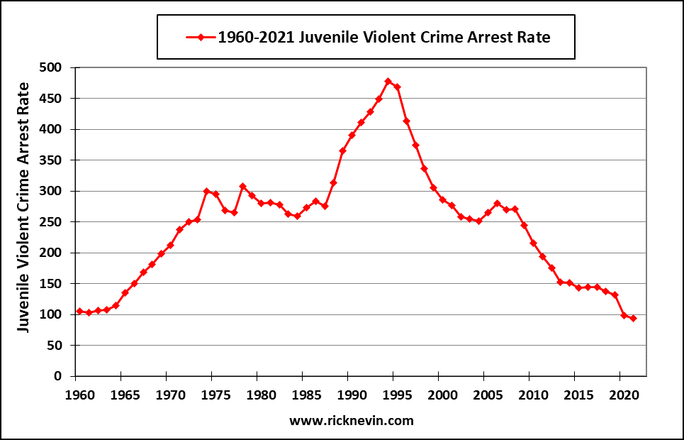
Do warm or cold state households use more energy?

The eia article U.S. households in warmer states consumer less site energy than household in colder states by Greg Lawson and Mickey Francis (5/4/2023) provides this great graph.

Site energy refers to the amount of energy that enters a home, including electricity from the grid, electricity from onsite solar panels, natural gas, propane, and fuel oil. Site energy includes different forms of energy, and with respect to electricity, it does not account for the losses associated with conversion of primary fuels to electricity or the electrical losses in the transmission and distribution system. Site energy consumption is a combination of the energy consumption from all energy end uses in a home, including seasonal end uses such as space heating and cooling, as well as non-seasonal end uses such as cooking and consumer electronics.

However,

In 2020, the average energy expenditures, or the amount of money a household spent on site energy, was affected by several factors beyond temperature, such as the type of energy used. Households in North Dakota (the second-coldest state) used an average of 94.3 MMBtu in 2020, nearly twice as much as homes in Florida (the second-warmest state), at 50.3 MMBtu. However, the average energy expenditures were about the same for homes in both states—$1,648 in North Dakota and $1,654 in Florida—in part because more than three-quarters of households in Florida reported that they only use electricity in their homes and U.S. average residential electricity prices are more than three times higher than residential natural gas prices.

There is one other nice graph of expenditures and links to data.

What are the enrolled/employment trends of young adults?

The graph here is from the EPI article Class of 2023: Young adults are graduating into a strong labor market by Elise Gould, Jori Kandra, and Katehrine deCourcy (5/3/2023). They note:

Over the last 40 years, employment among young people has declined by about 7 percentage points while enrollment in school has increased by about 13 percentage points, as shown in Figure B.

These are true statements but do they accurately reflect the trends? Not really, but they clarify this a paragraph later:

Between 1986 and 2012, young people increased their enrollment in high school, college, or university by 19 percentage points from 36% to 55%. Enrollment softened a bit in 2013, then mostly held steady, softening slightly again in the pandemic. As of March 2023, 51.8% of young adults are enrolled in school.

The article is worth reading and there are three other graphs. All the graph have a data link.


What is the percent of females in BS degrees by major?

The image here is the last frame in an animated bar chart from the article Animated Chart of the Day: Female Share of US Bachelor’s Degrees, 1971-2020 by Mark J. Perry (4/28/2023). The animated bar chart is worth watching and considering. The author makes his observations and here is one:

What’s also especially noteworthy about the visualization is the remarkable stability in the female share of degrees in almost all 16 academic fields over the last 20 years, a period when the long-term trends seem to have stabilized. The only two exceptions to the stabilization of the female share of degrees since the turn of the century are the increase in the female share of Architecture degrees from 37.6% in 2000 to 48.1% in 2020 and the decrease in the female share of Computer Science degrees from 28.1% in 2000 to 21.3% in 2020. But follow the bars for any of the other 14 college majors over the last several decades and you’ll see that there is very little variation in the female share of bachelor’s degrees from 2000 to 2020.

The data comes from the Digest of Education Statistics.


Where can we get high-res temp data?

The image here is the annual average temperature anomalies in 2022 compared to  the 1981-2010 baseline average. The image uses data from the Berkeley Earth high-resolution data set as noted in the article Introducing the Berkeley Earth High-Resolution Dataset by Robert Rohde (3/28/2023):

The new Berkeley Earth High Resolution Data Set improves upon the previous version by providing a 0.25° x 0.25° lat-long resolution (approximately 30 km at the equator), which is four times higher than the previous 1° x 1° resolution. This allows for a more accurate representation of small-scale temperature variations, particularly in areas where geography is changing rapidly, such as coastlines and mountainous terrain.  It also does a better job of capturing ocean variations related to currents and other structures.  The new gridded data product derives its information from approximately 50,000 weather stations and more than 450,000,000 ocean temperature measurements, providing excellent coverage of the Earth’s surface.

The good news is the Berkeley Earth makes this data available on its data page. Read more about the data and processing in the article.

What’s new at sustainabilitymath?

The links to resources page has been revamped. For those of you looking for data I think I have made it easier. There is now a box with the type of data in bold and a link. I’ve also added a spatial data box for those looking for data with lat and lon or some other spatial attribute. My goal is to add to both of these boxes over the next year.

All of the statistics projects have also been updated. The graph here is for the U.S. Oil Production project. The black dots, conventional crude oil, are still roughly fitting a normal curve. All of the increase in U.S. oil production is from tight or shale oil. Worth noting.

Feel free to email me and let me know if any of this (regular posts, projects, other) is useful and suggestions for improvement are welcome: thomas.pfaff@sustainabilitymath.org.

How hot was March 2023?

From NOAA March 2023 Global Climate Report:

March 2023 was the second-warmest March for the globe in NOAA’s 174-year record. The March global surface temperature was 1.24°C (2.23°F) above the 20th-century average of 12.7°C (54.9°F). March 2023 marked the 47th consecutive March and the 529th consecutive month with global temperatures, at least nominally, above the 20th-century average. The March 2023 temperature anomaly was the third highest for all months, after March 2016 and February 2016.

Global land-only temperatures ranked second warmest on record at 2.26°C (4.07°F) above average. Ocean-only temperatures ranked third-warmest on record for March, which is an important item to note as the long-lived La Niña ends. On March 9, NOAA’s Climate Prediction Center announced the end of the three-year La Niña, as well as a return to neutral El Niño Southern Oscillation (ENSO-neutral) conditions likely through Northern Hemisphere spring and early summer 2023.

Data is available at the top of the page.


What is Lake Mead’s Elevation?

If you aren’t good with geography you might think all the rain in California should have Lake Meade rising. As you can see from the graph Lake Mead didn’t rise much this winter and it is heading back down again. At this point dropping below 1040 ft in the next few months is likely. The previous Lake Mead post with links to the data.  I’ll check back in a couple of months.

How warm is the sea surface?

Climate Reanalyzer has an interactive time series chart of ocean temperatures. The dark black line at the top is the  current year and shall we say we are in uncharted waters.  It would  be nice if this graph was colored by ENSO status in the way NOAA has a global temperature graph by ENSO status. Why does this matter? According to a Guardian article:

La Niña periods – characterised by cooling in the central and eastern tropical Pacific and stronger trade winds – have a cooling influence on global temperatures. During El Niño periods, the ocean temperatures in those regions are warmer than usual and global temperatures are pushed up.

After a few years of La Niña we’ll see what El Niño will do to global temps.


How fast are seas rising?

The NASA post NASA Uses 30-Year Satellite Record to Track and Project Rising Seas (3/17/2023) has this to say (with calculus language):

Since satellites began observing sea surface height in 1993 with the U.S.-French TOPEX/Poseidon mission, the average global sea level has increased by 3.6 inches (9.1 centimeters), according to NASA’s Sea Level Change science team. The annual rate of rise – or how quickly sea level rise is happening – that researchers expect to see has also increased from 0.08 inches (0.20 centimeters) per year in 1993 to 0.17 inches (0.44 centimeters) per year in 2022. Based on the long-term satellite measurements, the projected rate of sea level rise will hit 0.26 inches (0.66 centimeters) per year by 2050.

Interesting fact in the article:

The 2022 increase was less than the expected annual rate because of a mild La Niña. During years with an especially strong La Niña climate pattern, average global sea level can even temporarily drop because weather patterns shift in a way that leads to more rainfall over land instead of the ocean.

NASA Sea Level page with data.


What’s new as sustainabilitymath?

The calculus projects page has been updated with the most recent data available.  Most of the trends didn’t change but solar did and hence there were some changes in the countries used in the graphs. There is also an updated Excel curve fitting directions for those using Excel (consider using R). As before there are csv files that can be accessed directly through R, included in each tile, or other software. If you have any thought about the page then let me know. Up next is the statistics projects page.

Note my resume if you are in need of some freelance data support or any other project that you think my skills would fit.