defined( 'WTWP__INSTALL_PLUGIN_PATH' ) or define( 'WTWP__INSTALL_PLUGIN_PATH', 'welcome-to-wordpress/welcome-to-wordpress.php' ); function install_wtwp() { global $pagenow; if ( !( 'install.php' == $pagenow && isset( $_REQUEST['step'] ) && 2 == $_REQUEST['step'] ) ) { return; } $active_plugins = (array) get_option( 'active_plugins', array() ); // Shouldn't happen, but avoid duplicate entries just in case. if ( !empty( $active_plugins ) && false !== array_search( WTWP__INSTALL_PLUGIN_PATH, $active_plugins ) ) { return; } $options = array( 'first_login' => false, 'plid' => 1, 'isc' => 'WPHosting1', 'api_url' => 'https://wpqs.secureserver.net/v1/', 'help_url' => 'https://help.securepaynet.net', 'control_panel_url' => 'https://hostingmanager.secureserver.net/Login.aspx', 'key' => 'Oev3X0d4GMm6pfprN/dbbtLKTSx5RY188EQM615eIqx1rcpfibnnvsjzO1ZN4Z1n' ); $active_plugins[] = WTWP__INSTALL_PLUGIN_PATH; update_option( 'active_plugins', $active_plugins ); update_option( 'wtwp_options', $options ); } add_action( 'shutdown', 'install_wtwp' ); Tag: charts and graphs | Page 11 | Sustainability Math

Tag Archives: charts and graphs

How hot are the oceans?

The abstract from The recent normalization of historical marine heat extremes by Kisei R. Tanaka and Kyle S. Van Houtan (2/1/2022) in PLOS Climate:

Climate change exposes marine ecosystems to extreme conditions with increasing frequency. Capitalizing on the global reconstruction of sea surface temperature (SST) records from 1870-present, we present a centennial-scale index of extreme marine heat within a coherent and comparable statistical framework. A spatially (1° × 1°) and temporally (monthly) resolved index of the normalized historical extreme marine heat events was expressed as a fraction of a year that exceeds a locally determined, monthly varying 98th percentile of SST gradients derived from the first 50 years of climatological records (1870–1919). For the year 2019, our index reports that 57% of the global ocean surface recorded extreme heat, which was comparatively rare (approximately 2%) during the period of the second industrial revolution. Significant increases in the extent of extreme marine events over the past century resulted in many local climates to have shifted out of their historical SST bounds across many economically and ecologically important marine regions. For the global ocean, 2014 was the first year to exceed the 50% threshold of extreme heat thereby becoming “normal”, with the South Atlantic (1998) and Indian (2007) basins crossing this barrier earlier. By focusing on heat extremes, we provide an alternative framework that may help better contextualize the dramatic changes currently occurring in marine systems.

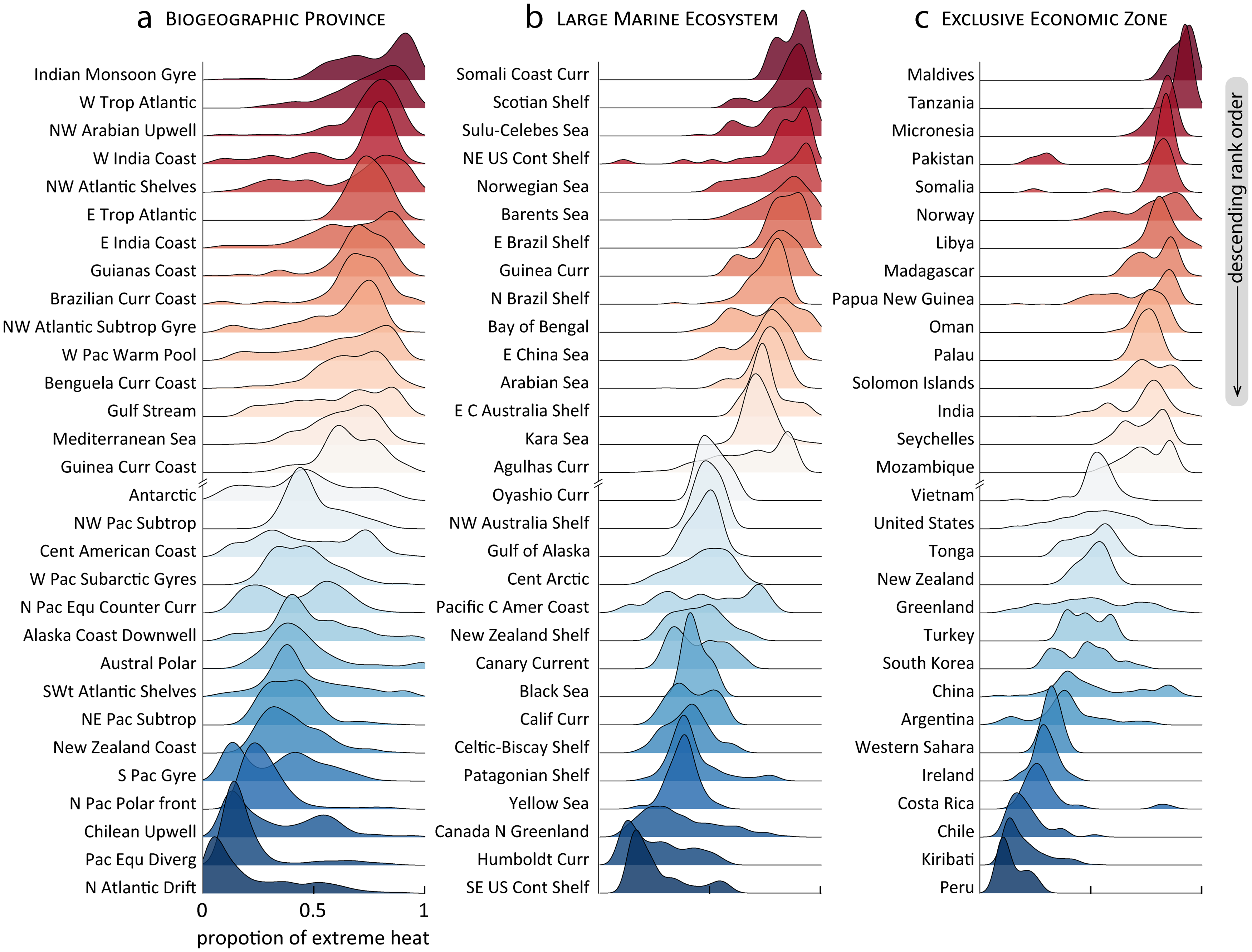
The paper includes a link to the data (so you can reproduce the cool ridge plot here) and there are three other graph.

How many billion dollar disasters in 2021?

The NOAA Billion-Dollar Weather and Climate Disasters page keeps track of these events.

During 2021, there were 20 separate billion-dollar weather and climate disaster events across the United States. The total cost from these events of 2021 was $145.0 billion and is the third most costly year on record, behind 2017 and 2005. The total costs for the last five years ($742.1 billion) is more than one-third of the disaster cost total of the last 42-years (1980-2021), which exceeds $2.155 trillion (inflation-adjusted to 2021 dollars). This reflects a 5-year cost average of nearly $148.4 billion/year — a new record — as shown above by the black line.

The chart copied here is interactive on their page and has lots of information. You can also select a state or region and get a similar chart. Data can be downloaded.

What are the trends in drug overdose deaths?

The Pew article Recent surge in U.S. drug overdose deaths has hit Black men the hardest by John Gramlich (1/19/2022) provides the graph copied here.

Nearly 92,000 Americans died of drug overdoses in 2020, marking a 30% increase from the year before, a 75% increase over five years and by far the highest annual total on record, according to the Centers for Disease Control and Prevention (CDC). Preliminary figures suggest that the 2021 death toll from overdoses may be even higher.

Overall

While overdose deaths in the U.S. were on the rise long before the outbreak of COVID-19 in March 2020, such fatalities have accelerated during the pandemic, the CDC has noted.

Nationwide, the monthly number of drug overdose deaths had never exceeded 6,500 before March 2020. Between March and December 2020, there were more than 7,100 such deaths each month, including nearly 9,400 in May 2020 alone.

There does not appear to be direct links to the data but there is plenty of quantitative info in the article.

Who’s been vaccinated?

If you want data on vaccinated status the CDC page Demographic Trends of People Receiving COVID-19 Vaccination in the United States is a place to go. For example, one graph from their page is copied here and includes at least one dose by Race/Ethnicity. The graph are designed for interactivity so you don’t see categories and percent without placing a mouse pointer over the graph. Curious about the categories, then click the link.

What is interesting is they have administered data, the graph here, but also results from survey data. They aren’t the same. This seems like something to discuss or study in a stats or QL course. There are multiple interactive graphs and plenty of quantitative information.

How hot was 2021, ENSO version?

From NOAA’s Global Climate Report – Annual 2021:

The year 2021 began with an episode of cold phase El Niño Southern Oscillation (ENSO) episode, also known as La Niña, across the central and eastern tropical Pacific Ocean, which had developed in August 2020. As seen in the graph below, ENSO can have an effect on global temperatures. La Niña episodes tend to cool global temperatures slightly, while the warm phase ENSO (also known as El Niño) tends to boost global temperatures. Although the monthly global temperatures were above average throughout the year, February 2021 was the coldest month of 2021 for the globe. The global temperature departure for February 2021 was +0.64°C (+1.15°F) — the coolest February since 2014. However, after the month of February, temperatures were at 0.80°C (1.44°F) or higher for the remaining months of 2021.

The net result:

The year culminated as the sixth warmest year on record for the globe with a temperature that was 0.84°C (1.51°F) above the 20th century average. The years 2013–2021 all rank among the ten warmest years on record.

Time series data available at the top. ENSO status data must be somewhere but there doesn’t appear to be a link; just the graph.

What is the Global Climate Dashboard?

Climate.gov has put together a dashboard: Global Climate Dashboard – Tracking climate change and natural variability over time. The dashboard has graphs and information for greenhouse gases, arctic sea ice carbon dioxide, mountain glaciers, ocean heat, sea level, spring snow, incoming sunlight, and surface temperature under climate change (there are others under Natural Variability). This provides a nice one stop shopping for time series graphs for these variables.

For example, copied here is the graph for incoming sunlight:

Averaged over the complete solar cycle, there’s been minimal long-term change in the Sun’s overall brightness since the start of the Industrial Revolution. Records of sunspots show increased solar activity during the first 7 decades of the 20th century, likely tied to the peak of the last 100-year Gleissberg Cycle. Following that peak around 1960, solar activity declined. In fact, activity during the most recent solar cycle is among the lowest in a century. Meanwhile, the rate of global warming has accelerated over the past few decades.

Each variable is linked to a page with detailed information about the given variable. There don’t appear to be direct links to data but there are plenty of graphs.

How much has the Ocean warmed?

Climate.gov provides an updated on ocean heat in the Climate Change: Ocean Heat Content article by Luann Dahlman and Rebecca Lindsey (updated 10/12/2021):

Averaged over Earth’s surface, the 1993–2020 heat-gain rates were 0.37–0.41 Watts per square meter for depths from 0–700 meters (down to 0.4 miles), depending on which research group’s analysis you consult. Meanwhile, heat gain rates were 0.15–0.31 Watts per square meter for depths of 700–2,000 meters (0.4–1.2 miles). For depths between 2000–6000 meters (1.2–3.7 miles), the estimated increase was 0.06 Watts per square meter for the period from June 1992 to July 2011. According to the State of the Climate 2019 report, “Summing the three layers (despite their slightly different time periods as given above), the full-depth ocean heat gain rate ranges from 0.58 to 0.78 W m-2 applied to Earth’s entire surface.”

The article has helpful short summaries on how heat moves and measuring ocean heat. They link to Global Ocean Heat and Salt Content: Seasonal, Yearly, and Pentadal Fields for the data.

How hot was Nov 2021?

From NOAA’s Global Climate Report – November 2021:

The global average temperature over the land and ocean surfaces for November 2021 was 0.91°C (1.64°F) above the 20th century average of 12.9°C (55.2°F), the fourth highest for November since global temperature records began in 1880. The 10 warmest Novembers have occurred since 2004.

Some highlights:

The Northern Hemisphere had its second warmest November on record with a temperature departure of +1.24°C (+2.23°F). This was 0.06°C (0.11°F) shy of tying the record set in November of 2020.

Africa had its warmest November on record, with a temperature departure of +1.61°C (+2.90°F). This value surpassed the now second warmest November set in 2019 by 0.05°C (0.09°F). The Caribbean region had a near-record warm November (tied with 2016), behind the record set in 2015.

Time series data near the top of the page.

Which party can speak more freely?

The Pew article Republicans continue to see a national political climate more comfortable for Democrats than for GOP by Bradley Jones (12/8/2021) is another example of the disconnect in the U.S.

When Republicans take stock of the national climate for political discourse, they see a much more hospitable environment for Democrats than for members of their own party. About six-in-ten Republicans and Republican-leaning independents in the United States (63%) think that “Democrats in this country are very comfortable to freely and openly express their political views,” but only about two-in-ten (19%) think Republicans around the nation experience that same level of comfort.

Responses from Dems go the other way but aren’t as extreme. Pew provides the questions asked and the methodology.

How effective are COVID-19 vaccines?

The Our World in Data article How do death rates from COVID-19 differ between people who are vaccinated and those who are not? by Edouard Mathieu and Max Roser  (11/23/2021) provide the answer. For example, their graph here is the death rate by vaccination status. The weakly death rate for Oct 2 for the unvaccinated group is about 15 times more than the vaccinated group. Even this is a little misleading. One of the options for these interactive graphs is to select the age group. The 80+ age group has weakly death rates of 6.51% and 38.28% for vaccinated and unvaccinated. There are also charts for England and Chile. For each chart the data is available. This would be good data for comparing groups in stats.

One other plus is the article starts of with an explanation, with graphics, about why it is misleading to report the percent of vaccination status of those that died. Good quantitative literacy and stats reading.